Fonts you hate
Fonts you hate
Out of context: Reply #9
- Started
- Last post
- 14 Responses
- CyBrainX4
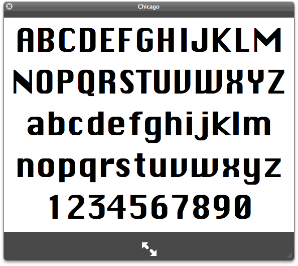
Most of these fonts have problems but I don't hate them. There was a system font on Mac before OSX that was the default substitute if you were missing anything. Chicago. I still see it every once in a while. The capital M in this font is painfully unacceptable.
- That 0 could also go to the Punches For thread.CyBrainX
- worse than comic sansshapesalad
- I remember hating this typeface on the Amiga back in 92 or so, entirely not understanding its history and provenanceNairn
- Given the choice between having to look at this one or Comic Sans all day on an interface, I'd go with this one. This one at least pretends to be serious.Continuity
- Comic Sans on an interface would have to be a joke, even if it were done by someone who wasn't a designer.CyBrainX
- this worked well on low res screens, but it was ugly stillmonospaced
- The one nice thing about this was that if you were missing a font, there was no doubt you had to take care of it immediately.CyBrainX