Show some recent work
Show some recent work
- Started
- Last post
- 8,641 Responses
- Kiggen0
- alane dante?********
- I will there, not that she knows here, she is german ;)Kiggen
- is that sauna???Amicus
- i like that a lot.antigirl
- Nice and simple.JerseyRaindog
- alane dante?
- i_monk0
- for ICICI Bank Canadai_monk
- reminds me of an old logo i did********
- i like everything except the phone. kinda reminds me of a bent sausage. Try varying the width of the handle.baseline_shift
- it *is* a bent sausage.i_monk
- imnotadesigner0
- 3 piece brochure package.
white foil stamp, embossed covers in a custom casingimnotadesigner - fancy!Kiggen
- that's nice!dyspl
- slickrick!akrokdesign
- Pretty sweet for someone who isn't a designer.shitehawke
- Mmmm! I particularly love the pattern in the second pic. Nice job, man.Nairn
- thnx! I love that pattern as well. Worked my ass of on it.
www.krop.com/anthony…imnotadesigner - nicejuhls
- you sir, are a designer.Gucci
- 3 piece brochure package.
- Meeklo0
- LOVE IT!!CLRBLND
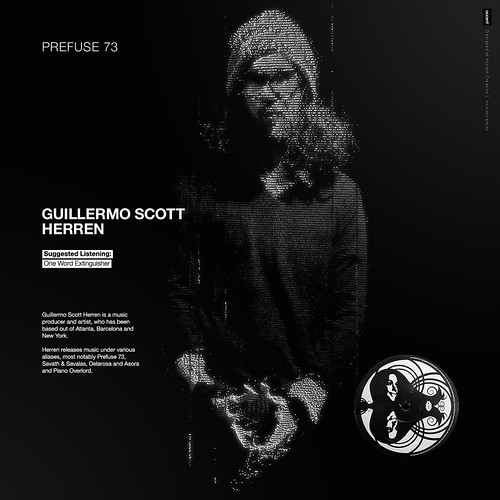
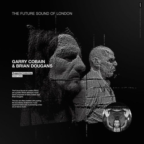
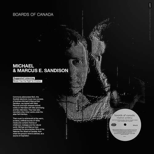
- oh ho...its a whole series.akrokdesign
- kicks ass. :-) nice.akrokdesign
- NIce!Nice!Nice!Kiggen
- greatinvisiblechamber
- seriously one of my favorite work i've seen last months.
great job!dyspl - the whole collection would make a very nice as a poster. you could sell it IMOdyspl
- heh, I'[ve been fiddling with displacement maps since your initial post from this series... methinks you've started a trend!Nairn
- wow!
thanks mangsMeeklo - i love this! and I think its even stronger seeing the whole set in flickrAudria
- its very awesome, temped to do also something like that now :)))Kiggen
- loved the set. fantastic!Chief
- also have to confess I played wit hdisplacment map after seeing your firsts pics last week :)dyspl
- really good lookingdopepope
- Really lovely work. Thumbs up.egosmoke
- Nice!ahalvarsson
- tears of joy
http://www.3rdgearba…
thanks everyone!Meeklo - i love it. healthy mix of the radio head 3d video and old ascii arterikjonsson
- someone else mentioned radio head, I know it looks a tad similar, please know I dont like radiohead and it was not on purposeMeeklo
- purpose, someone also mentioned new order, also not on purpose, but I consider that a compliment :)Meeklo
- extraordinary!smpl
- great style. really love these.dibec
- Really nice Meeklo, really nice.JerseyRaindog
- benfal990
2005, soon its gonna be 2009 :D
- Chief0
<a href="
_11863fea37.jpg" width="500" height="281" alt="MemorialDay_2009" /></a>another video. this one's from a memorial day bbq.
- dopepope0
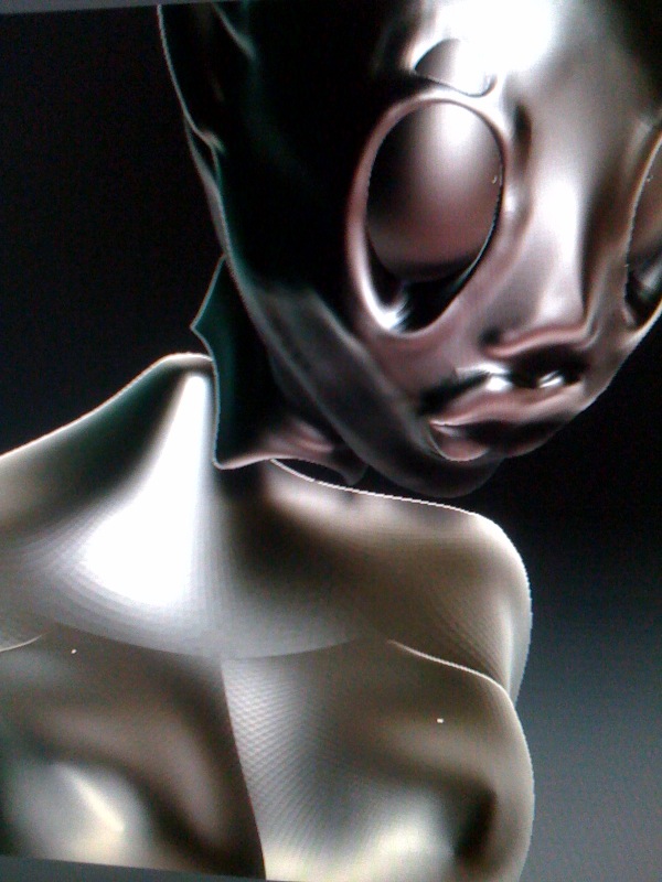
- looks... creepy :)Chief
- Its a self portrait : (dopepope
- i really like the lighting. the red cast on the face is great!Chief
- Gorgeous, man. Is there any intent, or are you playing?Nairn
- Just practicing some 3D forms in ZBrush.dopepope
- Inspiring. Thanks.Nairn
- nothing wrong w creepy, I like it!Meeklo
- I don't look like that. I was kidding. Creepy is good in my book too.dopepope
- nikdaum0
- sweetahalvarsson
- the pasties could be hot!dopepope
- love this stylejuhls
- Love it.JerseyRaindog
- ********0
- thanks to Mike for the book background graphic by the way.********
- awesome! my brother and i are driving from LA to Seattle the first of july. roadtrips are awesome! what a great way to remember them.Chief
- nicejuhls
- Nice!ismith
- nice one skt!!you know how I love your pics********
- gnnn, pleasing to fix the shadow on the flat version, sir?Nairn
- get a room!OSFA
- Noice!JerseyRaindog
- thanks to Mike for the book background graphic by the way.
- antigirl0
- four 8.5x11 inch books. and ten 8x8 inch books.antigirl
- nice, what are they for?smpl
- verey nicemikabast
- my site + boutiques that had them sold out. so need to re-up. http://antigirl.com/…antigirl
- This looks yummy.JerseyRaindog
- ahalvarsson0
- link??
im a coffee lover.Leigh - It's in swedish, and I'm about to send some links to roasterys here in sweden so they can review their coffees first. Will set a link here as soon as I have some content on it :)ahalvarsson
- link??
- dibec0
- why 400dpi?********
- nice colours.mistermik
- I am a quality w#ore.dibec
- you should go 500 pdi and R G Pjimzyk
- ha! the true reason is my print standard is 300. 400 gives me flexibility to work and crop if needed. =)dibec
- how much harder is it too find elements and use brushed at that dpi?Machuse
- my blade cuts on both ends. i shoot my own stock. =) if it is not an image ... I use vector work.dibec
- i'm liking it so farwordsinyourmouth3
- why 400dpi?
- JerseyRaindog0
- nice grid, sirscarabin
- yeah. looks good.dopepope
- where do you get the book image to put your pages on? is it stock images? wouldnt mind doing some stuff like this to show of my work myself :)instil_design
- or am i gonna get totally shot down for this and say its home made do it yourself :S lolinstil_design
- this looks greatMachuse
- Solid, once again.non
- sweet grid! sweet typo, well done!pascii
- clean, i like.canuck
- way to break the jersey stereotype, you made it look like St Tropes or some exotic location in europeMeeklo
- Instil - yeah it's homemade (just grads and photoshop shadows. Thx for all the compliments guys!JerseyRaindog
- Noice work JR. Wish I could do Editorial....Dancer
- yeah, really nice stuff. and you just used grads for the book, very nice ps work.jaylarson
- molo0
http://www.flickr.com/photos/dan…
not really new stuff but i just uploaded some older photo/video to my personal flickr. lots more i'm working on.


