Ambigram help
- Started
- Last post
- 15 Responses
- BaskerviIle
I'm designing an ambigram and it's working well, the first three letters of the first word rotate to read like the last three letters of the second word.
Now my only challenge is to make the letter L and & rotate to read like an S and O
so L& needs to rotate to So
any ideas how? can be ornate or gothic or whatever to make it work.
in case anyone doesn't know what an ambigram is:
http://www.johnlangdon.net/ambig…
- bigtrick0
that is a cool assignment!
if you give us more info on the word you're rotating, or at least the surrounding letters, it would prob. help.
- baseline_shift0
can we see it?
- bigtrick0
oh nevermind. i understand now
- BaskerviIle0
haven't got time to scan my sketches now, maybe tomorrow. It's frustrating because most of the words are working really well now.
The S will rotate easily into an ampersand type shape but it's really making an L look like an O which is stumping me.
going to keep on trying though- maybe downplay the L and have part of the ampersand be the O?
baseline_shift - You could use the letter next to it to complete the circle. If you know what I mean.Jnr_Madison
- maybe downplay the L and have part of the ampersand be the O?
- bigtrick0

make a cursive l with a super wide loop, going into a reverse ampersand? this is the best i can do.
- hopefully you got the idea - sorry for crappy phone picbigtrick
- nice idea.Jnr_Madison
- bigtrick0
What did you end up doing with this, Baskerville?
- kult0
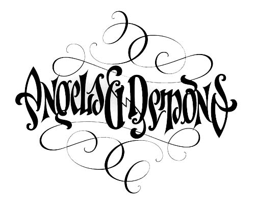
Bask, what's the full word? It's easier to conceive a solution when stepping back to look at the entire character set.
Here's an example of an ambigram I did once, but used a heavily stylized type treatment to pull it off:

- BaskerviIle0
In case anyone is interested, I've finished it now. Spent ages sketching letterforms on my tube journeys to work this week. Eventually drew it all up over the last couple of days. Ran out of time because it's for my cousin's wedding which is this weekend.
The couple are named Paul & Sonya, so the ambigram reads Paul & Sonya both ways up.I would liked to have spent more time on it, the S/& issue still needed to be resolved better and I would have liked to have added some calligraphic embellishments like the angels and demons one above, but to be honest I think they'll be pleased with it whatever. I've printed is on heavy watercolour paper and mounted and framed it, looks good.
Thanks for the cursive idea bigtrick, it ended up influencing the look of the whole piece.
This is the second ambigram I've ever done, they're really fun, almost like a typographic jigsaw puzzle.

- bigtrick0
That looks fantastic! I'm glad it turned out so well.
- neverblink0
Nice one.. I think I would increase the size of the ampersand/s
- it's small on purpose. If you make it bigger then it reads as Pauls not Paul&. compromiseBaskerviIle
- kelpie0
looks good baskerville, overcritical of me but at first read I saw Paul s & Onya
- Dancer0
POst the invites when you've dun'em!!
- they're not invites, it's just a card for them to say congrats, the wedding is this sundayBaskerviIle