Logos that look like this?
Logos that look like this?
- Started
- Last post
- 12 Responses
- jagara
Hey,
if you know logos similar to this one, please post :)

- jagara0
(the rectangle is part of the logo)
- uan0

- Continuity0
What is it about fashion label logos, anyway? These are all bloody boring, and it's always like this. Big boring all-caps type on the first line, smaller boring all caps type on the second line. Add thin-stroked rectangle around the lot and — hey, presto — job done.
Blah.
- Makes it easier to recognise and sew labels onto things.face_melter
- Presumably they become less subject to the whims of seasonal fads if the logos themselves say as ittle as possible - also, more likely to go with everythingdetritus
- jagara0
Nice suggestions! Anyone else? :)
- Ranger0
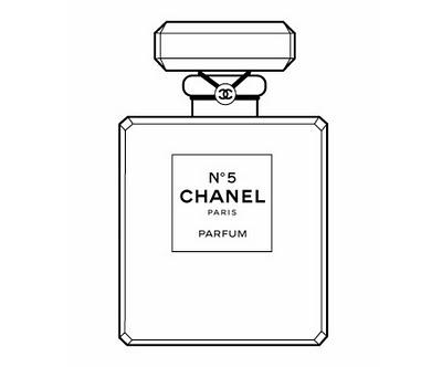
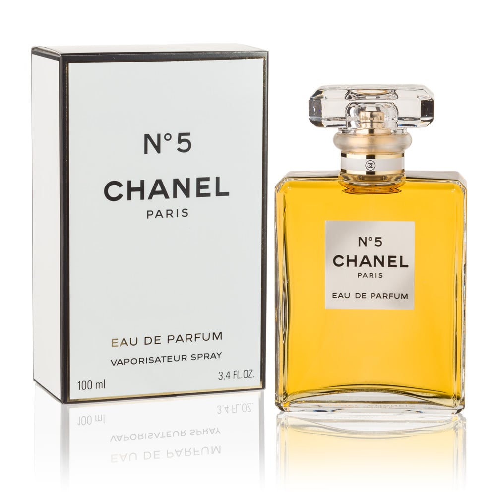
Chanel No. 5 – more the packaging than the logo I guess
- jagara2
Better: