Beer Label Crit
- Started
- Last post
- 21 Responses
- faxion
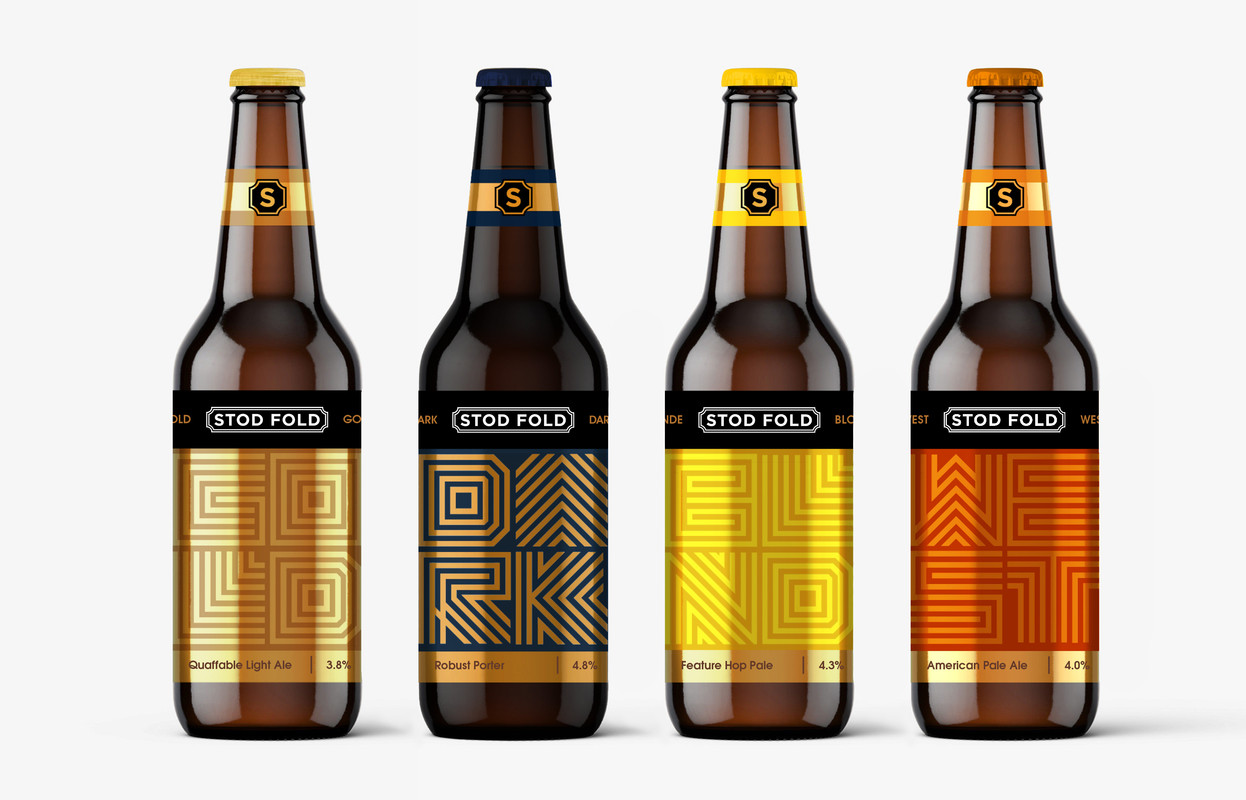
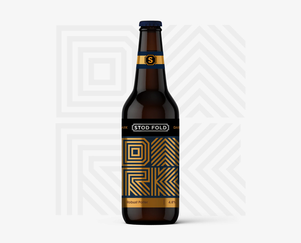
Worked up an alternative approach for a local micro brewery
Thoughts?
- shapesalad1
Thumbs up.
- Projectile2
Awesome. However you'll need to clarify in normal writing as well, this I can guarantee
- it is on the black logo band, but is it too subtle?faxion
- I could see it on the bottom right away without zooming in. It's usually where the info is placed.palimpsest
- palimpsest0
Nice alternative. You've managed to keep the same feeling from the other version while switching it up. I think the light ale needs more contrast like the porter. The APA and the hop ale have appetizing colors that make up for the lack of contrast.
As a beer drinker, I would pick this one over the version since it has more of an identity.
- monospaced4
I love the direction. Kudos on designing a modern label and still making it feel like beer and not an energy drink. It’s not easy to do! I also expect the type of beer spelled out to be a little bigger but this is really nice.
Did you consider “PALE” as well as “WEST” in there?
- cheers mono
these are existing ales, but others can be added - PALE is an optionfaxion - For sure man. I thought pale would work for the American Pale Ale just as well as West.monospaced
- Seriously love these though. There’s also room to throw in a little Easter egg ;)monospaced
- ++Krassy
- cheers mono
- oey_oey0
this is really good.
the writing is totally okay.
specially if it's going to be sold in shelves where's a label with price, brand and sort.
so, it's just eye educating the consumer.can't stop looking at it.
- Nairn1
I prefer this direction to the contours, but the train-station sign-esque branding itself doesn't seem to gel well with the modern forms.
One irksome point - the singular crossing-over line in the R. Seems inconsistent. Also, like Simon, I read 'Cold' not 'Gold'
Nice work!
- This is a terrible idea, but: Is there anyway to make the line forms rail-track like, somehow?Nairn
- Signed, that irritating fuck in marketing who throws shit ideas into the fray and you're expected to see them done no matter how useless the effort.Nairn
- lol walk awaymonospaced
- fooler2
Honestly they are very pretty and look very high end. Almost too fancy for a local brew pub.
What's going on with the leg of the R in DARK? Did you mean for the bottom 45° line to extend over the stem line? I think that should be clipped off.
And my BIGGEST critique ls an American Pale Ale should be more than 4.0%!!!!!!!!!!!!!!!
- Yeah, 4.0% is bud-lite territory. This beer will be decidedly weak. Sierra Nevada's Pale Ale is 5.5% I believe.section_014
- misterhow0
I don’t like the black rectangles. I think that part of the label should match the color bars of the neck banner.
- renderedred0
i like this. for me the only letter that wasn't clear is G.
- but you can figure it out based on context so really it’s a non issuemonospaced
- Hayzilla2
Lovely. Any crits would just be nitpicking for the sake of it.
- doesnotexist1
reads as coffee, not beer
- cassiellux1
Really nice man!
- monospaced0
btw that is a convincing metallic label effect from very little going on. I always struggled with that in presenting. But this is communicating well.
- dbloc2
Looks great. What's the story behind the name?
- faxion4
Yeah the G is not working for me
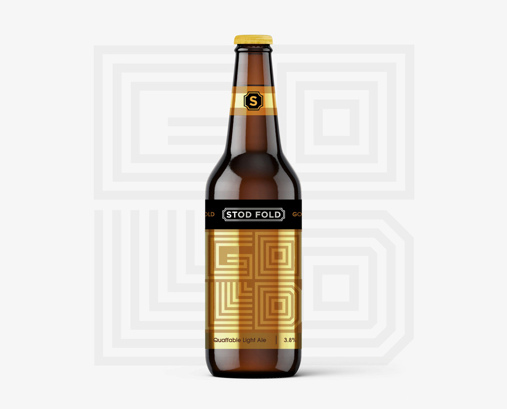
Tweaked the R too
- this R is betterfooler
- I like the R too, but the G I think can fill in and still be successfulmonospaced
- "dork"StoicLevels
- Definitely, much better on the R. That was really the only issue I sawMondoMorphic
- add another lined to the G from the top to the left wall on the inners fill that wack space like you did with the L maybe even add a dot to the LAQUTE
- I like these!utopian
- I don't liuke gold at all but I do like "dork". Still... Stod Fold pops way too much. Make it more subtle somehow. I think Gold should look like Dork.StoicLevels
- Also, instead of navy blue go with black or the darkest navy blue you can find that looks like black, basically.StoicLevels
- And that S seal looks amateurish and basic. Add some detail!StoicLevels
- Im taking you off the project for the weeken. come back on monday with a fresh set of eyes. imm not paying you to crowdsourse. fn amateur manStoicLevels
- https://memegenerato…StoicLevels
- o_0monospaced
- monospaced3
G was better when it was all filled in. The big gap is not as successful to me.
- I think the sameoey_oey
- Agreed.MondoMorphic
- Personally I like that it’s a graphic as more than type. That it doesn’t “read” instantly is good. If it’s too easy it’s less interesting.monospaced
- https://imgz.org/i8j…Nairn
- bingo Nairnmonospaced
- +1 to mono's comment. I liked it more when it was more textural and less literal.noRGB
- AQUTE1
coffee / energy drink cool
- faxion2
Cheers fellas, this is an existing brand so the logo remains untouched (main marque and 'S').
The name is directly taken from the country lane where they reside.
Mono & Nairn hit the target.
- Chimp0
Love the “lined” typography. Could you tell us a bit more about what kinds vibe you wanted to transmit and the customer?