Logo Critque
- Started
- Last post
- 31 Responses
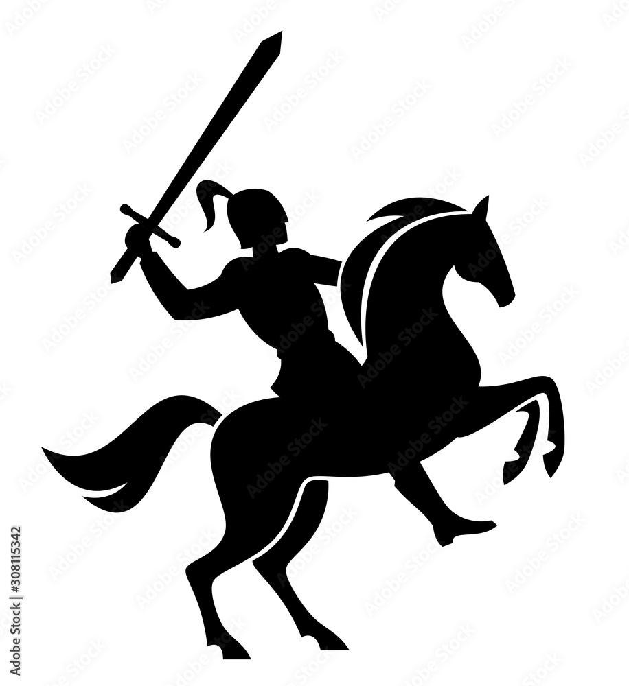
- canoe
I've been 'staring into the pond too long'.... besides a few microscopic lines I need to refine, I think this is ready for your critique!

- canoe-1
I should have said Logomark Critique... I'm half in the bag - colonoscopy hangover - signs I'm old.
- _niko0
What’s it for? What’s the name?
Aesthetically it looks nice
- canoe0
It will go on a shield, it will be an emblem made with platinum or titanium, and then it will also be stitched into leather as well as embroidered...
Luxury vehicle made in England - they wanted the knight and horse
- scruffics0
very nice!
main thing that stood out to me (and that only after looking at it for a while) is that the gap (stroke?) between the hand and the sword isn’t as wide as all the other gaps between other elements. not sure how big of a deal that is tho.
- PonyBoy0
not sure if the eyes or some of the straps are necessary... I like what's going w/the hind end and the head(s) — good strong forms that are clean but have character...
I just feel the middle is a little hacked up / could be joined in places (the tail flows nicely into the hind quarters without being disconnected - it's a more gentle approach at connecting lines whereas the middle of the logo is a bit more broken up).
- I kind of feel that you're probably most qualified among us to offer a critique, there, PonyBoy. ;)Continuity
- I had one motion that made the stomach one definitive shape... and then starting messing with it! I'll look at that, thanks!canoe
- *whinnies (for Continuity)PonyBoy
- Fax_Benson0
Nice.
If I had to be critical I'd say the legs are a bit chunky - especially the front ones. Getting slight husky dog vibes.
The knight's body shape and head angle don't feel quite right. A little under-developed compared to the horse.
- Thanks, yah, I feel ya, it's definitely a burly horsecanoe
- Continuity0
Overall, I really like it.
From my POV, I think there are too many gaps, and it's robbing the overall logomark of movement and tension. A horse rearing up is high-tension, high-energy, and it feels like some of that missing if the form of the horse (especially at the torso) is split up like that.
- I don't think it would hurt to see it in a more solid form... the client got caught up on the 'missing legs', so I broke it apart.canoe
- hans_glib-2
the legs are too look like an elephant. i guess not a problem if the vehicle is a lorry or a bus, tho.
- doesnotexist-2
he needs legs
- Too illustrative with the legs. Not the direction we're going in.canoe
- BaskerviIle1
Nice!
My feedback would be to justify to yourself when and where you use the gaps between the forms. eg: the gap between the highest raised leg and the body makes sense to indicate depth behind the horse's body but makes less sense on the foreground raised leg. I would make as much of it filled as possible, especially the main horse's body since it will help with the overall read and silhouette. I'd maybe reduce the size of the horse's head and introduce some space between it and the knight to help the separation/read also.
I'd also look at the relationship between the curves and straights.
I think the eyes and the notches in the feet are too small to replicate well at small sizes, particularly in embroidery.
- canoe2

- Starting to look a bit like a lion body now, the horse has a belly to itcanoe
- I like it....I feel that the horses legs are still a bit on the chunky side and should be streamlined a tad.utopian
- Yah too beefycanoe
- But balanced, ho humcanoe
- I've never really been in love with the legs I made... way too Bullish. Client didn't care. But it's bothering me more now.canoe
- The overall shape and form of the legs are nice...they just should be a tiny bit thinner.utopian
- maybe torso too long alsocanoe
- BaskerviIle0
I'm sure you've already looked at lots of reference material.
But I think referencing the rampant pose in a lot of heraldry and trying to separate all the limbs and the knight with different angles to ensure separation. Currently the knight and the horse's head are parallel to each other. You might want to open things out a bit.
- Yah the client and I explored different poses... been a challenging logo to develop... as simple as it seems.canoe
- Definitely not simple. I drew the logo for a large law firm involving a knight...it took a very long time to get agreementBaskerviIle
- dbloc0
Overall a nice mark. The only part that stands out to me that might need some re-thinking is the body/right arm. I'm guessing that's the right arm.
- i_monk1
There's an imbalance in the amount of detail you've put in the hooves vs the entire knight.
- slinky0
I like it, but the knight looks like a little person standing on the horse to me... not a bad thing if that's what your aiming for.
- This.Morning_star
- Actually I was going for a Mandellorian disco bot, ready to party.canoe
- hydro741
this bit bugs me:

Maybe add some lines like this? would fit the legs.

xoxo
- Thanks 'dro! There is definitely not enough "flair" for some people's liking, especially my client.canoe
- I said that wrong - my client doesn't want the flaircanoe
- Flair usually takes the modern/shapely look/feel. Probably will remove most of the "hairs" on the legs.canoe
- it was just an abrupt point against a smooth leg cut out that was throwing me off. Thought it would benefit from a touch of hair wisp. Totally dig this tho!hydro74
- Dang "flair usually takes away from a modern/geometric theme"canoe
- _niko1
I'm afraid that by the time the QBN committee is done with your horse, it'll be a camel!