Logo Critque
- Started
- Last post
- 31 Responses
- sarahfailin0
i keep looking at this negative space in the rear. somehow my eye is just drawn to it... looks like a couple little walking legs? or fingers? I feel like something could be done with it...

my preference is no-hump. the hump makes him look tired.
- Keep seeing this as wellduckseason
- The knight looks like a midgetshapesalad
- canoe3
Besides the little under the chin whisker/blip, I'm content with this rendition.
Sorry to disappoint the podophilias but I don't see this working with feet and too much nuance.
The question is now - to humpback or to arch back. One looks more aggressive and fills up the space more, the other lets it breath more.


- shapesalad2
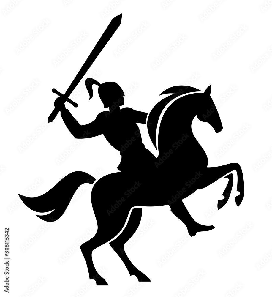
I don't 'get' the rider and the cut out line that extendes across the horse to end between it's front legs. Visually not making sense.
The angle of the sword is a bit odd feeling. maybe opposite way if you pulled horse back, you'd need to balance by having an arm going back, which would be the one with the sword as other arm holds rains.
There are many tiny details - eye, mouth of horse, detail on horses hooves etc - that are too small. a the logo is scaled down it's all going to be lost. And those details feel at odds with the larger sized elements. Everything should feel uniform in it's scale.
- *As the logo scales down...shapesalad
- You don't get that it's a knight on a horse?canoe
- In a modern Heraldic style?canoe
- Arm going back while charging forward?canoe
- Definitely loses detail at a small size, but for the emblem...canoe
- Chimp0
Hey this is looking good! I personally like the overall aesthetic.
What emotions do you want to transmit? Who's your audience?
On a high level I feel the balanced could be improved and the shapes seem to conflict with each other. Could it be more fluid and have more movement in it? It's for a car brand so I'd expect it to be little more dynamic.
Looking closer, some of the details may be lost when it's reproduced in leather or metal. What happened to the Knight's feet?
I would look to simplify it by taking out some of the gaps and the tiny details.
- _niko1
I'm afraid that by the time the QBN committee is done with your horse, it'll be a camel!
- hydro741
this bit bugs me:

Maybe add some lines like this? would fit the legs.

xoxo
- Thanks 'dro! There is definitely not enough "flair" for some people's liking, especially my client.canoe
- I said that wrong - my client doesn't want the flaircanoe
- Flair usually takes the modern/shapely look/feel. Probably will remove most of the "hairs" on the legs.canoe
- it was just an abrupt point against a smooth leg cut out that was throwing me off. Thought it would benefit from a touch of hair wisp. Totally dig this tho!hydro74
- Dang "flair usually takes away from a modern/geometric theme"canoe
- slinky0
I like it, but the knight looks like a little person standing on the horse to me... not a bad thing if that's what your aiming for.
- This.Morning_star
- Actually I was going for a Mandellorian disco bot, ready to party.canoe
- i_monk1
There's an imbalance in the amount of detail you've put in the hooves vs the entire knight.
- PonyBoy0
not sure if the eyes or some of the straps are necessary... I like what's going w/the hind end and the head(s) — good strong forms that are clean but have character...
I just feel the middle is a little hacked up / could be joined in places (the tail flows nicely into the hind quarters without being disconnected - it's a more gentle approach at connecting lines whereas the middle of the logo is a bit more broken up).
- I kind of feel that you're probably most qualified among us to offer a critique, there, PonyBoy. ;)Continuity
- I had one motion that made the stomach one definitive shape... and then starting messing with it! I'll look at that, thanks!canoe
- *whinnies (for Continuity)PonyBoy
- BaskerviIle0
I'm sure you've already looked at lots of reference material.
But I think referencing the rampant pose in a lot of heraldry and trying to separate all the limbs and the knight with different angles to ensure separation. Currently the knight and the horse's head are parallel to each other. You might want to open things out a bit.
- Yah the client and I explored different poses... been a challenging logo to develop... as simple as it seems.canoe
- Definitely not simple. I drew the logo for a large law firm involving a knight...it took a very long time to get agreementBaskerviIle
- canoe2

- Starting to look a bit like a lion body now, the horse has a belly to itcanoe
- I like it....I feel that the horses legs are still a bit on the chunky side and should be streamlined a tad.utopian
- Yah too beefycanoe
- But balanced, ho humcanoe
- I've never really been in love with the legs I made... way too Bullish. Client didn't care. But it's bothering me more now.canoe
- The overall shape and form of the legs are nice...they just should be a tiny bit thinner.utopian
- maybe torso too long alsocanoe
- BaskerviIle1
Nice!
My feedback would be to justify to yourself when and where you use the gaps between the forms. eg: the gap between the highest raised leg and the body makes sense to indicate depth behind the horse's body but makes less sense on the foreground raised leg. I would make as much of it filled as possible, especially the main horse's body since it will help with the overall read and silhouette. I'd maybe reduce the size of the horse's head and introduce some space between it and the knight to help the separation/read also.
I'd also look at the relationship between the curves and straights.
I think the eyes and the notches in the feet are too small to replicate well at small sizes, particularly in embroidery.
- doesnotexist-2
he needs legs
- Too illustrative with the legs. Not the direction we're going in.canoe
- hans_glib-2
the legs are too look like an elephant. i guess not a problem if the vehicle is a lorry or a bus, tho.
- Continuity0
Overall, I really like it.
From my POV, I think there are too many gaps, and it's robbing the overall logomark of movement and tension. A horse rearing up is high-tension, high-energy, and it feels like some of that missing if the form of the horse (especially at the torso) is split up like that.
- I don't think it would hurt to see it in a more solid form... the client got caught up on the 'missing legs', so I broke it apart.canoe