Logo of the Day
Out of context: Reply #89
- Started
- Last post
- 820 Responses
- CALLES0
didn;t feel like starting a new thread
didn't feel like starting a new
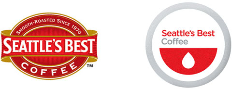
Seattle's Best Coffee Stirs Up Heated Opinions
Seattle's Best Coffee revealed a redesigned logo this week. Unfortunately, its ambiguous look brings to mind a lot more than just a cup of joe.
The simplified design seems rather generic, say some of the kinder observers. Other pundits are calling it a bowl of cereal filled with tears. But the harshest critics say the new look seems more appropriate for a blood donation center.
"Seattle's Best Blood Bank," wrote one snarky blog commentator. "High school art students could do a better job at designing a logo," proclaimed another. Ouch.
A poll from The Seattle Times revealed a whopping 68 percent of over 2,000 respondents thought Seattle's Best Coffee should "try again."
In response, Seattle's Best, which Starbucks acquired in 2003, says it didn't intend for its new look to be fancy or visually arresting. According to a spokesperson for the company, the logo "has to live in all kinds of environments." The understated look may be intentionally generic, as she say- http://michaelcinaas…jaylarson
- works better once u see the complete packagedirtydesign