Windows 10
Windows 10
Out of context: Reply #29
- Started
- Last post
- 35 Responses
- BaskerviIle1
What's a grid?
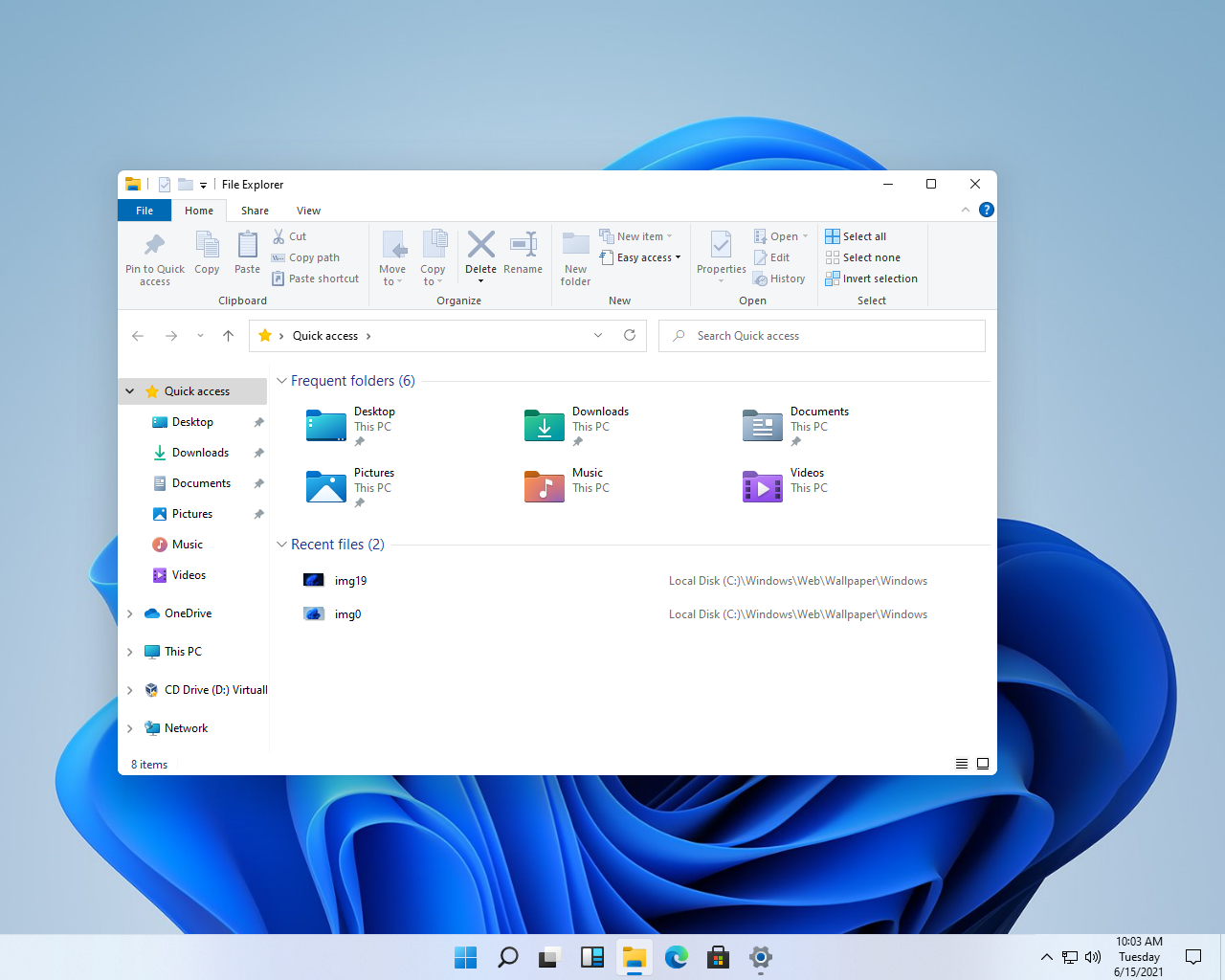
...This kills me that this kind of mess not only gets created but that it actually gets through rounds and rounds of meetings, critiques, testing etc and sees the light of day. Just, how?
No intelligent use of subtle tones to denote different spaces, just white on white. A crazy mix of left-aligned and centred type. Odd alignments with icons. Nasty approach to tabs. Pin icons littered everywhere. Text still rendered horribly on windows. How hard can it be to clean up?- MS is in the "good enough" business, not the design businessgrafician
- Surely that's all customisable though?inteliboy
- they've decided they don't ever want Mac users to migrateMrT
- It's not done yet. Having said that, it's MS so half of the design will be unifinished/not fit together.kalkal
- Designers gotta design.
Funny, on another forum, I see so many techies ridiculing designers pointless focus on irrelevancies *shrug*Nairn - Always been a catch 22 for Microsoft, they need to maintain compatibility for legacy apps, but to really improve, they'd need a total rewritekalkal
- Type is still absolute shit. Icons still horsey and ugly and outdated. Really, a huge delete drop down menu? Jesus fuck it’s bad. Innovation I guess.monospaced
- They're totally redesigning file explorer, there has been a brief couple of shots in another promo vid, looks nothing like thiskalkal
