vancouver 2010 poster
vancouver 2010 poster
Out of context: Reply #23
- Started
- Last post
- 40 Responses
- jimzyk0
very nice MISTA SPAAAKLE!!
well done. would love to see more, if there's any more in the public domain yet.
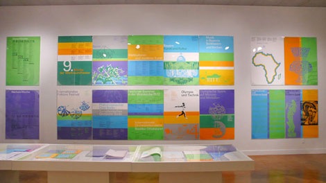
the style is very like otl aicher's 1972 identity but maybe thats just the colours in this instance. either way, great job, really like it.
- the style is NOTHING like this.. wtf???gentleman
- what is it with designer's knee jerk reaction to reffering to Otl Aichers posters everytime a new olympic thing comes out?gentleman
- look at the colour and style of the treatment of the imagery. relax there gentleman.jimzyk
- No, the entire Vancouver campaign reminds me of Otl's work as well. Can't put my finger on it. Perhaps the colours.juhls
- And I wouldn't say that about any other campaign.juhls
- seeeeeee....
even juhls thinks so!jimzyk - *perhaps the colours*juhls
- nah i don't see it at all. perhaps its those 5 link rings... ? ;)horton
- possibly horton....
possibly..jimzyk