Tweet of the Day
Tweet of the Day
Out of context: Reply #1163
- Started
- Last post
- 1,237 Responses
- OBBTKN0
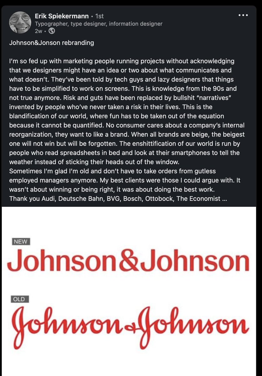
- Or maybe — just maybe, Erik — J&J got a bit tired of their wordmark looking like it said "Jolmson & Jolmson"?Continuity
- I do remember a few years back everyone making their branding as boring as possible so it would look good on Insta. I think I gave up design then.PhanLo
- Well, true. But it's not like the old J+J identity was all that spectacular itself.Continuity
- It's not that fabulous, you're right. Probably a bit hard for folk to read now since they don't understand cursive too.PhanLo
- Cursive hasn’t been taught in schools for well over 20 years. That means young parents and kids maybe can’t read this brand. Lolnb
- I prefer my logos in hieroglyphsmilfhunter
- They should change it to Johnson as well as JohnsonBK
- Nobody sees that and doesn’t know it’s Johnson and Johnson. It isn’t a legibility issue. The wordmark was perfect before.monospaced
- And fuck this. I’m teaching my kid cursive. That’s bullshit.monospaced
- My kids both write in cursive. 11+7HAYZ1LLLA