Show some recent work
- Started
- Last post
- 8,641 Responses
- uncle_helv0
- nice as always helv.********
- nicemarindsgn
- Nice, although I don't really like the title font. Feels 'less fresh' than the rest of the logoneverblink
- That leaf is an awful lot like the USGBC leafs.grymes
- That leaf looks like an awful lot like a leaf. You should be careful.non
- I can honestly say I haven't seen the leaf in question, although I have seen a leaf, sorry mother nature!uncle_helv
- LOL @ nonuncle_helv
- RIP ALERT!non
- very niceutopian
- I really like this. The only (minor) thing that bugs ME is the descent on the Q and how it affects the...********
- ...visual flow of the main logotype into the support "tagline." Just a subjective thing I guess though.********
- not bad. :-)akrokdesign
- Thanks for the feedback everyone, I appreciate it.
:)uncle_helv - dMullins: Yes I agree it is uncomfortable the masterlogo was always just QR, but since the appointment of a marketing manager, it was deemed that it needed a Taglineuncle_helv
- ... manager, it was deemed that it needed a Tagline, whereas before it was always written, never bolted on, sometimes compromise isn't always a good thing. I still like it though especially the Mark.uncle_helv
- ...compromise isn't always a good thing. I still like it though especially the Mark.uncle_helv
- I really like the mark. Very elegant.theredmasque
- nice as always helv.
- invisiblechamber0
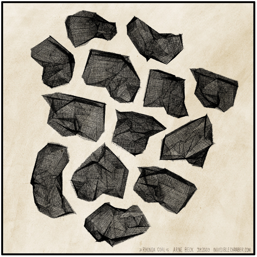
i spent so much time on experimenting with rhonda since the beta is out, so i decidet to call it »work« now. http://rhondaforever.com
- that is pretty coolSigDesign
- cool they almost look like heavy detailed pencil sketches. I so need a tablet.Cabein
- that is actually only one drawing viewed from different sides. yes, rhonda + tablet is gold.invisiblechamber
- identity0
an identity/brand Im working on for a local bar/club that is about to open up. They wanted me to appeal to the "well-to-do" set that gets out of work at 5. It's a miami-style bar that emphasizes white materials and the lighting. This is what I'm pitching (I should be done with the applications by the end of tomorrow - ill post them on my website):
- nice... reminds me on COS
http://images.blog.e…
Mau - thats nice - do you know what the story was behind it?identity
- That is smart my friend. Nice to see people think before they actually create.non
- Nice identities, identity.JerseyRaindog
- thank ya' kindly - the applications for this bar/club im working on are in the same vein - excited to share when done!identity
- Great work.TomBac
- nice... reminds me on COS
- dibec0
- how come the shoe look 3d ?WeLoveNoise
- original lighting of shot and my Godly skills. ;)dibec
- Slick photo.********
- yea flames kill it...sofakingbanned
- JerseyRaindog0
- I love your stuff. Always solid. GJ.non
- tight!Cabein
- niceutopian
- nice candy. :-)akrokdesign
- Clap, clap :)TomBac
- Cabein0
Started this clay sculpture around 3 weeks ago and heres hows its coming along..
More info > http://www.cabein.com/cabein/?p=…
- That's cool - what's it for?JerseyRaindog
- a spot of fun thought id start painting and doing more stuff non work relatedCabein
- Fuck yah, this is awesome. I really hope you post the final piece here.********
- awesomejuhls
- mydo0
- inspired meaning copy? just playin', nice work.doesnotexist
- First car I ever driven and it was a fucking track are setup, sweet********
- mydo0
- mydo0
- want one!!!!!dyspl
- threshold + halftone ?WeLoveNoise
- about 6 hours in illustrator pulling apart traced images. deleting the bits i didn't need.mydo
- very cööl!akrokdesign
- Very cool x 2.JerseyRaindog
- nice, mydo! love it!Chief
- Really nice!yar
- thanks guys!mydo
- Please do me a T shirt, Please********
- mydo0
- Boz0
still developing.. no flash.. only HTML/Jquery
- ********0
- yar0
img src="http://www.mattink.com/wp-c...
Crop from a short story of mine that just went up on mySpace Dark Horse Presents. http://tinyurl.com/qgbwpl
- yar0


