Show some recent work
- Started
- Last post
- 8,641 Responses
- ********0
- james_kirkup0
- lovely stuff. cool stuff on the website too.itstimefortea
- nice work, james!baseline_shift
- http://cargocollecti… is good.poomoo
- nice gradientsdoesnotexist
- lovely workutopian
- quamb0
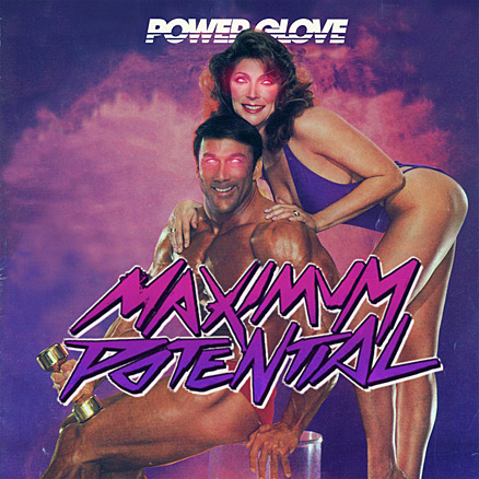
dolph inspired workout track...
http://www.myspace.com/powerglov…
- ephix0
we did some tv station IDs for a lionsgate films owned company recently and it's just gone live. I worked on most of it but there are quite a few things I would personally change. but you can't have everything your own way eh :)
ID 1. http://site.lewihirvela.com/2009…
ID 2. http://site.lewihirvela.com/2009…
would appreciate some constructive feedback though.
- #1 says "Mystery" more than "Thrill" to me. It isn't thrilling.i_monk
- ephix0
i_monk maybe you're right. the differences between those two are debatable though.
- cubanhaze0
a short short Short
- cubanhaze0
- reminded me of http://www.youtube.c…neverblink
- What was it ? I get a "This video is not available in your country due to copyright restrictions."cubanhaze
- Leftfield + Afrika Bambaata > Afrika Shox (video by Chris Cunningham)neverblink
- Thats exactly what I thought haha.slappy
- theredmasque0
!http://lynnetteshelley.com/img...
"The Elephant in the Room"
Measures 19 x 12.5 inches. Ink and liquid copper leaf.
- theredmasque0
- Hey - really nice there, tRM - good to see something beyond your usual style.detritus
- Thanks. Though I was told by a gallery owner that having more than one style at a show will confuse people.theredmasque
- but I wanted to try some crosshatching work. I did another crosshatching piece along with this one.theredmasque
- bulletfactory0
still a work in progress, but i figured... if not now; never. so here's the new site.
(i did lighten the menu text - thanks dMullins) - my mbp screen is much brighter than an external screen - esp. in a dark room.
First crack at using WP as a CMS.- does the "white" stand for "white space"?i_monk
- habulletfactory
- i'm trying something new. i wanted the site visable @ 1024, and text left-just, but everything pushed right. trying to be diff'rentbulletfactory
- I think this is far more legible than the last one I looked at. I might have some questions on WP as CMS. Email me?********
- neverblink0
takes a while to load (loading all images) - need to fix that
- the Ritme Ruis stuff is beautiful...
*waiting for the other images to loadMau - thanks, but the images don't do it justice, really a project you should see irl.neverblink
- Likescubanhaze
- you will want to correct this: http://imgur.com/R6c…jimbojones
- Nice! And as sick of word bubbles as i am, i really like your header image.baseline_shift
- noice!! fantastic work.bulletfactory
- wrote a lazy loader to improve DL speeds. @ jimbo, thanks for that!neverblink
- btw. anyone tried the deeplinking & filtering?neverblink
- the Ritme Ruis stuff is beautiful...
- ********0
- sucks pretty much********
- hockey?neverblink
- nah********
- yeah, it's terrible and i know terrible. 15 years of terrible work makes me a fucking expert.airey
- sucks pretty much
- p-mac0
- love the first!neverblink
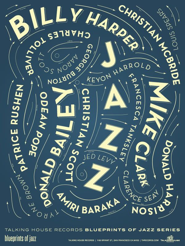
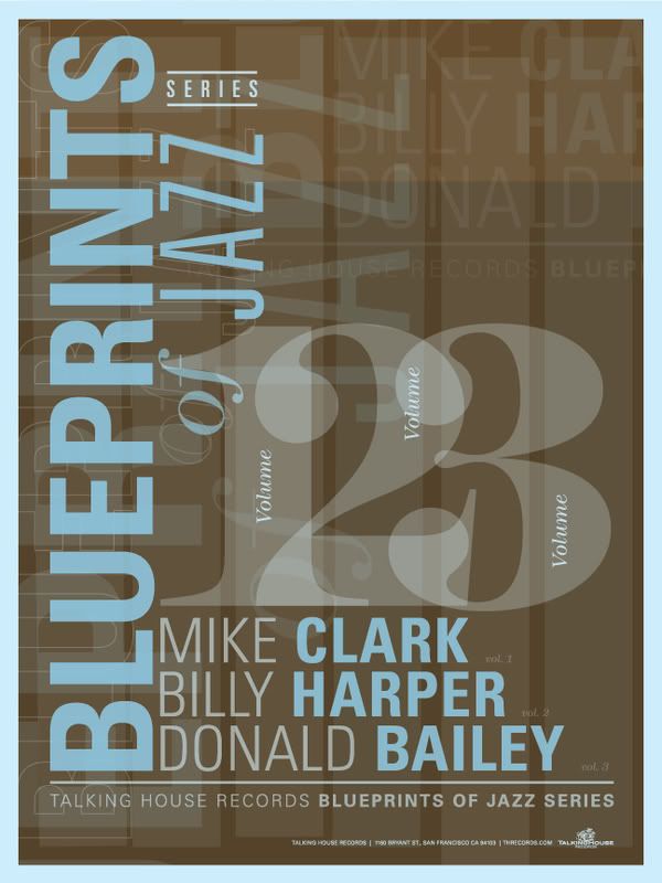
- 2 concepts so marketing would have a choice, but budget got slashed and posters never saw daylight.p-mac
- I like the first one too.ADRENONLINE
- that sucks, 1st one is greatjimbojones
- I also find the 1st one to be quite exquisite. Good job!
non - 2nd one reminiscent of a poster I did a while back.non


