Show some recent work
- Started
- Last post
- 8,629 Responses
- 3stripe0

- I don't get the concept. What has folding got to do with Theatre?Dancer
- Very nice.dog_opus
- yeah its nice and visual but conceptually there's nothing therehellojeehae
- It's a play on the word 'lift' and reflects LIFT's interactive/theatre 2.0 approach3stripe
- ummmm.. okaaay!?Dancer
- if it looked like film, he'd shut up.version3
- Very nice. Ignore the other folks who didn't work on the project and don't know the theatre.luckyorphan
- dog_opus0
Screenshot of a detail for a springtime symposium series poster I'm doing.

- tile0
More work in progress...

- Nice, Ford Mustang meets 1930s Ford Coupe in a hotrod kinda way.neverblink
- wouldn't be road legal in the UK. need to have 30% covered wheels.mydo
- not that that matters. looks great. back wheels bother me though.mydo
- as if you care 'bout the law, driving this thing ;)tile
- Cool!dog_opus
- neverscared0
horus rising

- tile0
I guess this is the final one...
The black gives it more of a retro-filmnoir-feel.
- very cool.grunttt
- wickedjanne76
- very cool. but you'd burn your leg on those pipes.dirtydesign
- no pain no gain ;)tile
- d0mino0
- Nice... would love to see more detailDancer
- All the projects are on the site.d0mino
- you should try aciddoesnotexist
- ********0
Work in progress website design to help Donington Race Track.

- make type bigger and give the road (bg) more definition, contrast, or more black. Would also rethink the type.janne76
- well it is work in progress, but thank anyway.********
- Column widths!i_monk
- yeah man, put some columns on that bitch ... shrink the top banner ... use more cowbellrayborn3000
- Emory0
A couple of new projects, the first is a press kit for the very talented William F. Gibbs. His music is pretty awesome. Take a listen here.
http://www.williamfgibbs.com/
And the second is a wedding invitation for a couple of friends.

- "my fellow sophisticates" = amazing... Very warm & great hand done type!ideaist
- these look great!theredmasque
- very nice! Is he part of the Bee Gee's Gibbs ;)?OSFA
- don't think so, maybe though, i'll have to ask him that.Emory
- TomBac0
Logo for NGO.
That's about it. Little more kern action.

- I would broaden the color differentials a bit—blending too much for my eyes.********
- When smaller, the mark would lose a lot.********
- I would broaden the color differentials a bit—blending too much for my eyes.
- BRNK0
A Lady Gaga concert poster I made for the hell of it:

- lurve the colors and the treatments.********
- Thanks! I was trying to accentuate her almost alien aesthetic.BRNK
- Very nice!Stian
- very cool- lose the sophisticated white/negative space and blow up that illy- very nice workdoesnotexist
- add a penisrayborn3000
- his facial features are spot on!Meeklo
- lurve the colors and the treatments.
- Emory0
My favorite illustrations are the ones that make me laugh out loud as I’m drawing them.

- tile0

- is that a photo or a render?bigtrickagain
- it's PS based on a photo ... isntead of making renders look like photostile
- Uncanny.
Really liking this recent thread of your work, tile.detritus - you know all the crappy "computer looking photos" you see everywhere due to over processing?Meeklo
- well those are horrible, but this right here, looks amazing, you found away to stand out man great job!Meeklo
- ********0

- e-pill0
back in 2006, i found an artist that blew my mind artistically where he had a style that transpired around one function..
"built just like lego"
that year i created my first Giant Robot/ Mecha and i called it
ANTI-DESOLATIONANGEL i created it all 100% Adobe Illustrator.
from then til now i been researching and learning how to take my 2D flat sketch concepts and re-making them into fully realized 3D versions that i can then take and make toys out of them. this year, i decided to make that initial change from 2D to 3D.
I purchased an app called Modo from Luxology:
http://www.luxology.com/trymodo/…2 weeks ago and started to work everyday putting in 18 hours every day for this last 2 weeks... i learned a lot!!
here is my first GIANT ROBOT 3D MECHA
ANTI-DESOLATIONANGEL
2010 will be the year i hopefully will launch a toy line. when it happens i will say that my nter buddies will have special pieces made for them. maybe ill name a toy after you.. would be cool!!
:)
- with that guy, i already see many balance issues...********
- Your hard work is going to pay off. I like seeing the the progress for sure.bzsaw
- does it fly?doesnotexist
- you better name one after me, edde********
- i was thinking of more than just a name but using the nter's likeness in making it.e-pill
- dmullins, can offer some words about the balance issues..e-pill
- it does have 12 legs for balance though.. do you mean with it stands on 2 legs?e-pill
- that is HELLA FUCKING SWEETbigtrickagain
- legs look a bit weak compared to original. Is the a QBNTPE5 preview?neverblink
- damn dude looks like a lot of work! keep it up mang!OSFA
- I would try to break up the symmetry .. but super fantastic manrayborn3000
- !!!!!!!!!!!!!!!!!!!!...invisiblechamber
- seen the guys work. love it. from the philipines or something,erikjonsson
- thank everyone. this isnt a preview for ntpe but a taste of style for what it can be.e-pill
- i live in NYC. the artist you may be referring towards is my mentor.e-pill
- I actually know that artist that inspired you to design this. He lives somewhere in indonesia and started his own clothing design. He certainly has an amazing portfolio. Lemme see if I can find it.aeroform
- Found him: http://machine56.dev…aeroform
- yes he is my mentor.edd-e
- with that guy, i already see many balance issues...
- ********0

- sweet. I like the looks of this a lot.Emory
- This is quite nice. Quite nice indeed.duckofrubber
- mynameisdave0
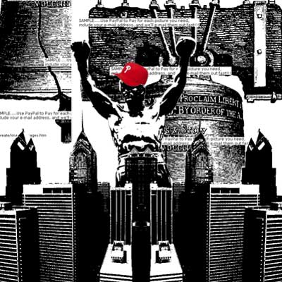
One of three posters I'm showing in a gallery exhibit showcasing multiple local designer's personal work in poster design:

Here's the other two I've already posted:
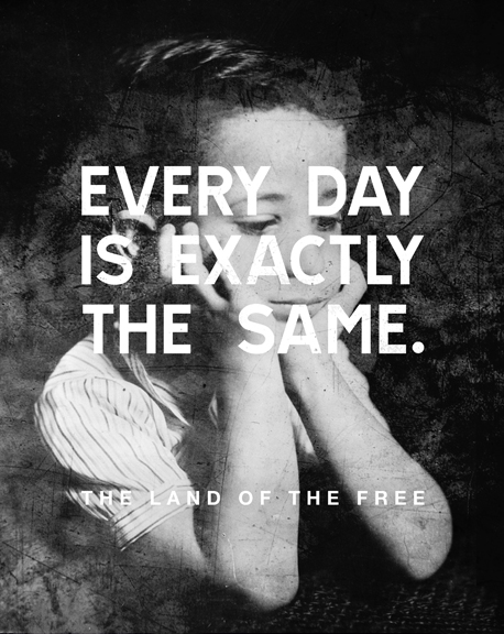
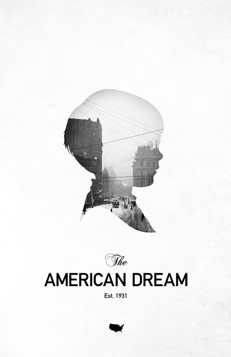
The show will also feature photography and fine art work at two seperate venues, with all 3 venues being a block apart from each other. Here's my entry for the photography venue:
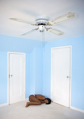
- very nice!OSFA
- thanks!mynameisdave
- i dig thiscolin_s
- nice photo (:bigtrickagain