Show some recent work
- Started
- Last post
- 8,629 Responses
- hektor9110
Just finished this project...
- at first glance I was hungry for eggs....Amicus
- but then you want to scrub your body with one of these haha thanks...hektor911
- +1********
- thought of eggs toostewart
- i like the top one most.akrokdesign
- its really nice but yea looks like food.sofakingbanned
- I too thought of eggsEmory
- i will do some editing...hektor911
- mynameisdave0
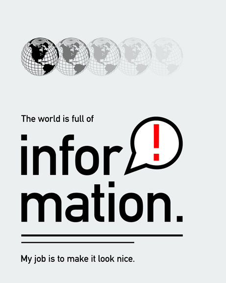


The idea behind this series is to use the same information, same graphic elements, and the same typeface but create something unique for each design. The idea came from CSS Zen Garden, but I'm applying it to print, if you will.- second one does not look niceRavdyk
- lol. thanks! Good to know.mynameisdave
- they still look the samestewart
- these kind of dont make any sensewordssssss
- make it nice by not justifyin' son! ;)OSFA
- thatboyneave0

New site for my wife's floristry business.
http://jacquelines.co.nz/- 3 widowstypist
- Great site, sweet photos too!Day
- Widows tricky to control online but yeah, you're right they are worth fixing here.thatboyneave
- make it less choppy, it looks nice! :)ismith
- niceutopian
- Decent typography requires decent copy editing.detritus
- nice site! and the photos are great! did you do the photography?OSFA
- beautiful photosantoine_101
- My friend and colleague Felipe did the photos, he is on this site as felipeskroskithatboyneave
- yeah photos are greatbigtrickagain
- I just had a look at this site & think it looks great but I do think the type is a bit recessive both in the logo (which I previously commented on and thought was really elegant) and in the body copy... with it coming from Flash the text doesn't appear to be anti-aliased on my monitor so it's a little illegible...twelveandahalf
- svenreed0
- msced i need real work

- svenreed0

why not - been lugging around the ol' 7dizzle lately
- dyspl0
playing with my girfriend business card, while waiting she comes back from work.
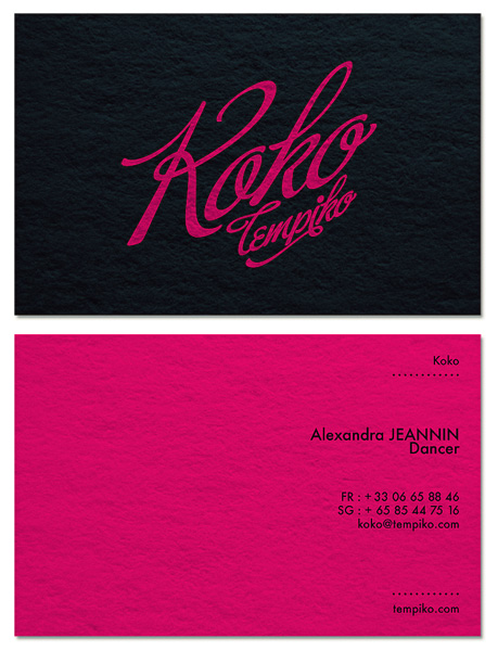
- need more work on it, but it's 4am here...dyspl
- loving the colour and the direction the logo is taking... not sure about the layout of the contact detailsAmicus
- probably the spacing being similar but not quite the same.Amicus
- yes, I was not happy with the detail side. both typo and layout need work.dyspl
- I'd like to give it a cabaret feeling without being too litteral (and as she does much more thn cabaret, I would like to keep the style more open)dyspl
- the overall look open enough.dyspl
- Food Job you are in a different country as my new ID is very similar.. inspired by the "Fame" logoDancer
- "Good" JobDancer
- You gave your gf's phone number the internets?
j/k looks cool.slappy - listen to Dancer, he knows this shit...
And what type of dancer is she? Should we include a pole on the left side to balance things out?OSFA - left to balance things out?
;)OSFA - I think Buffet Script needs a lot of work generally, but particularly the cap Rfoz
- shapeaspect0
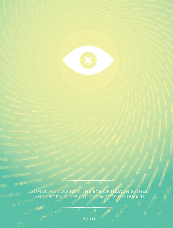
Second in the 'most played tracks of 2009' posters I've been doing.

- are referring to drugs Sir?hektor911
- I quite like that, shapeaspect.detritus
- very nice!Meeklo
- reminds me of -
http://rockofeye.net…
nice workHombre_Lobo - very nice sir!********
- qwerty090
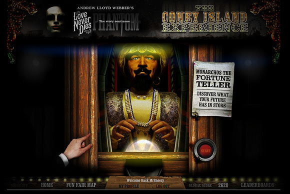
<img width="580" height="388" alt="Coney Island Experience" src="http://blog.electrolyte.co.uk/wp-content/uploads/2010/03/007.jpg" title="007"/>
<a title="Love Never Dies - Coney Island Experience" rel="bookmark" href="http://www.loveneverdies.com/coney-island-experience/">Love Never Dies - Coney Island Experience</a>
- tangoxray30
Justa basic sunset timelapse I did last week. Wish th reframe wasnt there and the exposures a bit more bumpy than i'd like.
- megE0

- nicekiusa
- nice work!********
- BIG improvement. its good.sofakingbanned
- still needs a tad bit of massagingmegE
- this is badjimbojones
- looks like an erect rocket.meffid
- Kiggen0
Personal project. I travel a lot to Milan to visit the misses.
Making a personal project about it, that is going to be something selfpromotional