Show some recent work
- Started
- Last post
- 8,639 Responses
- ********0
not much graphics at home lately, working on a album. 1 down.....
- BonSeff0
its not there, but on its way.. wherever that is..
http://birddogindustries.com/fmt…- thats pretty awesome!emukid
- Seriously top notch.blaw
- HOLY FUCK ESÉ********
- nice. are you familiar with Vectoraster? lostminds.comarterie
- BAMFmrdobolina
- 4040
- neverscared0
- stop designing half of everything you slackass!slappy
- i dont get it..what?neverscared
- BaskerviIle0
This is a classical album cover I just designed and sent to print.
It's for a classical cellist I know. He's just recorded a crazy project.
It's a piece written in 1570 by Thomas Tallis for 40 voices and he's played the whole piece on solo cello and mulitracked the whole thing, it's amazing. The design comes from the 40 voices, so the grid for the booklet is shown on the cover (5x8) and there are 40 concentric 40-sided polygons overlaid.
I didn't want it to look like the standard cheesy classical albums that always seem to feature old paintings etc.- This is lovely, BaskervilleConcrete
- nice one mate.********
- cheers concrete, I've been off work for surgery so I'm finding time for personal stuff nowBaskerviIle
- Spem in alium? One of my favourite ever music pieces. Nice work - interesting interpretation.detritus
- Though - why do the circles degrade as they encompass the 40 voices? I'd expect it the other way around?detritus
- nice one!neue75_bold
- Oooh.JerseyRaindog
- Stop the press!!!
There's only 39 there....Dancer - detritus - I think (bad idea) the answer to your ? is that they are 40-sided polygons, not true circles. Great concept + execution btw!Cultr
- +execution btw Bskerville, inspiring!Cultr
- Oop, so it is. Gosh. That IS clever and just wouldn't work the other way around. I rescind my doubt, Baskerville!detritus
- And lo! It says it right there in the description. Je suis idiot.detritus
- love itMeeklo
- invisiblechamber0
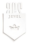
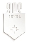
different purpose logos for a jewellery designer.
i did the site too, but not recently: http://www.aesjewel.com
- ********0
_root.theAlphaB =tilNext *5;
- wrong thread?********
- maybe thats just the most recent thing he did********
- exactly... wake up!********
- too clever for me.********
- wrong thread?
- moamoa0
- sdon´t look at the G pleasemoamoa
- Nooooooo! I looked at the G!ian
- just kidding, looks interesting, continue!ian
- Interesting. Shouldn't the 'M' be pointed on the bottom like Gotham?********
- the M is a letter that I don´t really like from gotham... I wanna use this font just for my fashion clientsmoamoa
- and so I think this M fits bettermoamoa
- release it free********
- I want to use it just for my fashion clients.. will give a feedback when its donemoamoa
- moamoa0
- love the color combo.ESKEMA
- you killed it with the overprinted bits...neue75_bold
- did u read my text? :)
will be a almost trasparent varnish in 2 coloursmoamoa - oh I forgot to write that it will be almost transparent.. sorrymoamoa
- i tend to agree with nueueeue...********
- OnesandZeros0
Art for Bandazian - really great rock/pop/indie(ish) band. Think REM, Built to Spill. etc...
The new album is coming out in a week and I'll make sure to remind everyone.
http://www.myspace.com/bandazian… (new songs not up yet)
I am indeed working on a real website.Cover
Album Release Poster
- ********0
- enfocusmedia0
http://www.lvs.com.au
(I had no control over the imagery in the flash header)


