Show some recent work
- Started
- Last post
- 8,641 Responses
- utopian0
- niceEightyDeuce
- beautiful.. is this your house?bogue
- at the office.utopian
- holly shit, this is niceGeorgesII
- I like the slit at the end. What's it for.. cables? Nice work, man.detritus
- The slit was designed to add visual separation at the end of the table as well as to show the grain of the bambooutopian
- i want to have a board meeting there.ohhhhhsnap
- arne0
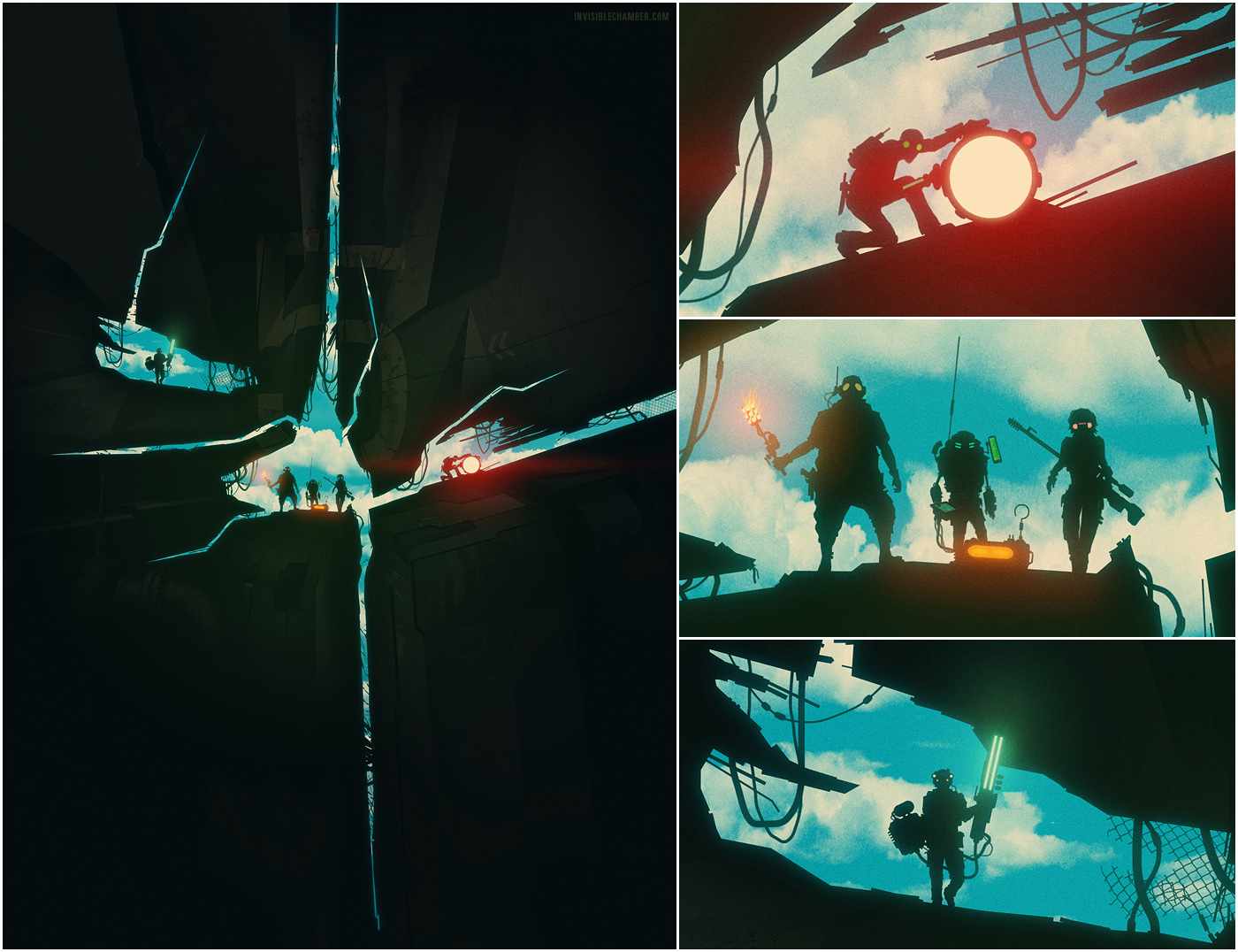
illustration for card game »the agents« on kickstarter:
http://www.kickstarter.com/proje…
- capn_ron0
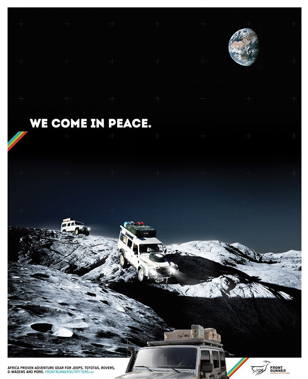
I feel like i remember someone here doing this work....anyone remember who? It is really good.
- i remember this...it was a guy that was into outdoorsmanship i think..cbass99
- yeh it was a qbner, he did some rucksack posters too that were nice. had some good stuff!Hombre_Lobo
- was it related to this? http://www.qbn.com/t…mekk
- GeorgesIV0
- S&M Fleshlight?********
- New Mac Pro?detritus
- vape mod?scarabin
- nicepinkfloyd
- It's been 7 days, Gorgeous.detritus
- posted here: www.neofuturism.netgeorgesIII
- S&M Fleshlight?
- cbass990
Recent "design test" for a job:
Foundry Concept: After researching Foundry Cycles, I noticed how these bikes have a cross platform from Race, Dirt, Road and that these bikes are built with precision and durability. I wanted the logo to stand out and to be the main focal point, but also showing behind the logo that these bikes are to be used anywhere; on road, off road and anywhere in-between. I thought showing the Minneapolis skyline and some nature elements like the mountains/trees would get across the point that Foundry is a bike made for people who work hard and play harder. Texture on the logo could be an option to show character and durability with these bikes.
Salsa Concept: "Path To New Places" was running around in my head and I noticed in the Salsa logo how the "A" and the "S" had a slight movement going on..So I sketched out some lines to show how this bike is about adventure and getting you places. Showing point A to point B while running right through the Salsa logo worked and I believe captured the concept of Path To New Places. I also included a slightly visible navigation element to further show this bike is meant to discover new places and be an on-going adventure.
- ********0
- Julesvm0
short film for stoli
- de4k0
- very nice! love the tree onesMiguex
- i really like this.ohhhhhsnap
- lovely stuff therefadein11
- ben_0
Piece of identity work for an furniture/industrial designer - web is just a wordpress theme chop up for the time being, when budget allows we'll do something a bit more comprehensive, but we needed something up for ICFF.
http://static.squarespace.com/st…
http://benmotz.com/#/jonathan-sa…
- detritus0
Sorry, a bit of spamming here..
We launched http://www.blackdragonpress.co.u… today, selling the *fucking gorgeous* work of Nicolas Delort.
Nearly 30K pageviews in less than 3 hours — I'm not used to this kind of internet!
- Delort's work is insane.ben_
- You have a coming soon page for the shop when you are on the blog.wordssssss
- JG_LB0
- Netflix has its own channel in UK on Virgin media. So not that daft a question :)fadein11
- uk doesn't countdoesnotexist
- it's not a television channel, is it?monospaced
- haha thanks for the feedbackJG_LB
- i dig thesemoldero


