Show some recent work
- Started
- Last post
- 8,641 Responses
- colin_s0
i redid my website and have a bunch of new things.
http://www.distortedperspective.…
new book: out of mind - 100 copies of the same book each individually worked on as an effort to indulge the format of book as an object of art
(a few covers there)
new book: false positive - photo and word based meditation on time and space, based on recent photography experiments over the same thread
new album: suburban crime music
https://soundcloud.com/obstrepit…
also various design work, a couple new photography series including an abstract polaroid experiment
and some new paintings
been busy. more to come.
- there is a consistent conceptual link between all of this involving time and identity, but i'll leave the pretentious stuff out of here.colin_s
- Lovely®utopian
- nice lookin' stuff manscarabin
- love interior6 - very tomato.fadein11
- I've always liked your stuffcbass99
- +++ great stuff +++LOKi
- thanks all!colin_s
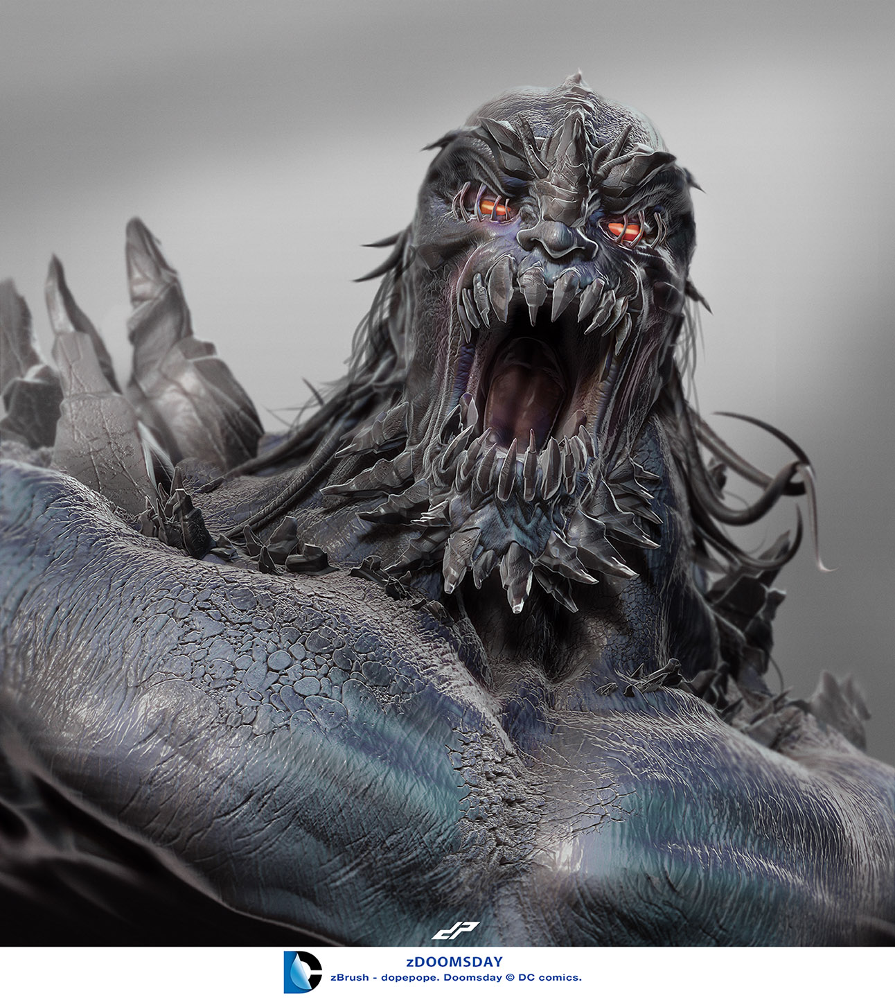
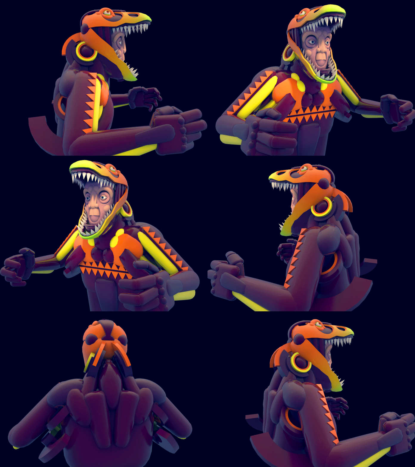
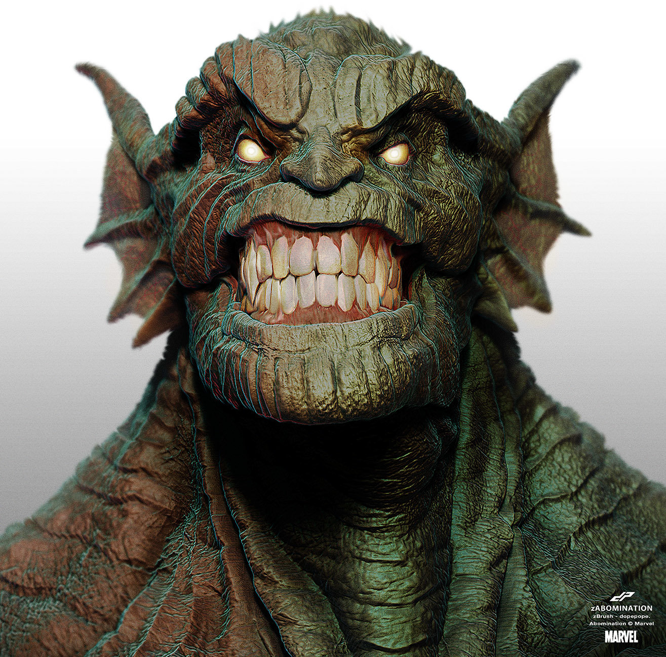
- dopepope4
- dudedesmo
- Cloverfield 2utopian
- Doomsday, nice.EightyDeuce
- Getting pretty damn good at these!baseline_shift
- monospaced2
- wedding invite?
nice!utopian - Yup. Thanks!monospaced
- looks good!scarabin
- This is a sample; The final version is stamped nicer (deeper/cleaner) and is in a 4-way gatefold around the invites. Burgundy cotton stock.monospaced
- I've seen a "silver-ish pink" metallic foil before that looked beautiful. That would look great on that burgundy stock.utopian
- The foil was probably a pearl iridescent.utopian
- http://imgur.com/S6j…utopian
- I bet it would! Gold/brass is one of our colors, so we stuck with it.monospaced
- Nice mono!Hayoth
- She said "yes"?! ;)goldieboy
- wedding invite?
- ********1
- oh well :)
http://www.thisispla…******** - squarespace
http://www.whyimcray…moldero
- oh well :)
- juanluisgarcia11
- great, as usualmonospaced
- also, WTF?monospaced
- love that font
what is it?publicdisplay - thanks. wtf=nouvelle blackjuanluisgarcia
- and it's FREE!!
http://www.dafont.co…CyBrainX - UP VOTED!GeorgesII
- milfhunter4
- nice > nice > nice > nice > typo,
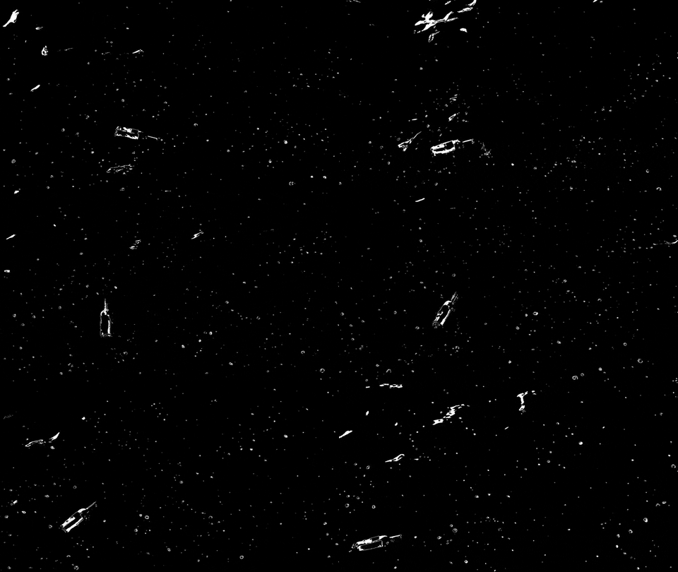
the word is pubish :)GeorgesII - laser-marked bottles?
tres poshdetritus - Thanks!
Yes, i used a Rotary Laser Engravermilfhunter - Nice, it's come out well - low res, I assume? otherwise = $$$!detritus
- had it done at my old art school for free.milfhunter
- nice > nice > nice > nice > typo,
- scarabin0
- Love itYobim
- What does it sound like??Projectile
- Dopepinkfloyd
- i'll make a video laterscarabin
- face_melter0
Following on from my previous abandoned petrol station image, I thought it would make sense to build a similarly styled motel.
The main building was modelled quite quickly, so the sign gets a bit more attention. The numbers are just placeholders for the UVW Mapping, so I know which parts of the textures are at the front.
- tank021
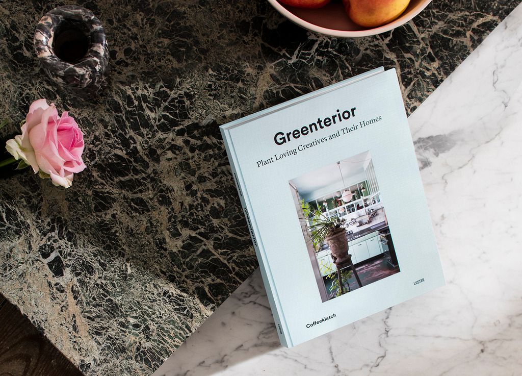
working on a book!
Greenterior is the first Coffeeklatch book about plant loving creatives and their homes. It features 18 creatives in 5 cities, photographed by Bart Kiggen and interviewed by Magali Elali. Alongside stories, the book contains a handy index listing all the plants highlighted in the photos, including their specific characteristics.
Greenterior is published by Luster and edited in Dutch and English.
Available in stores in November 2015.
Subscribe below for updates and sneak-previews.
- ********8
- love the type, and prefer the 2-color (bottom) onemonospaced
- reminds me of Fat Wreck Chords, even if it doesn't resemble it at all... good stuff man!monospaced
- The first one is my fav, looks greatpinkfloyd
- lol pinkfloyd.
Thanks mono, bottom one is my suggestion but I don't think he'll go for it.******** - I like the last and and then the second one. First one the least.********
- I agree with everyone, bottom one it is. Just call the client and let them know we have decided. Great Job!Miguex
- The top logo is the "old" right?monospaced
- Yes the top one is their old logo - I didn't do that.... bottom two are my work... :)********
- Much better********
- Kerning needs some work.Hayoth
- Indeed, haven't played with kerning yet.********
- Really like the bottom one +1Ben99
- This gives me hope that your persona here isn't IRL ;) LOL nice workbklyndroobeki
- i like this good-designer version of set.inteliboy
- Bottom one for me, too. It's simplified and punchier, and that type is dead sexy. Brilliant work, mate.Continuity
- I like the 3rd one.
imo, increase the contrast of the speedlines, incorporate or be more playful with the speedlines and type. a 9 with more bottom curve?uan - something like the Franklin Gothic 9 maybe. just to make the 89 more compact, roundish, circle-ish...uan
- but you could roll with what it is, nice redesign!uan
- yep really like what you have done to update it - there's something nice and playful about it. Bottom one I reckon but try to get a little purple into it?fadein11
- Haha thanks for the comments. I assumed most of you knew my insulting persona here was in jest...********
- I love waking up the morning after working while super stoned and thinking 'cool, I did that?'********
- haha, totallymonospaced
- 2nd or 3rd. looking good.akrok
- Obviously second or third lol they're the only choices. The first one is (I thought obviously) their old one :)********
- Maybe I didn't make that clear. Thanks for comments :)********


