Show some recent work
Show some recent work
- Started
- Last post
- 8,641 Responses
- fadein112
reworked this track from a while ago:
https://soundcloud.com/fadein_tr…
(not mastered properly yet so prob needs decent speakers)
- skwiotsmith2
The Horizon Leans Forward / Acrylic on Wood Panel / 18" x 24"
http://formsandshapes.com/work/t…- beautifulfreakpelican
- Your website has been an open tab on my mac for days now. I keep going back to browse. Really amazing work.freakpelican
- @freakpelican Thank you...I appreciate it!skwiotsmith
- Yep.
You rock.********
- arne7
- ...how?detritus
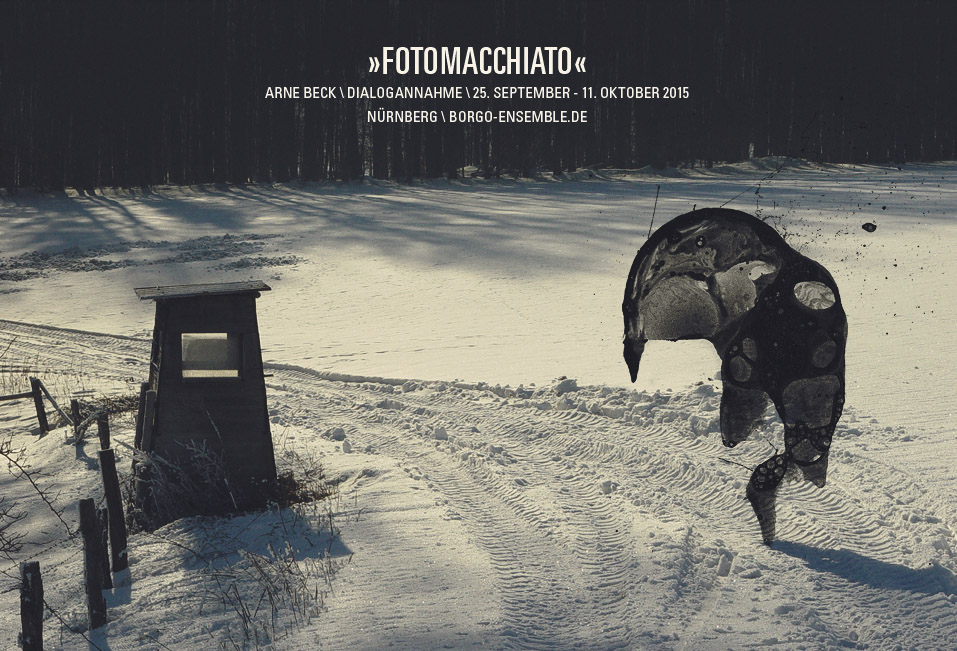
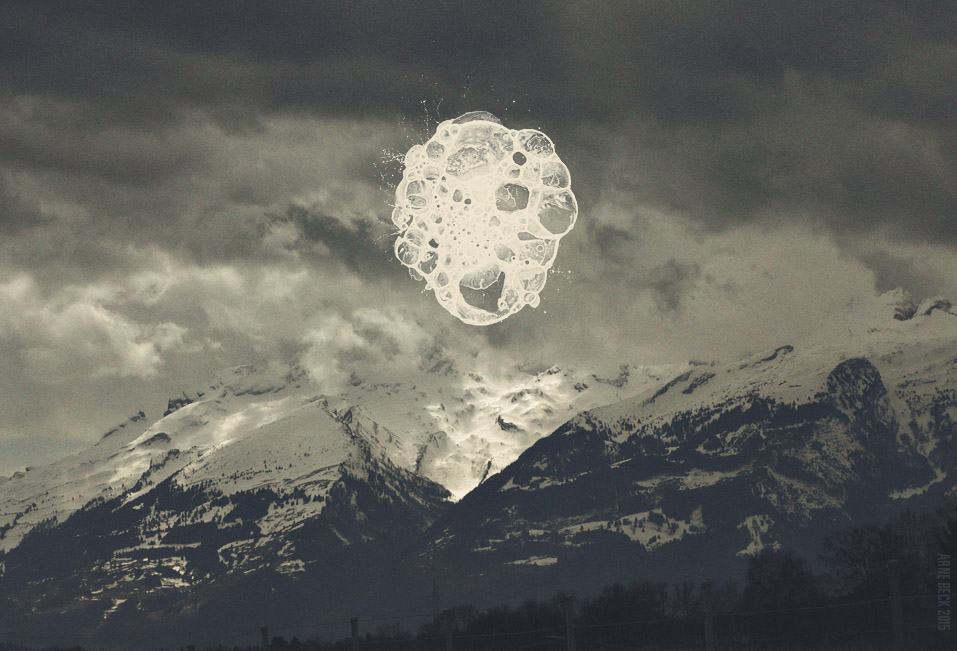
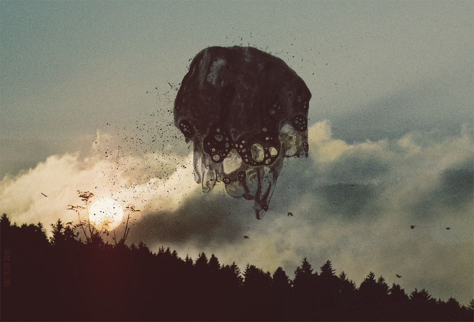
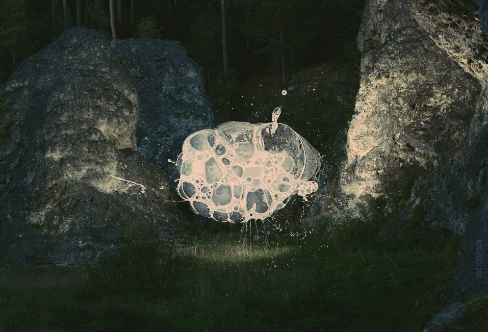
- experimental blots composed with matching photography. so, shopped, but high end for print this time.arne
- Arne
High end 'shopper******** - neat!baseline_shift
- i like these! how are the blots formed?scarabin
- Blot-tasticRamanisky2
- plexus + e3d ?meffid
- RobertNewton0
- Why is his name and post code capitalised, but the address not? tight-tracked sans in a prof setting is a little hackneyed, imho.detritus
- personally i'd tweak the corners of the 'overlaid white cross detail' so that there's a hint of roundness, to match the technicore font a bit and help finish itdetritus
- you've come a bit undone with the tight-tracking where the blue in your o and the preceding c is concerned, haven't you?detritus
- actually, ignore rounded cross corners comment - i zoomed image and main font's all tight cornered too, isn't it?detritus
- ..or round those corners too a bit, so that it's friendly and 'niceandeasy', blahblahdetritus
- the red part in the o of the logo is pixelated. (just a technical remark).
the card: font is to small and tight, hard to read.uan - and the logo and the name/address block could use some alignment. looks a bit placed at random to my eye. how about using a grid system?uan
- tracking way way too tight.fadein11
- I like the color choice and the logo btw :) the whole is not bad at all, I'm just used to watch for details and explanations to make stuff better.uan
- address capitalisation?fadein11
- pixellated part of o in the logo? I presume thats a glitchfadein11
- haha - sorry Detritus - just read your comments... great minds eh.fadein11
- I would add spaces back between the words in the descriptor tag line too.monospaced
- https://media.giphy.…********
- adjust the tracking like the other said, hard to readBen99
- ^ aren't you all just rays of sunshineGnash
- He asked for feedback and got some useful feedback. What's the problem yo********
- Basically, fix it.********
- I'm slightly concerned about the template. In your mockup the email is Matthew@... but what if it's a longer name? Reduce the logo size?bulletfactory
- True, the feedback is constructive -- but did he ask for feedback? I figured this thread was more a 'here's the finished product' than a work-in-progress thingGnash
- lol his exact words, right there, are...
"Got any feedback?"******** - ^ oh damn, i'm an idiot. carry on.Gnash
- agree about the space, if the name is longer than matthew you're screwed. On a related note, if the email contains the company url is it redundant to also incl._niko
- ...include the url? been coming across this quite a bit lately._niko
- the tight kerning is killing me.Hayoth
- wagshaft2
Another video from out xbox nfl series. more to come.
- Mattjanz3n7
- niceutopian
- likeyfadein11
- Really cool layout! Logo + navigation feel "divorced" though.studderine
- yep possibly menu mlets it down a bit - how about a slide in menu with burger icon?fadein11
- no burger menu on desktop. never.studderine
- Disagree - used on loads of desktop sites - nice to have a discreet menu and keeps headers clean. Not always appropriate though.fadein11
- studderine you wrong-erinedoesnotexist
- Thought about hamburger and obviously smaller devices will have it but it was important to keep it as usable as possible for their demo.Mattjanz3n
- Yeah, clean from a design standpoint. Users? Surefire way for people to never seen your menu options unless you need to hide 'em :)studderine
- on a site like this, it doesn't matter. at all. if you were talking about michael kors ecom or amazon then you are right.doesnotexist
- People are coming to find information—hiding the nav is a barrier to finding it. Yes, they will use the content but navigation needs to be there as well.studderine
- not a barrier - the burger is a beacon. and like @doesnot says - poerfectly fine on a site like this - one click is no barrier when not after a quick purchase,fadein11
- answer to a question or porn. The header is visually powerful, the weak list of menu items detracts from it.fadein11
- wagshaft2
Also just released a Surface spot:
- skwiotsmith1
4 AM / Acrylic on Wood Panel / 18" x 24"
http://formsandshapes.com/work/4…
- ********6
- Great work for such a short time.********
- nice... it's spelled "chile" though, or maybe "chili" for the gringosmonospaced
- Chili, Columbia, Per Say********
- 'Chilli' is Commonwealth/UK spelling.Continuity
- you wrote Chilli... And Netflixcannonball1978
- Xi Yi********
- i'll have the mumbai platterscarabin
- nice lino illos. are those coriander seeds next to "Tijuana Platter"?bklyndroobeki
- I think they're fennel. Can't take credit for the illustrations they're stock I had from an old project.********
- I would add a bigger margin for a poster - give it some breathing space. I would make the location part of the footer - its easily lost next to the mainfadein11
- headline. Quite big at the bottom with smaller social media etc may work.fadein11
- No feedback thanks egomaniacs. I boshed it out in two hours and it's already printed and hanging around brighton. Thanks but go fuck yourselves :)********
- Feedback is probably the wrong word, I just mean I really don't need to hear how you think you'd improve it. Fucking designers.... :)********
- hmmm. ego? so why did you post it here again?fadein11
- kerning between L-A-T in Platter needs some work bro.fadein11
- And between O-T in POT. No excuse for bad kerning bro.fadein11
- haha, spiteful little twit aren't you********
- but thanks for stopping by********
- You're right about the kerning though, surprised that's all you spotted. I kerned nothing, just typed it out...********
- never post shit you don't want criticised on here. Spitelful little twat ha - coming from you!???fadein11
- Got all narky and had to point out shit even after I'd said critique was not needed. Yes, spiteful twatty behaviour regardless. Haha********
- welcome to QBN... it's happened to me numerous times. At least my points were valid. But sorry I upset you.fadein11
- haha you didn't, I was trolling if anything.********
- ah okay... think I got v.drunk in that pub once by the way.fadein11
- :)********
- I think you can expect designers to talk about the design and critique it here whether you asked for it or not. Just how we are as a group.monospaced
- appropriate for the peasant's pot, i'd say.bklyndroobeki
- Deal. I expect that and you expect me to be a cunt about it. It's me, remember.********
- deal.monospaced
- Great work for such a short time.
- naimshaikh2
- Feed on deez nutz********
- What's the thinking here?detritus
- I want this on my wall********
- In every room********
- it stays.bklyndroobeki
- Feed on deez nutz
- hellobotto2
T-shirt illustrations for a grocery store's new spice department:
- Sorry. While I can draw, I can't internet.hellobotto
- just post direct link next time********
- GeorgesII0
- Really don't like at all... get back to the CGI cities.fadein11
- I'm in after effects inferno right now ehehehGeorgesII
- People are branding their children now? Suppose she has a head start on all the kids that don't have a logo / personal monogram.Fax_Benson
- nice glowing thing though.Fax_Benson
- she's a designer, what best for her to do what she does best for her future daughter :)GeorgesII
- &Gfadein11
- Lol at the harshness of fadein********
- Fabricio9
Did this bumper video for a production company in Paris that I am working with.
- I have a question mate,
how do one learn motion, I can decently use after effects, but I just can't use it to make nice dynamic motion, is there a trickGeorgesII - nicefadein11
- The music makes me want to cut off my ears but I like the visuals********
- like that shitmoldero
- Hey Georges, those animations were made frame by frame on Flash, then exported to After EffectsFabricio
- Send me an e-mail and I can help you out :)Fabricio
- Wow, there is a lot going on there. I watched 5 times. I think the music is appropriate.CyBrainX
- I have a question mate,
- dopepope13
- damn dude ... +100Ramanisky2
- nicemaquito
- very nice.Gnash
- dope! really dope, @dopepope.Krassy
- : )dopepope
- wowhotroddy
- that's damn nice!moldero
- wowpinkfloyd
- The evolution of @dopepope; right before out eyes.
Excellent stuff dude.
*thumbsup*ideaist - out eyes = OUR eyes...ideaist
- it's what it's all about. constant practice and growth. Thanks for that.dopepope
- cool!iCanHazQBN
- Definitely cool to see your evolution. Latest stuff is amazing...********
- thank a lot fellasdopepope
- Hellboy?utopian


