Show some recent work
- Started
- Last post
- 8,641 Responses
- GeorgesII-2
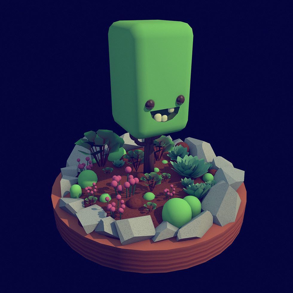
- is that a next level coffee grinder?pinkfloyd
- ^ so it wasn't just me :)Gnash
- what I'm I looking at here?utopian
- scientists are looking for your answersted
- ??Bennn
- dunno why you made a silencer dome, all you Brits are such showoffs, you love being under surveillance...robotron3k
- lol, roboderp called you a britmonospaced
- bjladams2
i like the way charcoal explodes across paper and leaves powder everywhere. i'm getting some stuff ready for an exhibition next month, working mostly with willow and newsprint and affixing them to 4' sections of plywood with wallpaper paste and covering with polished resin. the pieces are darker than the usual stuff i show, and maybe a little more abstract; i'm not sure how they'll be received, but i'm really enjoying the process.
- Rendle10
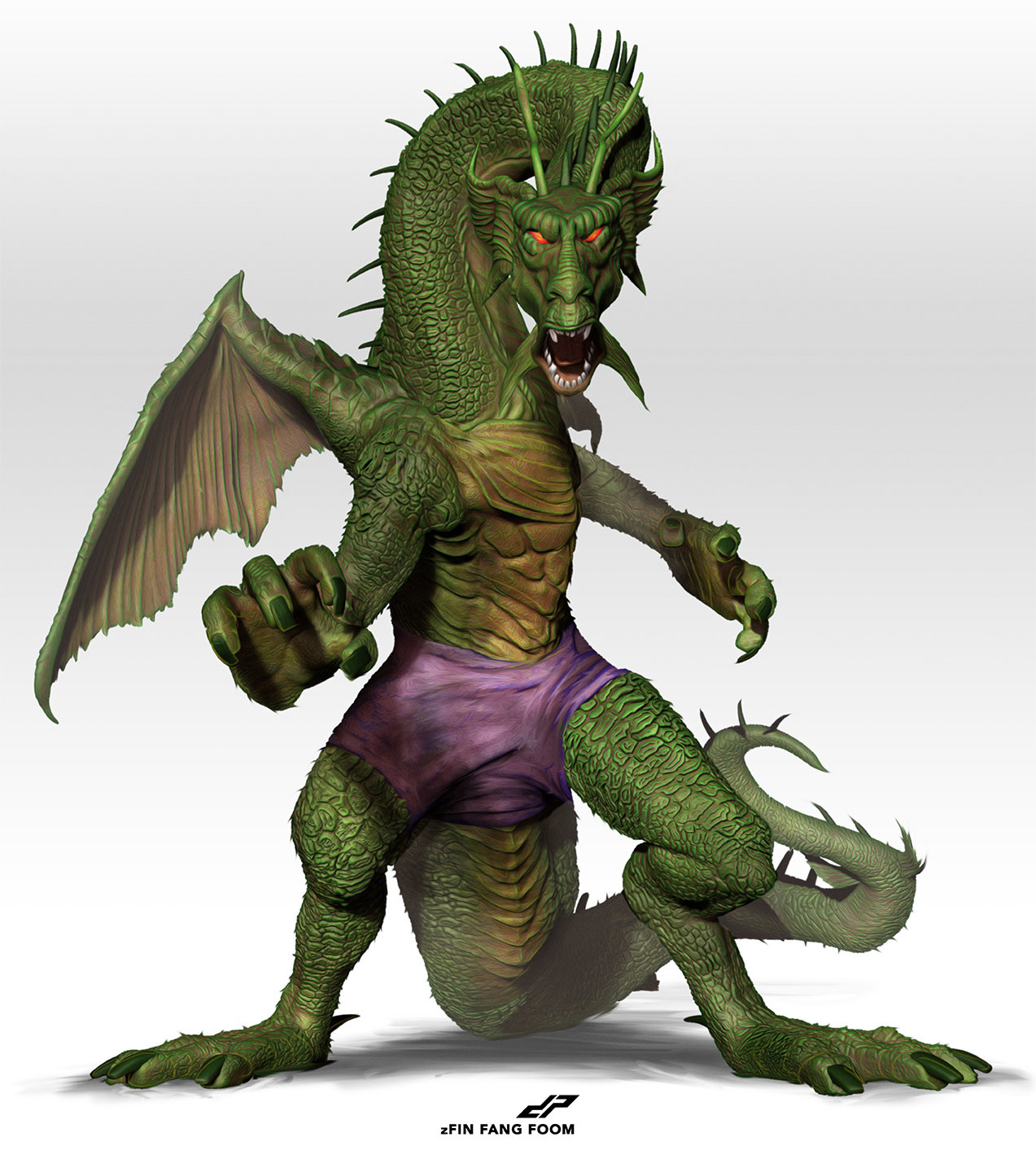
- love the top onefadein11
- Good stuff. These two should have a split screen argument, CNN style. Gif please.CyBrainX
- greatness!inteliboy
- Nice!!! Reminded me of http://www.made.com.…maquito
- niceGnash
- Could see the top one as an album cover of a Happy Mondays or Black Grape recordKrassy
- do you have a website, i like your styleBennn
- Hey Benn, I'm working on a new website at the moment, but I started an instagram you'd like to follow it...Rendle
- http://instagram.com…
:)Rendle
- Rendle4
- Playing with a new style here. Something very different to my usual in the previous post. Not sure how I feel about it yetRendle
- Drawing with an iPad?monospaced
- Indeed. I guess the downvote suggests it's not the best route to take? HahaRendle
- I would stick with the flat colors. The first two have more character too.CyBrainX
- Yea I totally agree. Was playing around with this last night but in hindsight I'm not such a fan myself. ThanksRendle
- don't base anything on down votes. keep searching. no reason not to expand your visual language.Gnash
- Radiohead's next album cover.Krassy
- p.s. what Gnash said. Don't EVER care about downvotes! ;-)Krassy
- Seriously. Freedom would kill himself if he cared.CyBrainX
- misterhow3
- hahh :D i would go with 3 or if it's too vivid 4sted
- 2 0r 4_niko
- 3 and 4 tooBennn
- weird illustration btw lolBennn
- 3duckseason
- 3maquito
- 3scarabin
- 3maquito
- haha, three here too :)
For a deck. For a generic Illu, 4 or 5.detritus - 3. Also, what's going to happen to the elbow? just chopped off?BuddhaHat
- 3. adds to the absurdity.inteliboy
- 3********
- #5section_014
- Tres. Who's it for?garbage
- #5HAYZ1LLLA
- #3, but would the beard look better in grey like $4?Ianbolton
- flip #3 colours so skin is yellow like the simpsons :)microkorg
- Many thanks to all. I'll post a final final when finished.misterhow
- bjladams14
- bezoar6
I work part time as a studio assistant.- are you in this vid?scarabin
- cool project, btw!scarabin
- ha that's really cool :)sted
- Thanks! Yes. I'm the brown, bearded guy.bezoar
- From the same project https://www.instagra…bezoar
- What a great job to do! Do you know how he accomplished the cropped fuzzy fur?detritus
- Dope! Saw one of these a while back at the LA nhm. Was that from your studio?futurefood
- Detritus, we used faux fur pelt adhered with silicone. I'm not sure what kind of animal. FFood, that's not out of our studio - first one we've done.bezoar
- coolmoldero
- Awesome!!!! I actually had a dream recently with these guys in it.lynley
- The dinosaurs I mean.lynley
- Nutter10
Some of the recent daily experiments, distorting typography, drawing triangle persons and misaligned shapes within silhouettes.
http://build-destroy.com/project…
https://www.instagram.com/morten…- You are Nutorious.CyBrainX
- Hah, thanks I also seem to mess up every time I post here. Do wish there was a edit button.Nutter
- Love 1,2,6. Post a tutorial!HAYZ1LLLA
- looks great. all of it!dopepope
- How are you doing the distorted type man? Looks coolIanbolton
- good stuff manscarabin
- +1Gnash
- fresh!feel
- Really nice. Asshole.detritus
- Would love to see that Lost text piece with a movie poster-like level of Photoshop finish on top.detritus
- the last 3 are BOMBMiguex
- i like itBattleAxe
- Yo Nutter. You gonna share the knowledge on 1,2,6 or what? ;-)
We need a pshop tutorials thread.HAYZ1LLLA - Love the first twoCalderone2000
- good stuff!uan
- Thanks everyone, HAYZ1LLLA ain't half the fun figuring it out? :)Nutter
- pinkfloyd16
- nicemoldero
- thanks manpinkfloyd
- so fun, i like itcapn_ron
- I usually block my post from hitting cover, but i'm proud of this one. Thanks capn!pinkfloyd
- great job!dopepope
- cheers!pinkfloyd
- Hey, now this is really good man! Looks like you've got a real good style here.detritus
- Thanks D, please stop picking on me on the internetpinkfloyd
- Never!detritus
- this is cool! all the lines work nicely.HijoDMaite
- Nice one********
- Awesome!Continuity
- up the artwork, up the screen name pink :)********
- Love_niko
- up the screenname? who are you?pinkfloyd
- i meant i dig the name 'pinkfloyd', i hope it wasn't complicated********
- oh, thankspinkfloyd
- lovely stylefadein11
- Nutter6
More recent experiments, actually messed up the grid but didn't notice it before they were done, and uploaded.
https://www.instagram.com/morten…
http://build-destroy.com/project…- nice as everfadein11
- noiceutopian
- first one is ace!Krassy
- very nice and I would buy the first one as a poster!HijoDMaite
- i think it's slightly too busy with the grid for me...pango
- ********14
- nice markGnash
- Thanks, I haven't really worked on (or kerned) the type as of yet********
- what orientation will you use for the spine bug?Gnash
- Boobs of the Day thread?chukkaphob
- Nice. The big gap between the pages and the spines / curves of the B is nagging a little.Fax_Benson
- maybe extend the page lines slightly by rounding the right-side ends?Fax_Benson
- Aye, seeing as we're nitting, the alignment of the text in your black back version's nagging me. I mean, I get it.. but I also don't. Nice mark though! +1'ddetritus
- assuming you're looking for criticism. If not, I'll merrily get tae fuck.Fax_Benson
- I appreciate the input. The type will never be displayed like that on a book though, will it, this is just a (very) quick mock up to display the branding...********
- @gnash, I'll align it as per the white one... I reckon!********
- great mark, setmonospaced
- Nice work. Upvoted +!chukkaphob
- Client's feedback was 'you're a fucking genius. Can't fault it!' So that was easy.********
- break out the bubblyGnash
- How many versions did you do before that looked a little too much like a dick, before settling on two leaves between the cover?detritus
- Haha I was seeing cocks and tits for hours********
- ;)detritus
- Really love that. Only 1 thing - what's going on with the little lower case r's in the type?fadein11
- +1 anywayfadein11
- +1pinkfloyd
- -1 pinklevitchdetritus
- ( . Y . )utopian
- Yes we've established a capital B looks vaguely like a set of tits, thank you Utopian as ever********
- make the type biggerdrgs
- I would love to see this foil stamped on a cloth book. Would look amazing.monospaced
- @fadein, on yea, think that's a rendering issue, not happening on the white on black one...********
- Oh yea *********
- Actually maybe it is, will sort out anyway cheers.********
- love itMiguex
- Nice!maquito
- could see the B as a small metallic book mark - the "teeth" facing into the pages.
Really nice.bklyndroobeki
- MarleyMarl1
- some similarities but in no way the same, or as well executedFax_Benson
- You missed the point, which is that two books as a B is a very obvious, predictable and clearly unoriginal solution.MarleyMarl
- and it's on...Gnash
- you got balls sayin' that MarleyMarl... take cover.fadein11
- I missed it because it's irrelevant.Fax_Benson
- Who cares? The end result looks nothing like those.ESKEMA
- If it was the other way around the RIP vigilantes on this site would be out in full force looking for blood.MarleyMarl
- Be good to incorporate the P somehow, perhaps as book mark. Or you could use the curves of the B & P as rollers for paper in a printer...fruitsalad
- Good solutions should only really have one solution.detritus
- ACTUALLY.
I presume you tried this, and it's too late anyway—did you try shortening the internal stems below, to imply a P?detritus - uh oh. are you saying it was plagiarized? or "inspired?"chukkaphob
- Other way round how exactly? Yes it is a rather obvious solution, which is what I like about it, personally.********
- also, curious, how did you find these 2? google reverse search by image?chukkaphob
- shit, but..
http://theresomewher…detritus - ..as i say, i'm drunk.detritus
- I did actually try that, which is rather nice isn't it, but they understandably want to stay away from the BP direction********
- I like set's double penetration solutionkona
- This is why I hate designers. Always the 'looks like' critic. Ugh.tank02
- Wait a minute, does this mean you created something that isn't an original thought, that has never been conceived before?!?!?
motherfucker...sofakingback - take his design license away!!!!
HANG HIM!!! AND LET US FEAST ON HIS FLESH!!!!!sofakingback - they have not hung him yet?utopian
- POPPPPPP CORNNNGeorgesII
- both of these are shit compared to the original post anyway - really pointless negative post.fadein11
- ^what fade saidPonyBoy
- way too close for comfort. you know dang well this was searched and seen. task, risk.severian
- It honestly wasn't. Really. Anyway these are shitty stock logos not established brands. All things considered, gfy********
- lynley7
- I remember you! You have a very recognisable style, which is an admirable thing.********
- hi! yeah I haven't been on here in ages. Thought i'd pop by. Thank you.lynley
- ^ what set said, and i'm sorry I can't quite remember your orginal name here..detritus
- i couldn't remember my old password myself so no worries! Nice to 'see' you.lynley
- Wow, that's a strangely comforting blast from the past. What was your old name? Red something?Fax_Benson
- ya i thought i remembered his name from years ago. was wondering how come he's still green.pango
- theredmasque was my old login. and he is a she. ;)lynley
- nice work. welcome backGnash
- Damn... we totally just assumed her gender ∑(O_O;)pango
- lol Pango and the ladiez chapter XIIsted
- Lovely work. Certified!Continuity
- It's Lynnette Shelley! I still have a collection of your Alice in Wonderland cards, and I absolutely love them. Great to see you still putting out great work :)BuddhaHat
- beautiful workHijoDMaite
- Oh wow, Buddha hat! Thanks again. Those are from 2009 I think? Maybe 2010.lynley
- I remember you! You have a very recognisable style, which is an admirable thing.
- mort_-3


