Show some recent work
Show some recent work
- Started
- Last post
- 8,640 Responses
- JG_LB0
- One sheet I did for a big conference we were a part of. At the very last minute they forced me to add images. UghJG_LB
- didnt you do a site for them to that you showed a few days ago? These layouts are way nicer, you should use something like this for the sitematt31
- Yeah, I did but neither of my designs were used. I'm a print designer....so yeah.JG_LB
- It's OK, don't lie, you know you were dying to use Mario Lopez on your layout...OSFA
- the sharpie sales will triple by 2050.janne76
- wmeredith0
Revamped the landing page on my folio:
- jonatne0
Finished up http://johnsonranch-tx.com/
- cbass990
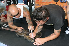
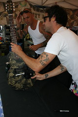
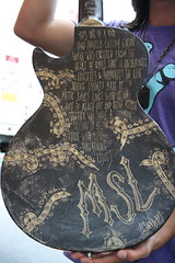
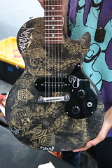
- nice! I was working with a luthier who was going to put my artwork on a guitar,but didn't pan out....theredmasque
- Loving the handlettering
royer - cool, thanks. it took a while.cbass99
- coolJaline
- JerseyRaindog0
This thread constantly makes me feel like an amateur.
- no no********
- waaaaaaaaat?
no dudeDancer - It's a good thing though. Never stand still and all that..JerseyRaindog
- no no
- misiracz0
- That's her O face, then?detritus
- ver-ooooohhhh-na 2008
*opera voice******** - like or dislike? thxmisiracz
- Not sureJG_LB
- i'm against it - it paints the singer in a bad light. it makes it like you're poking fun at herbulletfactory
- doesnotexist0
- i first read that at "failure age"bulletfactory
- I don't know how an a and an i can be confused for a u, but ok cooldoesnotexist
- it was at first glance - i read it correctly after a momentbulletfactory
- big-papes0
- niceOSFA
- gorgeous!
I want to see it biggerMeeklo - Thanks!
www.desk-2.combig-papes
- theredmasque0
an illustration of a Jackson Chameleon that someone requested....
- imnotadesigner0
- beautiful!neue75_bold
- nice colourHuebert
- I loveeeeeeeee it. great work!moamoa
- me dig********
- The color is wonderful.Ampersanderson
- How did you give it that colour/effect? Know of any good tutorials showing how to do this?fodcj
- beautiful work!dyspl
- lovely, colour too - but what's the dealio with that first guy's head-size? Is that 'shopped?detritus
- lovelyMeeklo
- Thank guys... I wasn't expecting such great feedback. Makes me feel all warm & fuzzy lolimnotadesigner
- I played around with the curves... alot and did quite a bit of manual touching up with the dodge/burn toolimnotadesigner
- color is a bit contriveddoesnotexist
- crazy.non
- GORADIO0
"This thread constantly makes me feel like an amateur. "
Couldn't agree more...
- You're a youngling - take it as inspiration and learn from it - remember, there will always be people 'better' than you...detritus
- ..and there'll always be people 'better' than them. We're creatives - we're naturally paranoid and angsty.detritus
- I thought it was just me!thestevo
- but what about the best? he must be lonely... he has no people better than him..janne76
- we all know the best designer in the world.janne76
- and we all know everyone is better than detritus...and I'm not talking about design...OSFA
- THA0
- What did you do?Ampersanderson
- The concert posters for the band "Nite Club." Screened & put up in NYC. The Emerica shirts as well, but not able to show them cause I would have to kill you ;)THA
- soynutz70
http://magazine.org/
its not exciting but designed every page.


