Show some recent work
- Started
- Last post
- 8,657 Responses
- loool10
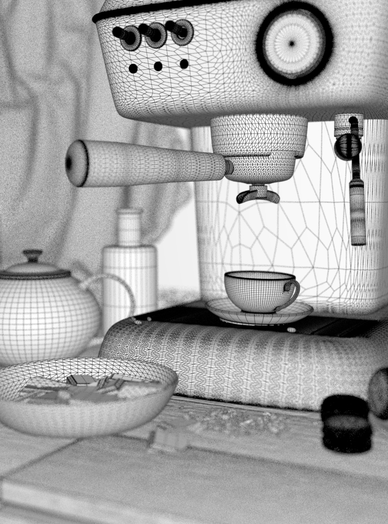
Got a very cool gig to do a 3d render of an old-wooden-toy-world referencing to one illustration from this artist https://www.instagram.com/tijana…
illustration:
renders, of course the brief was not to make it the same, just to take it as a starting point:
wire:
- nice, well done. fun projectGnash
- +1utopian
- very cooldopepope
- super nice :)sted
- Make it less industrial and more cozy like the picturedrgs
- What drgs saidmonospaced
- I agree. More sunny day, less Dutch Rennaissance.CyBrainX
- thanks guys, i like the Dutch Rennaissance reference - actually it was briefed like that...it seems the sunny day will happen too,i'll post it here when i do itloool
- speechlessnotype
- haga5
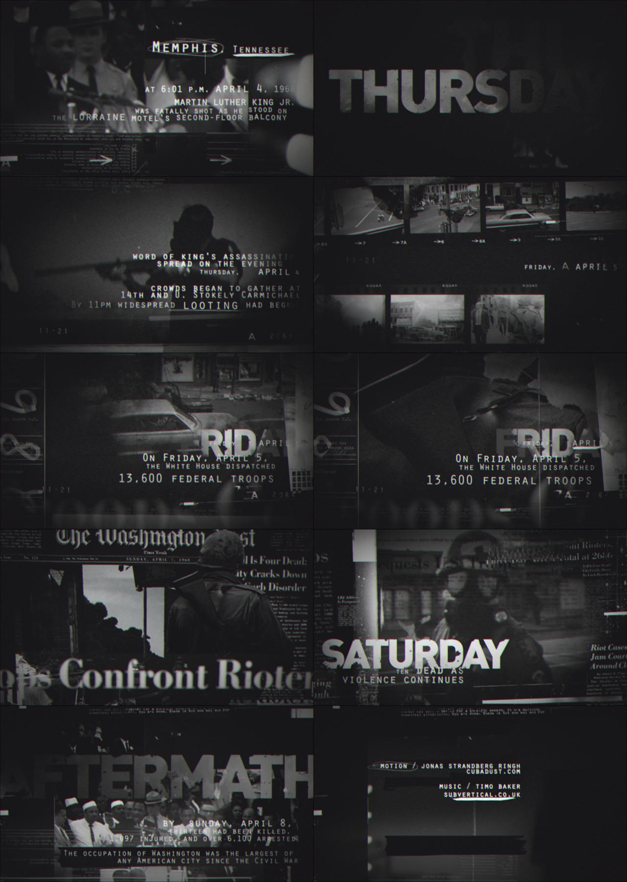
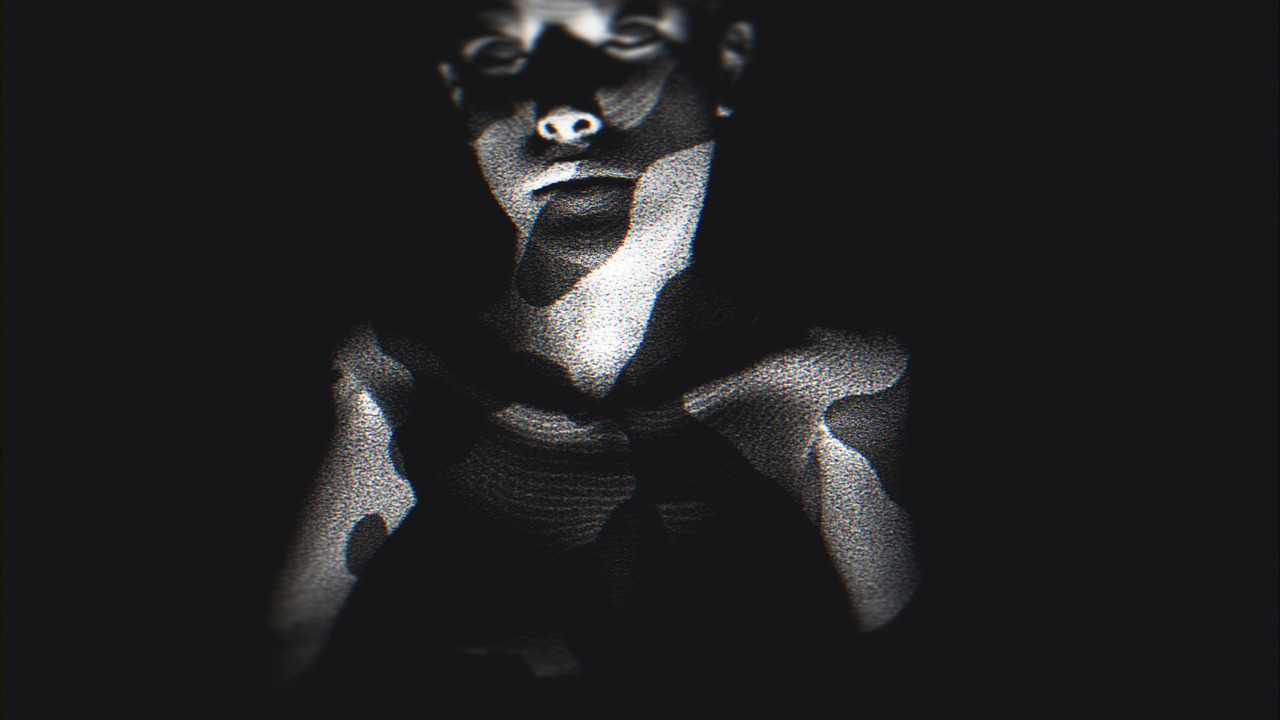
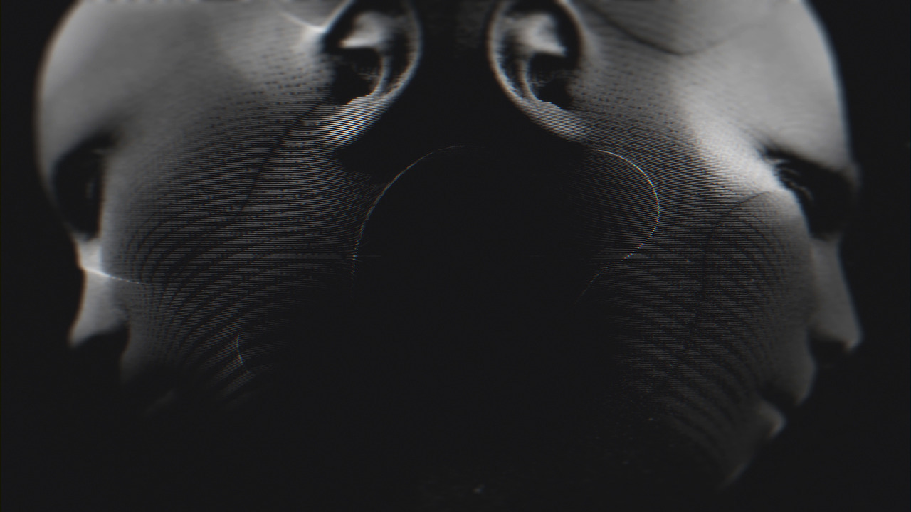
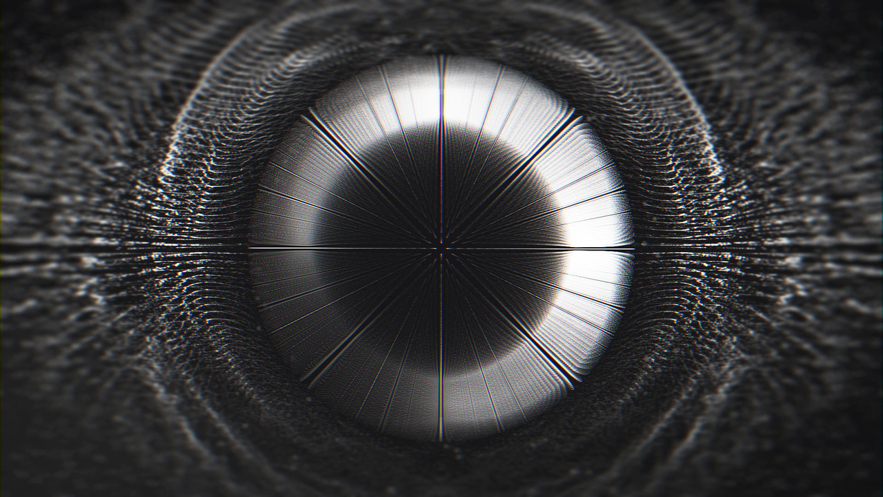
My latest commute project. Well actually I started on it 3 years ago, but never got around to finish it. It's a "short film" about the riots following the assassination of Martin Luther King Jr.
Music by http://www.timobaker.co.uk
- Reminds of a cool tv/doc show intro.
Very nice.Ramanisky2 - Thanks, Ramanisky2haga
- really nice!fadein11
- Thanks, appreciate it!haga
- Nice work, really like it!pedromendez
- pedromendez, thanks!haga
- Reminds of a cool tv/doc show intro.
- BannedKappa1
We've just gone live with Mixkit
https://www.producthunt.com/post…
An upvote would be appreciated!Mixkit is a curated gallery of high-quality videos and animation, made by some of the world’s most talented creators, with all content licensed for free.
- skwiotsmith16
- These are nice. Done analogue then scanned or done digitally? First couple look like fucked up/peeled polaroids.microkorg
- Mixture of scanned film + digital photography mucked about in Photoshop.skwiotsmith
- niceutopian
- loool7
- The light helps a lot!monospaced
- Your materials are unfuckingbelievable. So good. I rarely say it, but this looks real.monospaced
- yes. great jobd_gitale
- thank you guys, i'm reentering the freelance field back again and i had the luck i'm working on some interesting stuff... hopefuly there's more things comingloool
- lovely jobhans_glib
- The textures, the colour palette, the lighting, the sense of the miniature in a large world ... all sublime. This really is a beautiful thing.Continuity
- Really nice - is there a reason the floorboards are all lined up in a grid though? *twitches* ;)Nairn
- ha thanks guys again, they are not 100% aligned but it doesn't look like that, maybe i should have made them a bit more irregular...next time tho...loool
- they usually overlap by a 1/4-1/2 plank lengths, so maybe the gap is only every other board?monospaced
- i'll test with that but what i meant was vertically - i made a small vertical variation but it's obvously not enough...loool
- Nice. Gotta say, the floorboard crack bugs the hell out of me too. ;-)Hayzilla
- Wow, that's great. What renderer are you using?CyBrainX
- oof. puurrrfect********
- it's done with maya and arnoldloool
- These look outstanding !!breadlegz
- ArmandoEstrada2
La Senza Lingerie
- antimotion3
Some new pieces in the tech series I've been doing. Little more simple than the last batch...
Possibly thinking of selling as prints - anybody here have luck doing that sort of thing?
And if so - love recommendations - maybe better spots than redbubble - or is that spot okay? .
These are 5k x 5k px... around 16inches 300 dpi if printed.
- ********1
- never worn?Gnash
- @Gnash, never worn. I'm trying to show all the details. I'll be doing sets for the next 10 days or so. Hope there is interest.********
- That's a nice setup.CyBrainX
- Thanks @Cy! More to come.********
- ya, very nice picsGnash
- what? you shoot shoes on color to sell? I thought used shoes go to charity********
- @deathboy no mate, my never worn collection is gonna help pay my bills.
thanks @gnash (always improving)********
- loool7
- amazeballs, love this stuff!********
- Those objects look great but I think we need to turn up the lights a bit. The highlights work great as is but there needs to be more global light.CyBrainX
- looks wonderful, lemme see those macaroons!imbecile
- ohh boy this is going to be the decline of product photography. or at least a dent. if it hasn't.pango
- awesome workdopepope
- what render engine?imbecile
- it's done in arnoldloool
- I just started learning some Arnold yesterday. I'm amazed how fast and powerful it is and I'm not even using GPU rendering.CyBrainX
- amazeballs, love this stuff!
- arne4
- Radmonospaced
- That's great.CyBrainX
- way coolatomholc
- Really dig man!antimotion
- haga17
- great job!CALLES
- Thanks!haga
- nicedopepope
- Thanks, dopepope!haga
- on nearly every beat a cut or jump is not easy for my eyes but i like the visuals and the music - great work.api
- api, haha then imagen to edit the video for more than one hour at the time.haga
- But glad you liked it!haga
- splendid.utopian
- music by?utopian
- utopian, the post reads "Optimistic"imbecile
- Amazing work Haga, bummed we never hooked up on a thing, but this looks absolutely incredible!!!!! :Dmantrakid
- Mint!maquito
- choiceprophetone
- wow, lovely.fadein11
- utopian, yea he's called Optimistic. You can find the track on Spotify.haga
- And thanks all, I really appreciate it!haga
- mantrakid, we're still on!haga
- dope !neverscared
- neverscared, thanks!haga
- really nice.MrAbominable
- MrAbominable, appreciate it!haga
- So good man :) Was this done on Houdini?Fabricio
- Fabricio, thanks! No, all done in AE / Trapcode Form. Characters in Adobe Fuse.haga
- d0mino6
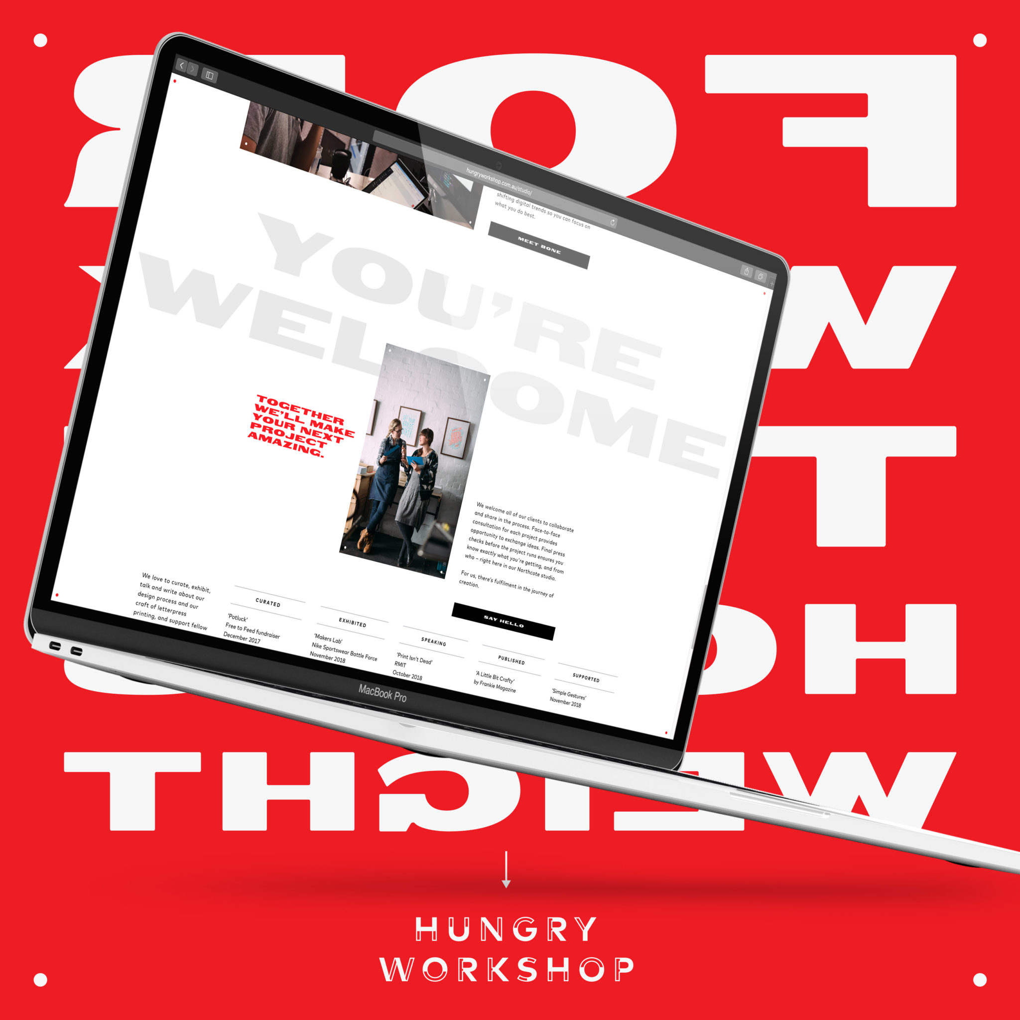
New site for my letterpress studio, built by my dev studio
http://hungryworkshop.com.au
built by http://bone.digital- re: bone.digital - a pretty bold move getting rid of the mouse cursor entirely - or is that not supposed to be like that?Nairn
- Nice. I'm after some letterpress cards...MrT
- super nice.Gnash
- Nairm, that sounds like a bug!d0mino
- sweet.utopian
- Very nice.Longcopylover
- Well done. Looks great!thumb_screws
- very nice! Too bad so far awayformed
- CyBrainX2
I started messing around with caustics but got carried away. C4D R20 with Physical, Volumes to model the lamp, xpCloth to make the ribbons, X-Particles/Thinking Particles combination to make the fog. I struggled with the Pyrocluster settings so I did a separate take without the fog to composite it at 47%.
- man I really want to get into Cinema 4D. I use 3ds Max but I'm not on Windows as much. Looks great.Boz
- I'm building the nerve to get a PC after decades of Mac use. I need to use GPU rendering.CyBrainX
- My Mac is so slow with 3D it takes a toll on my brain waiting for things to preview.CyBrainX
- Are you on a mac or windows machine Cybrain? And have you played with the GPU renders, Redshift or Octane?Fabricio
- I'm on Mac and have played with Arnold a bit which is CPU. There's a beta GPU Arnold but I haven't tried that yet.CyBrainX
- I'm mustering the courage to buy a beast PC after half a life using Macs. I'll re-evaluate GPU rendering then.CyBrainX
- dopepope5
More images : https://www.artstation.com/artwo…
3D model : https://skfb.ly/6IALA
Just a quick sculpt in between jobs. Banged it out in less than 2 days, including the renders. I don't get much time in between jobs, so I was lucky to get such good results. Hope you dig.
- Boz1
- curious to hear opinions in generalBoz
- Looks incredible to me.dopepope
- Very great. So many quality details.CyBrainX
- I'd love to see the evolution of your work from sketch/wire to this.Mattjanz3n
- Thumbs up..very nicedee-dubs
- excelllent!neverscared
- dope!
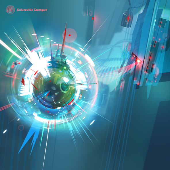
just 2 details that bothered me:
-the small 2 line type besides the red squares with numbers (because unreadable in the screenshot)
-it's 2019 (footer)uan - I like the overall vibe...however, there is little attention to detail such as: kerning, image alignment, spacing, etc...utopian
- can't really kern online though... you can, but last time i checked it was really hard work and quite impossible to get it right.uan
- Looks very nice, maybe a little busydmay
- Looks great. I think there is too much copy in some of the modules lower down the page. The module for "tech on the track" is spot on. One sentence.thumb_screws
- nice, man :)PonyBoy
- Boz, this should help you with your grid system. http://gridcalculato…utopian
- not sure about grid, but can tell depth levels in some off and thinking a little extra layering and texturing in comps would help********
- like dude vs car could be equalized, some of the 3d could be better with textures, but overall those minute details ppl mostly ignore********
- think it looks pretty good********
- Nice work. The only thing that bothers me is how bright Josef’s hair is on that dark background. Maybe burn the edges or play with the brightness/contrast.fooler
- Needs tremendously more white space IMO. Way too crammed viewing experience.noRGB
- Some of those copy blocks are multiple paragraphs parading as one wall of text. Convince them no one will read all that textnoRGB
- thanks everyone.. some good comments!Boz
- Nice work man - i would also change your 'Learn more' links to something more directive to the page each is linking topedromendez
- Love it. Bit more white space needed for me.Hayzilla
- Agree with white space comments. Also agree on cutting down/normalizing copy length - show more tell less. Also have some widows in different copy blocks.duckseason
- Do the "plus" symbols do anything or just visual flair? Opening quotation mark in hero is backwards/upside down.duckseason
- Style of visuals/illustration... in lower numbered sections feel a bit disconnected. Numbered sections are weirdly broken up by About section.duckseason
- Corner radius of the button in the About section looks like it could be increased - gittin' nitpicky...duckseason
- I'd also argue the line height/leading in the body copy could be bumped up a bit to help things breathe a bit more.duckseason
- colin_s3
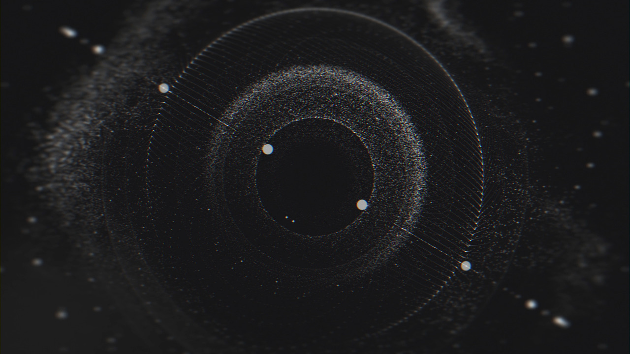
new a/v piece


