Show some recent work
- Started
- Last post
- 8,639 Responses
- stewart40
- Noice! Great stuff!Continuity
- Congrats!utopian
- Oh sweet!Gnash
- That is excellent!mg33
- Great! Keep it up ;)OBBTKN
- noice!bulletfactory
- Nicely done. Congrats.falcadia
- Well deserved!SimonFFM
- See? QBN has design content!
Lovely font!jagara - Nice uppercase ligatures!jagara
- I'm going to buy this. Perfection AND keep going with your type!!!
: )ideaist - Fantastic job. Fonts are a huge mission.CyBrainX
- Killerstoplying
- microkorg10
- phanlo is itching to post this to the photocopy threadimbecile
- Haha. <3
No actual physical photocopying involved here. The source materials are AI's take on photocopies ;)microkorg - So its "Show some recent work* "garbage
- Looks coolimbecile
- Early underworld artwork vibesdee-dubs
- Love it! Get it in the photocopy thread ;-)PhanLo
- Coolscarabin
- Yes very much Tomato/Underworld influenced. AI typographic photocopy outputs > video footage of monitor showing outputs > chopped in AE with scriptmicrokorg
- Can't wait to see the video. Please share when you're done. Refresh my memory. What was Tomato?CyBrainX
- Tomato is a design company and were(are?) part of Underworld and did(do?) all their artwork.
http://www.tomato.co…microkorg - Very nice. I think I'm going to be on this site for a while. This Iggy video is great. http://www.tomato.co…CyBrainX
- where_am_i9
Havent posted here in a while!
Will drop some stuff, first up are a bunch of short films made for a perfume brand. 10 bottles, chess themed, we designed the environments to live in that world but without being over the top chess related. Love how some of them turned out, the render were very clean.Black
White
- ❤********
- Lights working overtime, +1garbage
- haha yeah, bright n clean was the order of the daywhere_am_i
- NiiiiicePhanLo
- ❤
- where_am_i7
This is one of the most enjoyable projects Ive ever been involved with, and a great story too. Worked closely with the director on bringing the story to life and mixing the animation and live action.
below is a montage of some of the animation stuff. The link to full 11min film below. If you have the time give it a watch, its a great story and a super fun film!Full film
- I wish I had more time right now but the first 4 minutes of the long version is fantastic. The cinematography is exceptional.CyBrainX
- It's extraordinary.uan
- Give it a watch when you have the time. Its an amazing story. Its also amazing what he is doing with the film and graphic novel now. Travelling Africa inspiringwhere_am_i
- kids in rural schools. He is a legend. We shot on location in South Africa and Austria and had teams all over the world bringing this together in the middle ofwhere_am_i
- the omicron shut down. So many crazy things happened along the way. Ive seen so many times but I still get goodies when he puts that helmet onwhere_am_i
- *goosies. /goose bumpswhere_am_i
- Noesis-3
https://bit.ly/MCOUTINHO rebranding of a major portuguese car dealership
- where_am_i2
I was trying to post links to the bhnc links for this and the mind games stuff I posted the other day as its quite cool to see the print that was rendered at 14k but I guess the qoob wont let me. Here are another couple of perfume launch films that were fun comp up
- if you want to see the print of this and the mind games the bhnc link is in the vimeo descriptionwhere_am_i
- Very nice. That sure is kinetic. Did you build the city?CyBrainX
- cheers. first one is stock footage and in the cg a lot of footage on planes etcwhere_am_i
- second one has some assets i bought and edited and a mix of some basic models for the windowswhere_am_i
- SimonFFM26
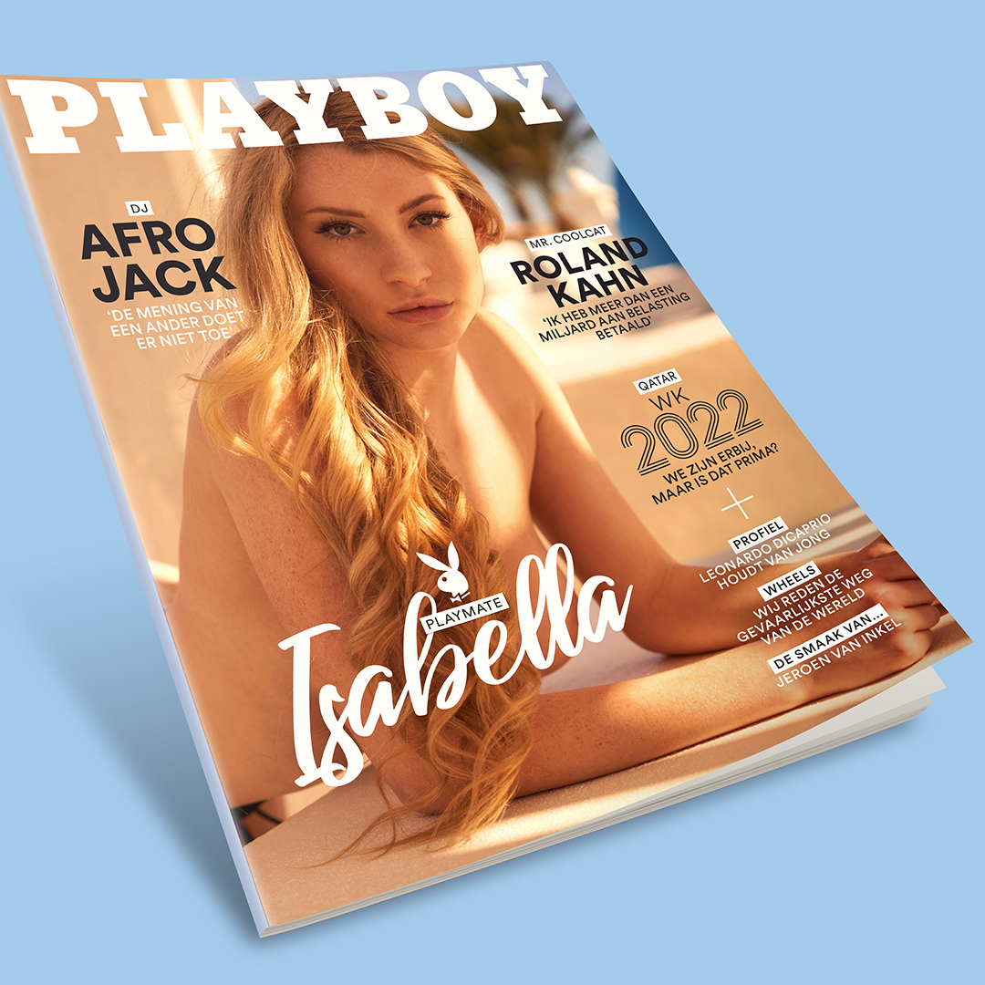
- Is that "2022" in stewart's Troix font?
(See above. ^^)CyBrainX - No, it's not
https://d39l2hkdp2es…Nairn - No, Stewart's actually looks better (and has a different "2" and more distinct thickness).SimonFFM
- Noice!Continuity
- such a cum slututopian
- Congratulations Simon!********
- Thank you!SimonFFM
- Super cool!bezoar
- Utopian failed no fap november early this yeardrgs
- heck yes! nice work Simon!capn_ron
- Nice, Simon!!! <3PonyBoy
- Well done Simon!stewart
- Now this is the type of humble brag I can get on board with. Congrats!stoplying
- Congrats Simon!Krassy
- lol@utopian, always a true gentleman********
- Congrats Simon! It's been a joy to watch your journey.formed
- looks like a complex photo to capture - regarding lighting.shapesalad
- Posing was more difficult than lighting.SimonFFM
- Here's a behind the scenes shot (nsfw):
https://pbs.twimg.co…SimonFFM - She's 21? Jesus Christ********
- She was 18 when I photographed her. Her mother was younger than me.SimonFFM
- Um, Simon? WTF is 'Magical Growth Sheen'?! o_OContinuity
- @continuity: https://www.simonbol…SimonFFM
- Ah. It's something for hair. No wonder I had no idea what it was. :PContinuity
- Yes and no. I use it for the body to make it look shiny.SimonFFM
- Is that "2022" in stewart's Troix font?
- slappy37
- they nicescruffics
- love the toyotawhere_am_i
- Thanks for posting!
Love em.PhanLo - ❤********
- very niceshapesalad
- Cool. That Volvo looks a bit sinister with the boot slightly open.mort_
- Also forcing myself to draw on the iPad. I have yet to find workflow from sketchbook to iPad to mouse on the machinemisterhow
- Very niceBonSeff
- Nice style. I like the Volvo, my grandpa had one like that, almost in that yellowish color.stewart
- Love em!instrmntl
- Dope!dibec
- Nice. Drawings and selection of cars.Longcopylover
- Love these.Chimp
- Thanks!slappy
- These are cool.MrT
- Instead of spamming this thread, I post a new one of these most days on an instagram account I just started. @paper.garageslappy
- These are great. The colors bring it to the next level too.CyBrainX
- I made DM'd a request on your instagram account!CyBrainX
- sweet!ArchitectofFate
- I love it when the booty is slightly open.palimpsest
- I requested the The Subaru Sambar (Sumo/Libero) or Volvo C303 Laplanderpalimpsest
- Which generation Sambar?slappy
- 1995 or whichever you prefer.palimpsest
- No worries, I’ll post up some requests tonight.slappy
- I'm counting on it.palimpsest
- https://i.imgur.com/…
@palimpsestslappy - https://i.imgur.com/…
@CyBrainXslappy - Thanks!palimpsest
- Nairn9
As always, I'm a very small cog in the grand business of making this sort of thing, with essentially zero creative involvement, but I saw this on a bus advert on the way in this morning and tried explaining to my wee daughter what her Daddy's involvement was. I'm not sure she really got it, lol.
- Great stuff man.Chimp
- Snowgran slowly crossing the road didn't make my heart sink at all.. who's cutting onions?!garbage
- I know you're in the laser biznez, Nairn but I couldn't spot what you did here.palimpsest
- Good! That means they did their jobs well :) I cut pretty much every flat surface. I realised trying to explain to my Dad how much was there, in the end.Nairn
- As far as I can see, the only things that didn't cross my hands at some point are the 3D characters and the smartphone at the end, which looks hand-doneNairn
- Obvs I'm just a knife in this process - really not trying to claim any more credit than that.Nairn
- Then you did well.
Kudos.palimpsest
- de4k7
- dyspl32
- very cooldopepope
- would fiddle withscruffics
- What is it? I like it.SimonFFM
- ++++
Like the base glowPhanLo - dope.milfhunter
- ❤********
- das ist nicested
- So damned cool, Em!Nairn
- sick!aliastime
- Very cool. I have some flange gaskets that might help with defibrillator re-sequencing.CyBrainX
- There’s more on B&C but can’t link from here.
How much for the gaskets CyBrainX?dyspl - Image too smalldrgs
- 7 quatloos each, For 12, I'll throw in a metaphysics simulator - gamma alignment.CyBrainX
- Bravo! Great workOBBTKN
- show the scene before renderimbecile
- dyspl, nice!
you know this album cover, right?
https://ninjatune.ne…microkorg - Funki Porcini - Fast Asleepmicrokorg
- einzsted
- Dope!Chimp
- grafician-5
- Logo for a street wear brand, should spell "EGAL", but idk
Still wipgrafician - The different stroke thicknesses because? Also, squint and it’s a bit of a Pokémon ball...or baby yoda’s pram. Sorrymisterhow
- yeaaaah... that's a bit of a mess tbhhans_glib
- different stroke thicknesses plays with depth
EGAL means EQUALgrafician - The depth is not coming through at all, and it doesn’t seem visually strong enough for Street wear, kinda fragile. Interested where this is going.monospaced
- Your other ideas?monospaced
- Logo for a street wear brand, should spell "EGAL", but idk
- hydro7416
- The worst NDAs are the ones you sign where you know that it wouldn't matter who you told, they wouldn't be able to work anything out anyway. So dumb.Nairn
- These are great!mathinc
- I always tell my friends that still have faith in our nonexistent democracy that the Constitution can't stand up and enforce itself.CyBrainX
- fisheye11
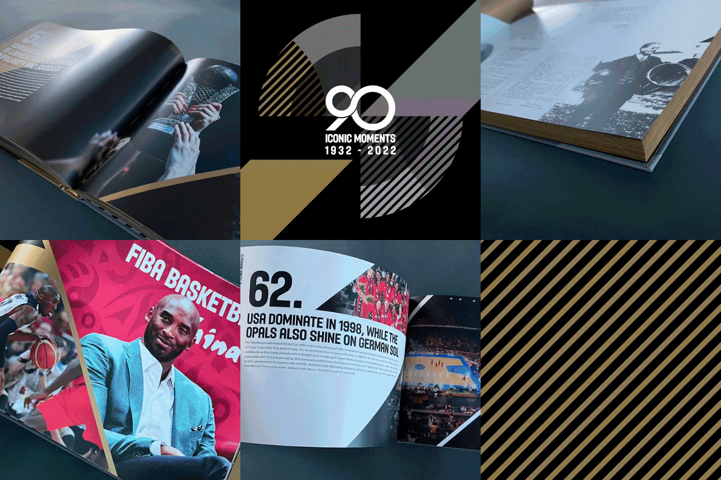
- I can't read that fast but those pages look great.CyBrainX
- Thanks! It is a FIBA, 90th anniversary book.fisheye
- wow!!hydro74
- looks nice from what i can see whilst having an epileptic fitdee-dubs
- More FPS than a James Francis Cameron film!
: )ideaist - 1990?monospaced
- aimed at millenials with no attention span obvstrooperbill
- PhanLo32
Here's how that mural looked with some projection on it.
There's a little making of video over at https://www.instagram.com/p/Cmbv… if you can be bothered.
-- Fuck yeah! That must be a real buzz, seeing the end-result :)
'Zat you in the vid, Phan?Nairn - Yep Nairn, in the blue top.
It's exciting to mess with the projectors, we often have them out on pretty dry jobs, so it's good to play around.PhanLo - the flats were left over from a bloomberg job and were going to get skipped, but we've kept them in the warehouse now.PhanLo
- I’m sure I’ve said this before, but you one talented MoFo, quality work yet again!dee-dubs
- ❤********
- Bravo Phanlo, good work!!OBBTKN
- I love this. The projection work is so cool.CyBrainX
- Hoes Before Bros ❤utopian
- Fantastic.MrT
- We kind of ran out of animation time before we headed off for xmas, but we really wanted to test the idea to try to do some installs next year.PhanLo
- Cheers folks, hope you all have a good xmas!PhanLo
- Super rad brother!dibec
- Sooo good. Congrats!scarabin
- cool! what is this woman figure?milfhunter
- serenityneverscared
- Magnificent, Phan. This is seriously gorgeous!Continuity
- @milfhunter, the theme we made up was loosely scottish, scifi nouveau, bit random. I worked on the drawing side and my workmate on the projection sidePhanLo
- Beautifulsea_sea
- amazing. nice one !d_gitale
- Fuck yeah! That must be a real buzz, seeing the end-result :)
- big-papes9
Not graphic but I created the original music score for a new podcast on Radio 4. Just dropped this week.
- The music at about 2:50 here?
https://www.bbc.co.u… . If so, you should hook up with Adam Curtis for his next gig:)Nairn
- The music at about 2:50 here?
- hydro7420
New fuck around font. Free up on my Patreon if you want it
https://www.patreon.com/Hydro74- +bezoar
- Sick one!instrmntl
- noicemilfhunter
- radneverscared
- 열정!ninano
- Always gooood!PhanLo
- I like "fuck around font", like you're cheating on your Foundry.
Lolz.ideaist - DopeYakuZoku
- Lovelyutopian
- What would a Find Out font look like?i_monk
- stewart47
- I really like this - bravo!Nairn
- Sweet********
- check plus!misterhow
- Like it a lot!OBBTKN
- Smart & coolNBQ00
- ❤ Love it! ❤PhanLo
- Nice - would love to see more!bulletfactory
- That's very nicepedromendez
- very goodneverscared
- Excellent!
the E works!Krassy - great concept and execution, it looks and FEELS nice, kudos!whatthefunk
- Topologically inaccurate flight pathdrgs
- That's a nice and smooth cloud sailing.sted
- love the mark, hate the fonthans_glib
- @drgs maybe its a Glider? :)sted
- @hans, good one, it's not a font (yet)stewart
- Nice, Is that Elon's plane!utopian
- So fresh.
So clean.
It stays.ideaist - clever and pleasingdopepope
- Nive work!dbloc
- I see the 'E' in the flight path, but it'd be cooler if you could see E F C in the a loop. And maybe 3 nodes/dots on the loop, for the connections.shapesalad
- Also i'd not have the red in the gradient, and i'd keep it all electric aqua blue to white gradient. To convey the 'electric' thing.shapesalad
- It's nice, but the connotations could pump stronger. The logo mark on it's own is not conveying anything, almost looks like a knob pointing up left.shapesalad
- https://i0.wp.com/be…BonSeff
- ^ LOLpango
- mister stewart once again returning design balance to this website I visit on a daily basis. Very nice, palstoplying
- If anyone knows about looking like a knob it’s you, shapescarabin
- get rid of the gradient. the font does not fit.
hmm.. go back to the beginning.sandpipe - As well executed as it is conceived.
Great work.CyBrainX


