Show some recent work
Show some recent work
- Started
- Last post
- 8,641 Responses
- ********0
- hm, could have used a better font, no?********
- there is issues with that logo, if you need it in smaller sizes.akrokdesign
- font id?OSFA
- i would love to see this a more circular mid section of the 'd'sfeske
- Font is nice, but the speach mark not only won't work in small res but is soooo overdone.********
- speech bubble*********
- needed a circle.mistermik
- hm, could have used a better font, no?
- skii0
- is he a cactus?slappy
- don't see many cucumbers with thorns :)mistermik
- i like himtheredmasque
- he's a cactus alright. there are some more on page 55 of this thread (not cactus)skii
- slappy0
Just put a new temp site up until I get time to work out what to do with my site.
*not a blog, just looks like one haha.
- uncle_helv0
- wow, lovely, simply wonderful!neue75_bold
- beautifully set, just wonderous:)skii
- you're havin' a good week old boy! this is brilliant :Dkelpie
- nice!!poolio
- Is the face Gotham?voiceof
- Yes Gotham Light & Medium throughout!uncle_helv
- Thanks guys, it means a lot!! I'm trying to sort my Be hance page out next week, so there should be a portfolio of sorts up shortly! (if you're interested of course :D) thanks again!uncle_helv
- ...shortly! (if you're interested of course :D) thanks again!uncle_helv
- noiceJG_LB
- hot!akrokdesign
- bravo bravo.... veryyyyyyyyyyy nice!!!!!!!!!!moamoa
- when you do, make sure you join my circle jerk...neue75_bold
- Cool and nice!********
- v nice.Jnr_Madison
- v nice. It bugs me though on the cover the gap between the two 'logo squares' is bigger than the one between...********
- the squares making up england. Feel odd. Lovely work though.********
- Now THATS what I'm talking about! Solid, as usual helv.non
- Gorgeous!dog_opus
- clap clap clap!Meeklo
- Love this! Excellent use of Gotham. 3 col landscape in flip format makes the layout look awesome!jysta
- This is what a good designer does. Congrats man, you made loads of text look beautiful!OSFA
- Oh, and I forwarded it to Five Sharp...OSFA
- Nice, simple and consistent, love it!!phatlee
- *whistles*JerseyRaindog
- moamoa0
- nice.********
- it works, but I can tell the g is out of place. It's what I've done for this: http://www.reintegra…neverblink
- hmmmm, good luck with that!neue75_bold
- awwwww I know this will end in a time-sonsuming disastermoamoa
- I did a logo lastr summer for a post house called "assembly" which combined serif and san serif lettershallelujah
- oddly, it wasn't that noticeablehallelujah
- nice.
- lvl_130
I posted this in my "I'm in NYC thread" but to hell with it, this is a better thread to put it in! :)
My new folio site:
http://www.levelthirteen.com
- neue75_bold0
- *chortle*Nairn
- ohhhh surprise surprise, very untypical work from you... I like it, --- american retro touchmoamoa
- sorry, it was a bad joke, here moamoa – http://www.qbn.com/t…neue75_bold
- hahahaha :) ok ok I knew it.. no I didn´t but .. yeah I wanted to sound friendly.... :)moamoa
- Great stuffnon
- Hahahahahauncle_helv
- if you didnt do this i was gonna :)megE
- you fucker...hallelujah
- I thought I'd at least have one laugh with this...neue75_bold
- haneue75_bold
- at least you didn't use one of my horrible american client logoshallelujah
- and please don't get any ideashallelujah
- it's ok, I'm not wearing a belt...neue75_bold
- I got the joke! hahaha
you got me wondering for a secondMeeklo - how unfortunate...OSFA
- neue75_bold0
- +1Complexfruit
- much better then your bullet version. I like the second one a bit moremoamoa
- yes, indeed, I was so high that night I did the previous ones.. ok, um... hmmm...neue75_bold
- * draws corollary...neue75_bold
- awww I am learning so many new words... thanksmoamoa
- thanks to greedo for the title of the second poster, btw...neue75_bold
- love itMeeklo
- Really great, love the serif one.ukit
- yummJaline
- very nice!, from the colors to the layout...sfeske
- You gonna get these printed or what? ;)Concrete
- they're sweeet! Print them!!OSFA
- thanks lads, suppose then I'd have to typeset them then... might look at putting a shop online sometime next year..neue75_bold
- Lush.JerseyRaindog
- sr_50
- Meeklo0
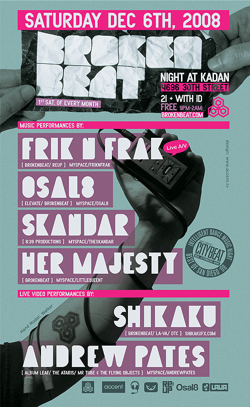
- Great job, Meeklo. Did you do the crumpled paper with a displacement filter, or is it an actual photo?dog_opus
- thanks buddy,
photo! I'm one of the hand models :)Meeklo - yeah, looks good Meeklo.akrokdesign
- I like this a lot.. it's all a bit different to what I've seen lately and it works well - nice job!poolio
- thank you both!Meeklo
- BonSeff0
finished my first and LAST 6-color screen print. shit was a bitch and i did it all inhouse. a couple hickups with how i prepared my transparencies, but over all i likes..
here are more pics of the project
http://birddogindustries.com/fmt…- nice how big issit?JG_LB
- 10.5x15.5 - there are (2) 2.5x15.5 panels that are going to go on either side. still need to print them. those are only 3 colorBonSeff
- only 3 colorBonSeff
- Freakin' excellent, Seff. Love the step photos, too.blaw
- love it.Ampersanderson
- WeLoveNoise0
new corporate mark for motion design studio
- i thought you were fixing me some jobs. no?********
- i askd kro to contact u - cos there is some print work in the pipelineWeLoveNoise
- dnt worry have u in mind if i need help :) whens that moleskin book coming to me ?WeLoveNoise
- ah yes that book. soon!********
- i thought you were fixing me some jobs. no?
- WeLoveNoise0
- this is for a motion graphics house, right?sfeske
- yes but they specialise in wedding/barmitvahs so they wanted it aimed at that marketWeLoveNoise


