Show some recent work
Show some recent work
- Started
- Last post
- 8,641 Responses
- DesignedbyDave0
Logo, promotional material and website for Subversive Spaces, a surrealism exhibition at The Whitworth Art Gallery, Manchester.
A5 Invitation:
Website:
http://www.subversivespaces.com
- Meeklo0
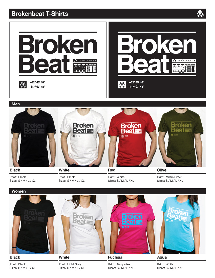
- I like the red one, and white, the others.. gmm********
- fair enough,
I think the black on black is going to look sick!Meeklo - hehe the american apparel imageserikjonsson
- well, they are mock ups, and we will print them on AA, so it made sense :)Meeklo
- love the black + black onejuhls
- I mean the printing and the look of it. I don't wear many shirts with text on them, but that's just a personal preference.juhls
- looking good.akrokdesign
- I like the red one, and white, the others.. gmm
- ********0
- Maybe change the type to somehing more poppy?Kiggen
- for the rest, i likeKiggen
- zoiets? http://kiggen.be/stu…Kiggen
- hm, what font is that?
the colour looks different! more bling as my orange, how does that come********
- ********0
- http://kiggen.be/stu…Mau
- !!!!!!!!!Mau
- this has reference to Maus.********
- nazi maus comic********
- bart and me agreed on this********
- i guess********
- hahaKiggen
- I thnk the kid wants you dead, mau...deadmau ?Kiggen
- colour looks like runsMau
- hahaha ..... little CUNTMau
- runs? what does a run look like?********
- http://www.natur-und…Mau
- i just wait for the books, and then dead mau.
no jk.. but deadmau5 is actually one great dj******** - you have very nice work digdre,
i'm somehow blown away, i'm 20 and it motivate me to get betterelektro - what a compliment! thanks********
- Noice digdre!ukit
- grymes0
- needs more narwhal********
- How do you supposed I get more narwhal?grymes
- no idea.. but it needs more narwhal.********
- 1 more horn********
- hahah Like it. Good sense of hummer for that one********
- a narwal's horn is actually a tooth, might be good to correct that so it's coming out of his mouth.doesnotexist
- I like thisMeeklo
- It's a bloody representation of a narwhal and since when does the tooth come out of it's mouth.grymes
- I like something about this.juhls
- love it!sikma
- well donearthur
- His right flipper isn't connected to his body. Otherwise looking good...tparsons
- needs more narwhal
- ********0
- Gifto0
- these are yours??? AWESOME!! i ffofunded them some days ago. just awesome********
- Thanks digdre — they are only digital prints, but if you mail me your address I'll try and send you the set if you want 'em?Gifto
- oh my god oh my god!!********
- these are killer.baseline_shift
- LOVE ITTMau
- nicejuhls
- very nice, gifto.akrokdesign
- Great audio to accompany, download here (password: foxglove)
http://drop.io/hidde…
Gifto - lovely, bitch.Jnr_Madison
- So good!jiaf
- these are yours??? AWESOME!! i ffofunded them some days ago. just awesome
- _salisae_0
concept for a web studio that wants to also be thought of as a print designer.
- _salisae_0
- mother_salisae_
- tif's won't embed.Jnr_Madison
- sweet!invisiblechamber
- works for meMau
- NiceKiggen
- yes - quicktime converts it - but colours look not right hereinvisiblechamber
- sorry .. see below. always something new to learn, eh?_salisae_
- Two Time Failure®********
- identity0
- Nice!!Leigh
- Lush indeed.JerseyRaindog
- thanks guys!
Theyve been a great client; theyre a boutique interior design firm.identity
- _salisae_0
- looks even bettar than the tiff.invisiblechamber
- nice!identity
- only thing I can bring up: I would solve the backside of the BC without the bloc, and place it among themselve like on the letter headMau
- letter head...Mau
- ahh good idea .. can i update my abt submission?_salisae_
- lovely.********
- hahahah.Mau
- NOMau
- hehe okay!_salisae_
- thanks everyone ;)_salisae_
- the plan is to print with florescent ink so it looks electric_salisae_
- ;) no srsly... its beautiful.. I can´t add more then thatMau
- That looks great, I love it.jiaf
- nice, indeedcoco_ono
- awesome********
- Love it Shari, really nice.********
- very niceelektro
- Trade Gothic?********
- lovely! I see you do european pretty well too ;Pkelpie
- lookin' good. :-)akrokdesign
- font = Amen_salisae_
- nicejuhls
- Can't say enough good things about this, very refreshing!!!uncle_helv
- thanks again for your comments. really glad the idea is so easily understood. :)_salisae_
- Nice _salisae_!JerseyRaindog
- invisiblechamber0
- I didn't know you are also motiondesigner..
I dig it******** - Bloody hell that's nice EC. How did you make it? Can I ask? Dont answer. I don't need to know. =D********
- whoa.Point5
- it's basically a photoshop ducument with several layers animated in aftereffects.invisiblechamber
- love itjuhls
- I didn't know you are also motiondesigner..
- goodro0
We released our 10th anniversary chair "Z10" last December. It was a collaboration with the engineers. The styling of the Z10 chair was handled by myself and my cohort in marketing. The chairs are mostly Titanium and Carbon Fiber. One of the nicest aspects is the etching or "Titanium Tattoo's". A little different for this crowd but we thought it turned out pretty good.
- I always play around with the weelchair of my grandma********
- this is a much much cooler one though :D********
- quite nice gjattentionspan
- brilliant********
- fucking crazy.antigirl
- I always play around with the weelchair of my grandma
- hektor9110
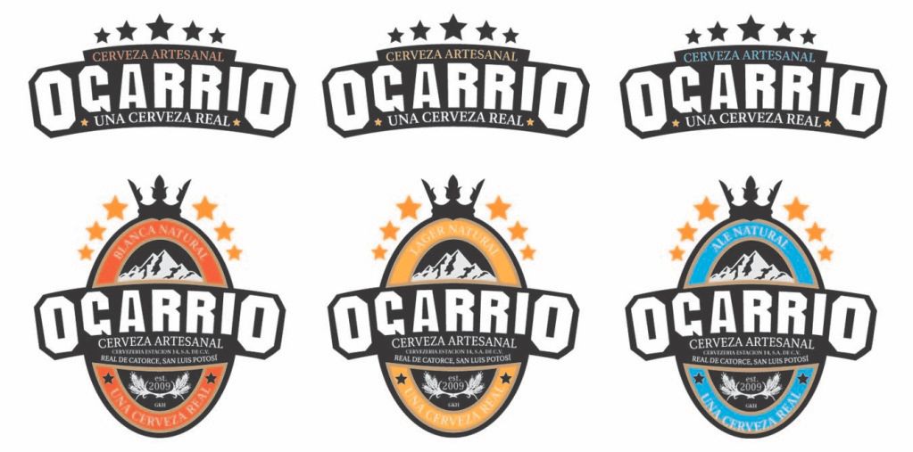
- the head on the cups illustration looks a lil funny. i'll take a case plzJG_LB
- very nice logos********
- I can't get past the A_salisae_
- The relationship with the G & A is rather strange, infact attached to the crest shape the type looks wrong IMO!!!uncle_helv
- yeah, i wish the A was as fat as the rest of the family. :-) other wise, not bad.akrokdesign
- second the fatter A. Also kerning and it looks like the R's need some rotation (very slight)Amicus
- it's mainly that I want to see a curve run smootly across the bottom of the G A RRI LettersAmicus
- Make the A biggerAnders


