Show some recent work
Show some recent work
- Started
- Last post
- 8,641 Responses
- dibec0
- stop being so goodjuhls
- lol. I am just a guy with a camera.dibec
- Good to know you have pieces up for sale. One of these days...juhls
- P.S. I think you have this one in your blog twice:
http://dibec.com/blo…juhls - it is. thank you.dibec
- What lens were you using on the double posted one?raf
- Canon 85mm 1.2 L. It's dead sharp, one of my fav lens.dibec
- Aargh.. my 50mm f/1.4 turns every light into flare in the opposite corner at night.raf
- very nice shotsikma
- Nice idea, nicely executed.slappy
- that looks great!theredmasque
- Desktop :)Iggyboo
- ********0
- that looks tasty.dibec
- Thanks. Do you think the logo/contact stuff works when floated at the bottom? I want the work to be the focus.********
- Logotype is still unconsidered.thizzbobby
- fryday0
- It's a rollover image made in flash. I thought it would show up on here but obviously u have to click on the link.fryday
- her neck becomes very dark, but still nice workBaskerviIle
- Dancer0
Almost pro bono job for a mate of mine – Wanted something different over the usual IT ident stuff:
(holding page)
http://www.abutcher.co.uk/- NicePPirate
- i like
thought the black text wasnt very legible thoWeLoveNoise - one the web yeah? I know. time of the essence, I designed the holding page he built itDancer
- nice********
- The barcode is scannable as wellDancer
- Dancer0
Website for a Gastro Pub local to me:
http://www.thewellingtonarms.com…
(first site built with EE)- You need to smarten up the fail page on the contact form, old boy.Nairn
- WeLoveNoise0
- like this. nice.Dancer
- +1poomoo
- very very niceMeeklo
- Nice, but that stock photo bothers me. Seen it too often.ETM
- not a fan of using istock stuff but unfortunately cud not find anything betterWeLoveNoise
- WeLoveNoise0
- still a working progressWeLoveNoise
- too much detail IMODancer
- i kno - had to reduce the little bits
you think the logo works well for the type of company ?WeLoveNoise - http://www.38one.com…typist
- never even seent hat mark typist u little tit wank so bugger off with ur accusaionsWeLoveNoise
- chill! i am saying you rip off
just showing example of arch film, you are asking the if the idea work for arch film...typist - i mean not saying you rip off...
sorrytypist - haha - sos man - got the wrong idea. man think i do need to chill tho cos its only mondayWeLoveNoise
- i think just S p a c e s Matter,
keep the typeface, and it's golden, motif may be not necessarytypist - nice idea - might work it thanks :)WeLoveNoise
- also, look for some geomatric texture paper stock, i will try just blind emboss S p a c e s , it gives double meaning to the logotypetypist
- yeh - my first idea was to do something with negative spaces on "spaces". but thought having the mark would help distinguish what the company did moreWeLoveNoise
- distinguish wat the company didWeLoveNoise
- needs a bit of work too illustrative. imoIggyboo
- this is been a bit redundant design - went down the route typist suggested :) cheers wuWeLoveNoise
- seansuth0
- keane?typist
- not working********
- http://twitpic.com/3…seansuth
- Meeklo0
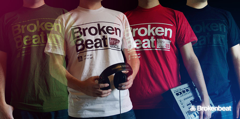
- the dudes are a bit "transparent".akrokdesign
- just like their intentionsMeeklo
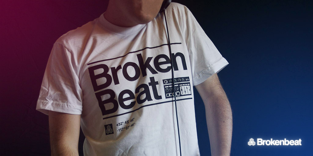
- nice! I'll take a white one .. Is that an mc303 i see?letterhead
- I like it.Iggyboo
- you are correct!
It cost me $800 waaay back in the day, today its worth nothingMeeklo
- ismith0
_______________________________
http://faktion.net/LSD.pdf
_______________________________
I feel kind of bad posting this because I really wasn't thinking about the design as I was making it, I literally did this in 4 hours including the information gathering and my shitty writing. I have so many more excuses but ah fuck, kill me now I deserve a little beating for this :)
- theredmasque0
"Fenrir (or Wolf Dragon No. 3)"
My take on the Norse mythological figure of Fenrir, who was a monstrous wolf, and eldest son of Loki, the trickster God,and a giantess. I made a kind of wolf/serpent hybrid.
The full size is 19" x 25".Detail:
Some in progress shots
Anyway, these are crappy photos of the artwork. The colors/details etc. look better in person. I just got a better camera the other day that I need to play with so hopefully once I get used to it I can start taking non-crap photos with it ;)
- ulven fenriserikjonsson
- i've seen several names for this figure. I guess that is the swedish or norwegian one?theredmasque
- Very Norse Myth. I actually got a book on all those myhs and read up on this character for a story/related to work...Iggyboo
- nice work.Iggyboo
- Thank you! I love reading all those old myths (whether celtic, norse or another culture).theredmasque
- Dude you are prolific.Dancer
- Thanks. Working on something else now. also now selling a bunch o prints & tshirts at lynnetteshelley.comtheredmasque
- wordsinyourmouth30
- nicejuhls
- solid man. i like the background elements.
Seems like a great job to land!baseline_shift - I hope they execute your design perfectly for their current site. Because its a total mess now.Iggyboo
- You should play with including a background advertisements system too.Iggyboo
- wordsinyourmouth30
whoops... accidentally double posted


