Business Card Help
- Started
- Last post
- 27 Responses
- Meeklo
So I got probably 27 cards left I need to make new ones, I want to keep it similar since I got a positive response on them:
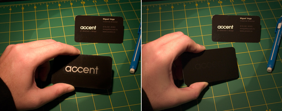
- Meeklo0

the back will be the same (spot uv)
the front maybe white. Thoughts?- I do not like the box around the logo on the white version.blaw
- you had to bring that up!
I'm not sure if I like it either..
but I like my logo on blackMeeklo - should I stay black on both sides?Meeklo
- I like black on both sides, as shown above. Very nice.blaw
- oh man.
Meeklo - I think there's too much letterspacing in the serif type. Looks a bit affected.AndyRoss
- the black on both sides would look great.Jaline
- readyok0
Looks fine. Why the rounded edges?
My typical response when people hand me a rounded business card is. "Hmmm, couldnt design something good enough to fit a hard edge card, and you are distracting me with these rounded corners?"
- readyok0
That sounded really cynical. Let me rephrase:
If you are going to use the rounded corners on the card, why not design a card that warrants rounded corners. It just seems like they are unnecessary?
- Corvo0
those are small, neat well-designed cards - and you know it. I don't see why you're posting your question which is not a question. Exactly as readyok said. If you're showing-off (now that's me who's saying it) you can go to bed - they're ok. Print some more. Why change what is good already?
- "showing-off" in a good way: "wanting appreciation". That's ok with me.Corvo
- thats why I stated I wanted a change remember?
the reason I'm in doubt is because I want them to look better not worse.Meeklo - better not worse
:)Meeklo - sorry, sometimes I forget words/phrases have not the same weight across. Anyway, those look great as it is.Corvo
- czawada0
Did you print those on Touché?
- I dont know what that is.
cardstock 12 pt?Meeklo - It's a type stock, has a suede/velvet texture to it. From the photo it looks though you used it. it's a great stock.czawada
- And would work really well with your design.czawada
- good tip
I think I know what you are talking about, it feels like a peach skin almost no?Meeklo - That's the one. There is also another one along the same lines called Curious Touch.czawada
- I dont know what that is.
- monNom0
I'm not big on the old-style numerals with a modern look like that. Otherwise very nice.
- Meeklo0
yeah, the corners is just a minor detail to me, I liked how it feels better than straight (to me at least) I could make something up like, well the connection with the client is stronger due to the fact that round edges might be perceived as more friendly and not so strict..
but I just like it better. If you guys think it suck then fudge it, straight it is.. no biggie ;)
- AndyRoss0
If you leave the corners sharp, people pick their teeth with them, and they get dog-eared.
Round corners, I think, to keep them handsome over a long period of pocket-time.
- former20
rounded edges look good to me. I agree about killing that hard edged rectangle - that's the part that doesn't seem right. Either make that have rounded edges too or make the text dark (I'd go with dark text).
Rounded edges seem to go with the "CC" too.
Nice and simple cards.
- subimage0
These are dope, where'd you get them printed - and did they do the round edges, or did you manually do them?
- sea_sea0
i like the original black on black. rounded looks good too. nice.
- Corvo0
overall, I think round corners show an attention to detail, and testify for a top-notch print-house - if they're free of that tiny half-millimetre cutter's bump that usually occurs between the curve's end and the straight line.
- Meeklo0
the dots on the u you use after a G and some other letter I dont remember now when you pronounce the U, in the case of miguel the U is silent. Maybe cause the G and the E are a bit fascist and have the U intimidated or possibly black mailed it with a polaroid of a naked ex-gf
- ü in G/Q in BR PT, where the u isn't silent. in PT PT u is silent after G/Q. That's why I asked, coz is spanish is Miquel.Corvo
- in PT is "meegéhl"; in BR without the dots would be Meegwell. they add the dots to silent the consonant.Corvo
- Vega is spanish, of course. Same for Veiga in pt, which means "valley" in both cases or, specific, "a hollow-ground".Corvo
- very good! you get an A+
or may I say "10"Meeklo
- Llyod0
I'd copy the first ones. They're really nice.
- Jaline0
I like the black/black, but 002 is nice too.
- Meeklo0
I kinda like number 2 better than 1...

