design thread
- Started
- Last post
- 181 Responses
- emukid
this is a thread in which I cut and paste stuff about design. if this doesn't appeal to you, please don't read it.
- emukid0
just kidding!
- vrmbr0
emukid
this is a thread in which I cut and paste stuff about design. if this doesn't appeal to you, please don't read it.
emukid
just kidding!
- ratbaggy0
where?
- ********0
- vrmbr0
Skip to main content
Welcome, vrmbr | Logout
Public Voice Network
Stay
Broadcast
design thread 33Sexiest Woman Alive 3535blog 1790817908*SF/NYC FRAUD* 133133The hungry thread 4040< Meeklo 1515Fred's Bread & Ja... 55Lost 215215best project management a... 1414THEFILTER 1010*New Fraud - Same Story* 99Foam Mag Redesign / Opini... 1111Wesley Snipes 44Laziest American thing 1919this is absurd 2727which came first ? 1616Polygamy case 7070Gorbie and Sapphire 4141NTPE??? 3737Pic of the Day 28872887need eyeglasses? 77awesome show last nite 1717Clinton thread 343343FMT 042308 4747
search?Next
design thread 33 Responses
Last post: 0 minutes ago | Thread started: Apr 24, 08, 3:48 p.m.RespondNew TopicDisable Images
emukid
this is a thread in which I cut and paste stuff about design. if this doesn't appeal to you, please don't read it.
Apr 24, 08, 3:48 p.m. – Permalinkemukid
just kidding!
piitb!!!
– emukid
emukid
okay seriously though, this is supposed to be a design thread.
vrmbr
emukid
this is a thread in which I cut and paste stuff about design. if this doesn't appeal to you, please don't read it.
emukid
just kidding!
that was cut and pasted
– vrmbr
RespondAll images larger than 450 pixels wide or tall will be auto-scaled.
Paste full URL to image, no HTML.
QBN supports free speech and moderates this board at the exact same time.
Family is everything: Krop Jobs, Vantageous Advertising, (mt) hosting.
© 1999-2008 QBN LLC.
Skip to main content
- emukid0
An invisible grid of parallel horizontal lines is used as a constant reference in the creation of a font. It resembles a musical score and its four (or five) horizontal lines represent, from top to bottom, the ascender line (the height of the highest ascender), which is sometimes equivalent to and sometimes higher than the ascent or capline (the height of the capital letters). Next comes the meanline or waist line (the height of a lowercase x), which can be referred to as a high waist line or a low waist line; the baseline (on which the letters appear to rest); and finally, at the very bottom, the descent, descender or beard line (the level to which the lowest descenders descend).
http://ilovetypography.com/2008/…
- ********0
This is a posh-post if I know one. Why don't you go join a design forum?
- emukid0
video that shows how the album sleeve actually works. worth checking out:
/- very cleversikma
- really good... amazingly detailed********
- who's album?designer4rent
- menomenaemukid
- some girls********
- wow. nice.cramdesign
- love "wet and rusting"bebelabree
- what is that strange plastic box it's in?Projectile
- emukid0
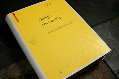
"Design Dictionary , as its name implies and as its subtitle, Perspectives on Design Terminology, elaborates is a comprehensive tome of more than 250 definitions extracted from the world of design, each written by one of the 110 contributors from around the globe. A truly impressive and unenviable effort, with a result that is nothing short of astounding."
http://www.underconsideration.co…
- ratbaggy0
hotness! this thread should be about design ... copied and pasted
- ********0
- LOL!********
- Ok now, why the strings?********
- internets enabled********
- it's a new apple shop!ShaunM
- LOL!
- ********0
- vnmbr0
- LOL?vnmbr
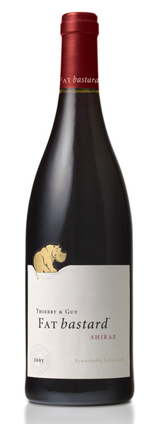
- that's a pretty nice labelemukid
- thats a good winemoamoa
- LOL********
- brilliant!akrokdesign
- great.chossy
- just picked up a bottle of that this weekend.bulletfactory
- cosmoo0
- http://www.levivanve…cosmoo
- holy shit that is amazingemukid
- I love this guy's stuff.anzelina
- Brilliant********
- yeah. awesomeakrokdesign
- Complexfruit0
- very nice!emukid
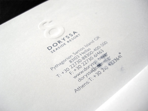
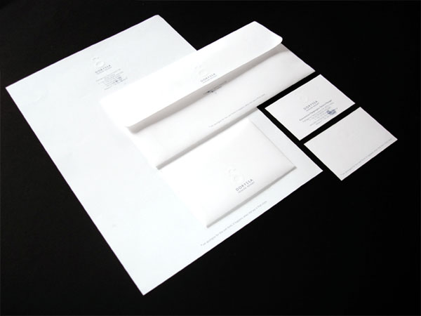
- Nice touch that. Good Detail. How did you get the client to agree to it?********
- sorry it's not my work roundabout, I liked the concept and just wanted to share itComplexfruit
- this is the studio that was responsible for it: http://www.mnpdesign…Complexfruit
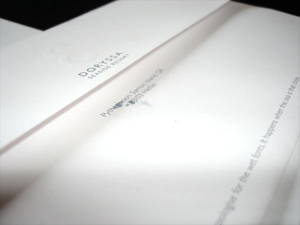
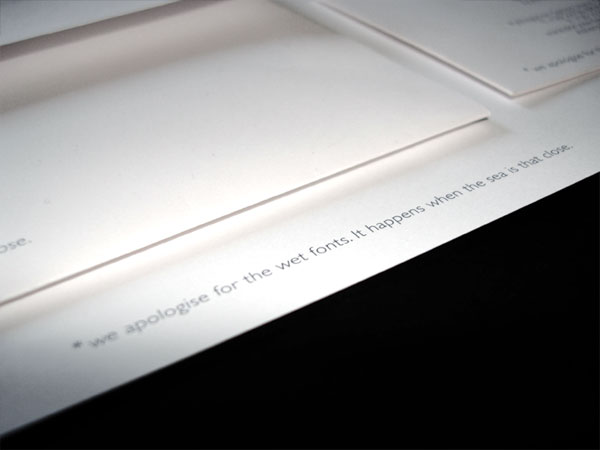
- They ruined it by putting the line at the end *sorry... blah blah blahDancer
- nah, doesn't do it for me. Trying to hard to be clever. They should've filled the envelopes with beach sandShaunM
- that might be how they got the client to agree to itOctober
- yeah i like but that ''sorry..blah blah'' line should have been tiny 6pt, way too obvious +imposing on the design.jimzyk


