Logo of the Day
Logo of the Day
- Started
- Last post
- 918 Responses
- utopian0
- for whom the bell tolls_niko
- Shittest. Shitter. Shit.MrT
- http://cdn.ebaumswor…********
- what MrT saidBen99
- utopian0
- hmmmaquito
- "Uber CEO Travis Kalanick personally helped design the new logo, and it shows"
http://www.theverge.…i_monk - lol is that really a quote? Why would anyone consider the CEO helping a good idea?sofakingback
- mrpt1
- hmmm, it's nice but it's kind of like well done on making the premier league look like every other trendy brand on the interwebs...********
- It's the kind of thing I'd whip up in ten minutes, because it's absolutely the most obvious and creativity free direction********
- My bollocks threaten to crawl back up inside my body when I think how much would have been paid for this.********
- Hakuna Matata********
- I think the lion looks pretty fantastic, but that type...yeesh.skwiotsmith
- I like the transition.i_monk
- way too generic. Old one was stronger_niko
- I agree the old one is stronger and has the feeling of tradition. Although this execution is good... just not as good as the original.sofakingback
- hmmm, it's nice but it's kind of like well done on making the premier league look like every other trendy brand on the interwebs...
- wagshaft1
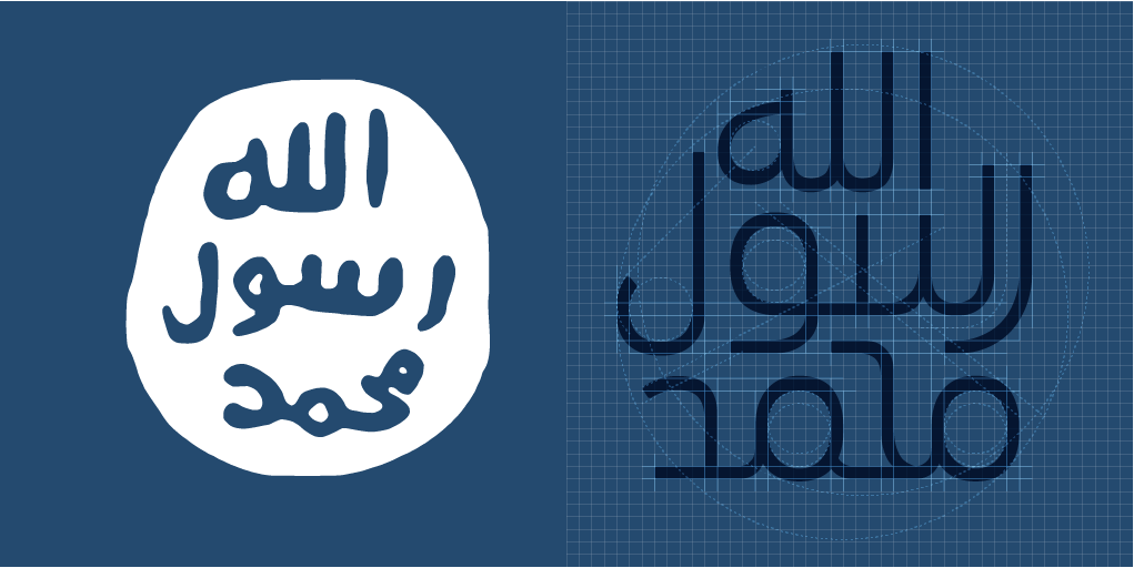
- I actually really like their current logo. Has an ancient coin feel to it.iCanHazQBN
- Allahu Akbarutopian
- iCanHaz, totally agreed.
Old one has more terror in it alsomaquito - It's like it was written in a puddle of blood with someone's finger. Plus looks very primitive. I think it totally works to represent ISIS.iCanHazQBN
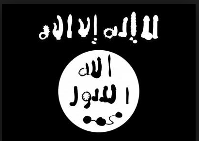
- aui
jawj
1010scarabin - should have settled on dick buttzenmasterfoo
- aUI
JgwJ
YOLOBennn - needs more drop shadows and bevel and emboss. and a flare or two. with metal effect.Bennn
- have to agree. their logo is pretty great.Gnash
- where in the logo are the fucking letters ISIS?dbloc
- Needs to be bigger.spunji
- all
jelly
loloface_melter
- imbecile6
- clever & well executedhotroddy
- Clever, but the logo and type are hard to read at a distance. Could be bolder and simplified more.bainbridge
- what bainbridge saidutopian
- the swan and big white ampersand are pretty legible from a distance.hotroddy
- Nice********
- Well executed, but there's a huge fatigue on X and X names for bars and restaurants.garbage
- Everything about it is great. Bravo to the designers.Krassy
- Does this exist or is it a logo pond mockup or something?_niko
- it took me a second look to actually see the word restaurant.utopian
- To clarify: the design is great, the idea is rotting in the back of the fridge.garbage
- It's just a pretend behance mockup. I love it though.HAYZ1LLLA
- Nice but it's another solution looking for a problem.MrT
- https://www.behance.…CygnusZero4
- I dont think this is an actual restaurant. Cant find anything at all for it. Probably made it up for his portfolio.CygnusZero4
- dead url from the business cards too http://theswanandmal…CygnusZero4
- You don't put tiny orange type on black and expect people to be able to read it. The details of the nostrils are lost among others. Poor execution.bainbridge
- SlashPeckham0
- +imbecile
- interestingutopian
- great markmonospaced
- Don't like. Its hard to read.desmo
- most of their viewers can't readtrue_cut
- don't need to read it, it's not meant to be read, it's a nice markmonospaced
- I am help but imagine that dog talking like Austin PowersmonNom
- I cant help but...monNom
- I digmoldero
- mrpt2
Sydney Opera House
Motion identity by Collider
- i_monk2
- Write them a letter, darkslateblue.detritus
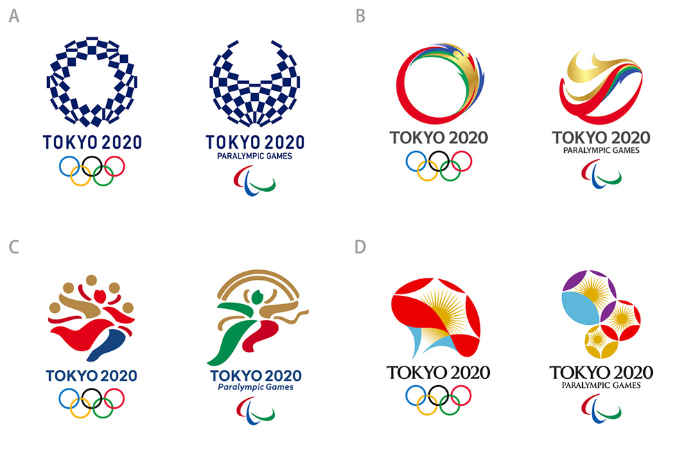
- Which one would be the outer circle the red one or the gold one?********
- C/o Opinions on the Tokyo 2020 Emblem Design
P.O. Box 132
Kanda Post Office
Tokyo 101-8791******** - Could you knock together a quick sketch to show us what you mean exactly?Ianbolton
- I like option DMaaku
- @darkslateblue I never said email.********
- Nor I. Good job, Orazal. Get writing, darkslateblue, tell them what they need to know!detritus
- ********1
- mastercard?Bluejam
- What? It's the Tokyo Olympics logo inspired by darkslateblue.********
- too gay********
- lolBluejam
- Master the moment!utopian
- lol @ setmonospaced
- Thank you for doing this. Saved me the trouble.iCanHazQBN
- LOLmoldero
- monospaced5
muted gradient version please, 3 different iterations at least
- detritus2
Holy heck, some of these are mind-blowingly good.
I love the subtlety of the considered execution - to the uninitiated they may scream "I have literally no idea what I'm doing, warghlbarghl!" but to the expert, to the nuanced and privileged few who are able to perceive and extract the deeply-considered minutiae in the creation, (which, let's face it, is the exact ethos of Japanese craftsmanship, so double kudoes to you!), these are perfect.
- i_monk2
This is Logo of the Day, not Show some recent work.
- mort_-3
- I love this programme.Morning_star
- Finestra is full tilt!********
- bottom one wins********


