Logo of the Day
Logo of the Day
- Started 17 years ago
- Last post 3 days ago
- 876 Responses
- neverscared0
- Digging this and the monogram BUT the rest of it feels kind of "meh", eh?ideaist
- The previous spirit of ecstasy silhouette was nicer. New logotype is better but still not particularly refined. The contour line graphic is generic/corporate.BaskerviIle
- neverscared0
- Nice colors but what is that?oey_oey
- Mutations because of Fukushima?_niko
- I'm having a hard time with the spacing between the text lines / big letters vertical alignment.maquito
- ^ yepoey_oey
- https://assets.rebel…dbloc
- @maquito I'm sure they'd have problems with how we align their alphabet as well =) How would I know what good leading or kerning looks like for Kanji...zarkonite
- Agree with maquito, the type feels at once too tight and too baggy. Especially the 2025BaskerviIle
- I would think it’d be easier to kern not knowing the language. I turn my type upside-down when I do my final tweakingGnash
- what the Coronavirus mutation will look like in 2025Krassy
- @zarkonite true! I'm sure I'd totally slay kanji characters with mo mercy... and it may result chaotic.maquito
- The turning chars upside down is a cool hack, Gnash.maquito
- There's something that defies the language gap, though. Block of text is unnaturally close to the icon. The white-space of the icon cries for more distance, imomaquito
- Expo 2025 looks almost mono but isn’t, which doesn’t help.MrT
- @ to be clear, maq, that’s not ‘my’ hack. I learned that at school :)Gnash
- +1 @gnashrenderedred
- I went to the last expo in Japan in 2005 in Aichi.. like, specifically flew to Japan for that .. it was awesome. missed out on seeing the Ghibli totoro houseautoflavour
- would probably go againautoflavour
- a blob it is afaikneverscared
- Bluejam-1
- That’s offensively shitsausages
- pure crapmilfhunter
- punches forgrotesk_neue
- Don't worry about it. The Games will have relocated out of LA, just like its populationMondoMorphic
- grafician-1
- Yeah, it's badgrafician
- Pentagram?formed
- I'm on this team and proud of the work we did on the rebrand. A lot has gone into not only the mark, but the entire design system.bulletfactory
- Obviously you can love it or hate it all you want.bulletfactory
- https://youtu.be/qCU…bulletfactory
- Well, why the i t and l are not the same height? We just "judge" it visually man, who knows the strategy behind it. Also gives a lot of LinkedIn vibes, you knowgrafician
- but you might trashed a lot more on that Brand New bloggrafician
- also the "e" needs to be a 1% bigger than the other letters, there are rules for rounded letters to pass the baseline so they don't look smaller, oh well...grafician
- also the entire branding looks like it's made for a consumer market, when in fact Intel profits come from the enterprise market and b2b sales, so I dunnografician
- rant over, enlighten us @bulletfactory with your design choices, so I can take my awful criticism back?grafician
- The different heights of the i, t and l irritate me, too.grotesk_neue
- it looks really inconsistent and amateurish.hans_glib
- cyan is now called "energy blue". great.sandpipe
- I'd assume the tittle doesn't align with the top of the t because it's a different colour so needs compensating for visually.Nairn
- I'd be surprised if the design team for one of the world's best-known brands hasn't thought about details that some rando design board member's irritated byNairn
- I can only imagine all the approvals needed to get to this, is there a design system case study somewhere?zarkonite
- reminds me of internet explorer with that e jumping out like it does. bullet's video shows a bunch of color schemes i like better than this particular one.sarahfailin
- grafician-2
- Totally agreen who the fuck chose that?grotesk_neue
- It's a more creative and unexpected solution, I give them that, great PR cuz of it, tumblr is full of stuff recreating that logografician
- all of these logos are available to download on freepik or shutterstockimbecile
- ^if you're mentioning the first 4 versions, sure, no doubtgrafician
- of the five, the elder god is by far the besthans_glib
- it's not like any of these are very strong... at least the eye elder god is trying to be something... as odd as it is.showpony
- sted0
- grafician1
All the logos from Cyberpunk 2077 recreated for download
- i_monk-1
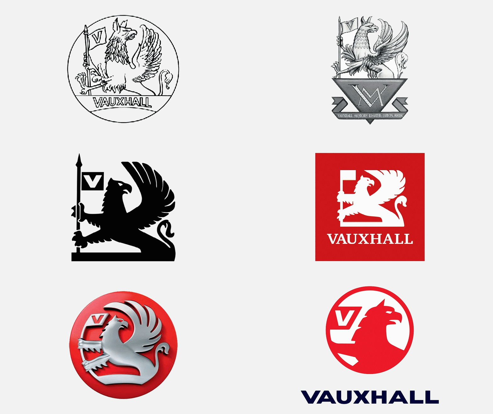
- Three steps earlier was a better flat logo, imo. Cropping out the wings is a mistake.i_monk
- Awful. not that it makes much difference - it's been a pointless sub-brand to GM and Opel for as long as I've been alive. Thoroughly unsexy.Nairn
- The griffin looks like he's turning his head in disgust at the flagBaskerviIle
- Agree 100% monk_niko
- Agree 101% monkdee-dubs
- Needs some detail in the body, too much red. Not that I care, when they’ve just copied Audi and Vauxhall’s are shit.calculator
- Griffin is like, "wut?"sarahfailin
- @Nairn. Pointless?
They sell more cars in the UK every year than Audi, Toyota, Renault, Peugeot, Volvo, Jaguar, Fiat, Nissan... I could go on...Hayzilla - So? As a BRAND it's basically just regurgitating Opel tech. I'm sure Vauxhall do sell well and make the DE owners lots - they're bland. People like bland.Nairn
- Oh, my bad - Opel's actually a French brand now, just like all the other car companies. Thank Goodness for French Gov't Protectionism.Nairn
- People love bland, but they want to think it's upmarket, quality stuff.i_monk
- The 3rd and 4th were the bestNBQ00
- And 5th too.NBQ00
- https://www.youtube.…garbage
- I just wish there were SOME indication of the wing, however minorscarabin
- Never understand opel > vauxhallisaca
- What is vauxhall?milfhunter
- The 2020 Mokka is pretty nice.utopian
- Vauxhall IS Opel you fool.
They rebadge them!Hayzilla - What the hell do you think a brand is, you fool?Nairn
- Cropping out the wings is always a mistake********
- fuck monk, I can't believe i missed your pun
https://i.gifer.com/…_niko
- PhanLo2
- I had to make an "e" icon like that D with different cuts, HARDEST THING IN THE WORLD TO PULL IT OFgrafician
- Clearly, because they didn't get the D right.MondoMorphic
- yikes!utopian
- grafician3
- For a HR firm ofc...grafician
- It's nice that. At my first job I had to redraw the early '90s Cellnet logo in Freehand 3.0, still gives me nightmares.MrT
- ^wooo dude! feel your pain!
Freehand was good tho' ripgrafician - I had a create an "O' affinity logo last year...what a pain in the ass. And then the client ended up selecting another logo.utopian
- Bluejam9
- An online encyclopaedia
of old Portuguese logos.
https://logosportugu…
via https://twitter.com/…Bluejam - Fantasticgarbage
- Saul Bass would be proud.ideaist
- An online encyclopaedia
- NBQ00-5
- pretty sure QBN in Cooper is the perfect logotype, it's like Coca Cola logo, nobody can do it better evergrafician
- But don’t you know Pentagram knows better?NBQ00
- BUT WE know better!@grafician
- https://www.urbandic…hans_glib
- https://quantumbusin…sted
- Projectile13
- It's not even 'aesthetics' it's overly-rigid brand cohesion.Nairn
- ^thisSimonFFM
- People sure have a lot of time and energy to complain about “free”. “Oh no! Gmail is worthless now that there is a new icon!”imbecile
- I was one of the people who whinged about the gmail icon change a couple of weeks back - purely because I thought it, and its loading anim, were pretty good.Nairn
- Its visually very bad, having all of them on one page on your phone isnt instinctive when you need to spot a specific app.Bennn
- I installed Nova launcher just to change themBennn
- exactly the comment i've made in the previous postmilfhunter
- It's too bad they are stuck with this horrible clownlike color scheme.yuekit
- It’s too bad people feel compelled to complain about global branding. Snapchat logo change caused the same fuss.imbecile
- ^ snapchat's a single logo. This is a whole suite that look identical at a glanceProjectile
- are you justifying your indignation? camera and calendar are somewhat similar, other than that, wholly different and not worth whining aboutimbecile
- They're not great, and they're not inspired, but if you fall into that last group you should take a cognition test to make sure everything is okay with you.ben_
- Is whinging about whingers any more useful?Nairn
- I find it much harder to quickly select the right tabs for Mail, Drive and Calendar now. Frustrating because we use it for work.monospaced
- not sure about whinging but I am sure this is still a design forum where designers discuss design-related things to dev as designers, agree it's 'overly-rigid'prophetone
- ^ exactly what Mono said. They should have worked more on color coding their app suite instead of using the same full palette for all icons.brandonp
- if you have to do a double or triple take to distinguish between these products, and still feels uncertain during the click then probably a little overbaked?prophetone
- I'm not whinging about you guys. I just find the graphic a bit hyperbolic. On my phone they seem easy enough to "get" what with the app name below and all ;)ben_
- Google Blows Ass!utopian
- that's true.ben_
- https://twitter.com/…prophetone
- THIS IS A DESIGN FORUM. WHINGE AWAY.inteliboy
- @ben_ if only we ONLY used phones. But in most cases, these icons live as 3mm icons in tabs that people need to access and reference regularly with a tiny arrowmonospaced
- also, easy enough is not good at all, considering it was EASIER before, and could have been further made easier. They went backward, dudermonospaced
- They remind me of plaiddbloc
- I like it better than adobe’s “initials” iconsscarabin

