Logo of the Day
- Started
- Last post
- 848 Responses
- grafician-3
This ridiculous discussions about these fucking logos...a meme really
but...reasons:
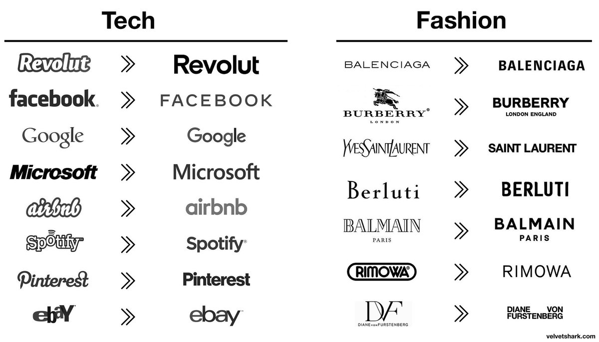
- Revolut going from a startup to a EU wide bank
- Facebook going from Zuck to Zuck under Sandberg
- Google going under Alphabet (and material fucking design)
- Microsoft going under Satya
- airbnb going worldwide
- spotify going global adding podcasts and shit
- pinterest rulling google images
- ebay dropping paypal and trying to still be relevantsame with all the fashion logos, almost all changes driven by changes of the owners, CDs, etc.
I might be mistaken, but all these were strategic, business decisions, then design decisions followed...
But then some idiots copy pasted these logos all together and called it a "trend" or something.
Oh well...
- Graphic design is nothing new for almost a decade and we still discussing this shit...grafician
- But yes...discuss™grafician
- The "Diane Von Furstenberg" logo is not bad at all.utopian
- You cannot scale without a sans serif logo
Discuss™grafician - https://cdn.neow.in/…Salarrue
- cleansing your logo of any character is the best illustration of how devoid of inspiration corporate life ishans_glib
- Legibility would be the trend, no? Some of these were just atrocious logos before (ebay??) Some did lose character, though, like Burberry.formed
- @formed yes, scale to other markets and the logo needs to adapt easily
And in the case of Burberry, the branding switched to their famous patterngrafician - When adobe makes font management so shitty in Illy, you just go with the same font for every client request...shapesalad
- "Yeah you need your logo updated? Remove anything that might trigger, sure, let me type that one out for you..., and ok, we're done, so that'll be $100k..."shapesalad
- wordmark ≠ logo
Most/all of the techs have an actual non-generic logo.i_monk - People like boring stuff. The cleaner the betterPhanLo
- The fact that so many companies made this move over the given time period is the definition of a trend.monospaced
- @shape, lol wut!? no.monospaced
- grafician-3
- Yeah, that's pretty boring. Guessing they all fell for the "well, it has to be legible on a small cell phone" and just followed the herd.formed
- The "architecture" is far worse, tho.formed
- The sans logo actually needed to be used on jewelry, so think extra smallgrafician
- whats the font tho?sarahfailin
- Probably custom ofc
But could be dafont.com too
You never know with Demna...grafician - beautifulHayoth
- grafician-3
- No. Also its like 5% chocolate 95% sugary trash.shapesalad
- no.oey_oey
- Sad is the fact that they changed the mountain symbol and now the bear inside is not visible anymore...grafician
- You can still see the bear, but the new Matterhorn is not as nicely resolved https://imgur.com/a/…MrT
- @MrT Oh just barelygrafician
- yeah it's a shame, but I do like the new packs and reintroduction of the old logo.MrT
- They're dropping "of switzerland" from the logo because it may be made elsewhere. I have only ever seen it in a triangular box, square box looks wrong.comicsans
- grafician1
For Sony retro logos and product shots:
- utopian-2
- I like the new oneMondoMorphic
- reminds me of couche-tard
https://c8.alamy.com…_niko - very angrybirds thosarahfailin
- obeseKrassy
- so it went from normal, to burnt, to high?shapesalad
- grafician-3
- More: https://www.creative…grafician
- iStockutopian
- they should have stopped at the 1920 one_niko
- besides the A+M monogram, it looks like a falcon in flight. just brilliant. the rest are all dog shit._niko
- woo Peter's learned to use illustrator and not just other people's images.MrT
- I'd still buy a One-77 if I was a bigger twat.MrT
- utopian-3
- utopian1
Cobb county school district halts distribution of new logo for East Side elementary school after condemnation on social media.
- jagara1
- KNKrassy
- it looks great on their vehicles_niko
- it's way too big on the vehicles.
"make the logo bigger" was at play . LOLKrassy - It's been quite a big rise for Kia over the years. Some of their latest models are tidy as hell. Vast improvement on brandingIanbolton
- KИwhatthefunk
- I like it. Certainly one of the better auto logos out there. Look at GM for fcks sake!formed
- KoreaИdbloc
- killed in actionzardoz
- worst logo on a cardoesnotexist
- ^ second worst behind CadillacKrassy
- https://cdn.motor1.c…
vs_niko - this https://www.autotrad…_niko
- utopian-2
- grafician5
- Always loved the logo and packaging/brandinggrafician
- This is a really good book: https://page-spread.…zardoz
- @zardoz Tnx, indeed!grafician
- sted0
ORF1 (former FS1) has been Austria´s number one TV channel since 1961. The mission of ORF 1 is simple: Broadcasting quality TV content for everyone. It was time for a new and confident take on a television identity based on new values and a clear vision. The main design principles are courage, clarity, versatility and zeitgeist.- I'm curious why they went with O and not Ö (Österreich), though. That's weird.Continuity
- Aaaah yeees, one of the low quality Bleed projectsgrafician
- What?sted
- fooler0
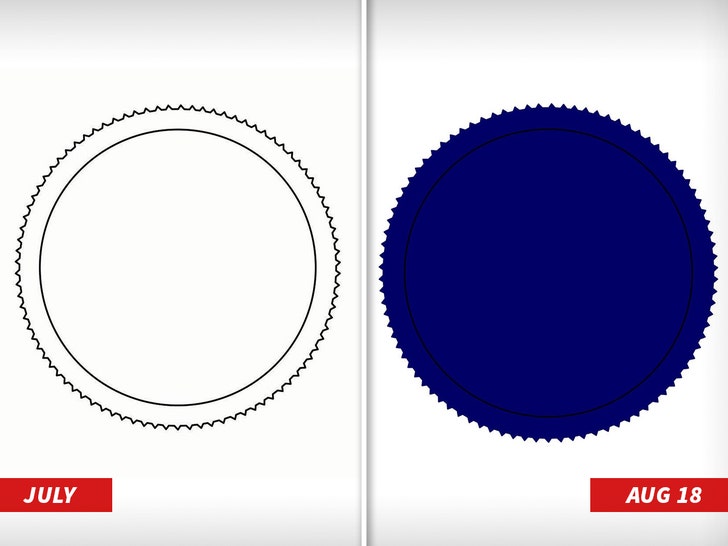
- what. a. knob.scruffics
- A bottle cap?i_monk
- probably something GAP relatedgrafician
- Clip Art...LOLutopian
- Maybe he's developing a new logo for Sealdbloc
- rimshot.wavpalimpsest
- Blue Reeses?stoplying
- It's a circular saw to cut off his own head.Nairn
- You know. For kids!monospaced
- lol monoMrT
- It is super similar no?nb
- lol @ monoYakuZoku
- bloke's a fuck knucklesab
- Diplomas are a growth business. The third world is coming into the middle classes.slappy
- Mattel?letterhead
- @mono great movieArchitectofFate
- grafician-1
- 1974 ahahhaahha AHAHAHAHHAHAsted
- Yes, still a good example (of timeless design).grafician
- Yes, still just bullshit and nothing to add.sted
- You're not a designer sted, this is not for you so move on.grafician
- Love this logo and identity.Chimp
- Yep a classic. When they were nationalised too before the free market sorted them out/fucked it all up.MrT


