Logo of the Day
- Started
- Last post
- 918 Responses
- i_monk1
- the typeface isn't doing it any favours but that logo is great._niko
- those mockups are horrible. only good thing about this is the symbolmilfhunter
- It's not mockups of the day is iti_monk
- symbol = clever intern willing to take the riskgrafician
- @i_monk A logo is more than a symbol..milfhunter
- A logo is not the mockups it appears on.i_monk
- A Symbol is made to be placed on objects to communicate.milfhunter
- The R-arrow is a nice mark. Not to be a cunt but, the arrow is indicating circumference not radius.microkorg
- The arrow literally indicates a cycle.i_monk
- Dickbutt.lnu
- grafician-9
- instagram is not transforming into Threads. those are 2 different appsmilfhunter
- threads is part of instagramgrafician
- https://media.tenor.…hydro74
- You can change the colour (and texture) of your X icon. it isn't fixed to black.microkorg
- utopian-1
- _niko2
- one more https://www.highsnob…_niko
- it has charactermilfhunter
- weakAQUTE
- Too lopsided without the numbers. The photography is classy.robthelad
- Chopsticks?sab
- whatthefunk-4
- Because the yoof can't read cursive?comicsans
- Harder to read now... smhnbq
- yawn.utopian
- Bad moveGnash
- Incredibly bad choicesarahfailin
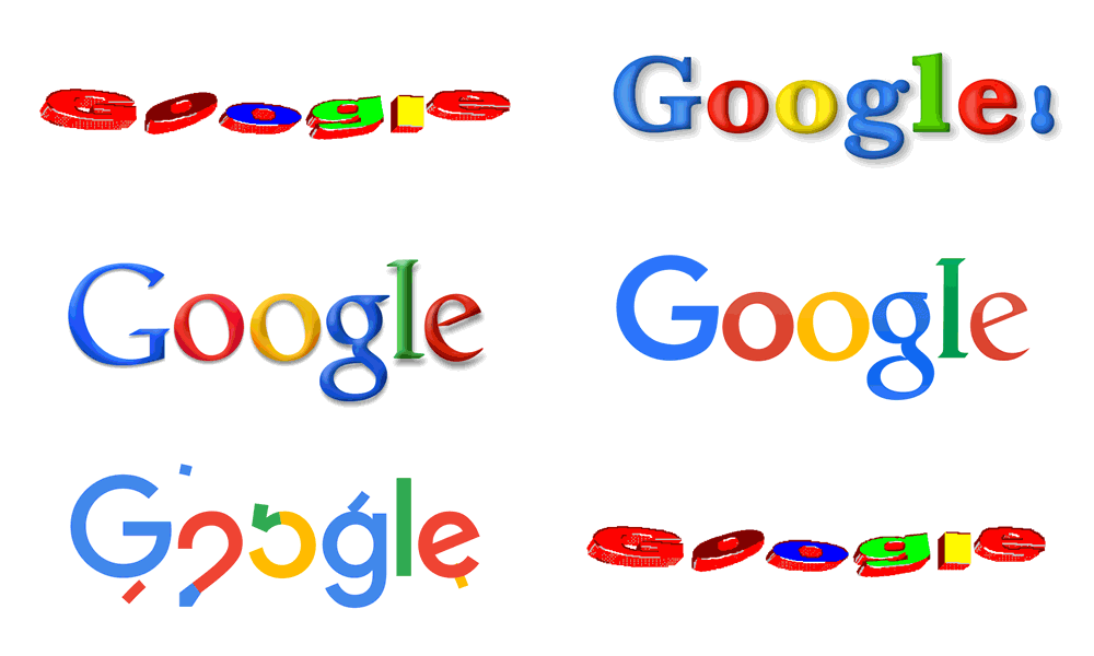
- way to make it less recognisable.
well done chaps, great use of company money!hans_glib - nopeYakuZoku
- what agency did this?
It must have taken monthsfuturefood - FAIL, I hope they FAILAQUTE
- Is that real? Damn. Their original is pretty timeless, new one is generic as can be.formed
- No.grafician
- i_monk4
- They nailed the search engine; that's for damn sure.ideaist
- For a while there yeah, but it's been kinda shit for a few years now. Quora has SEO'd garbage to the top of every search, Pinterest has ruined image search, andi_monk
- Google itself tries guessing what you meant when you search and fills the results with alternate suggestions unprompted.i_monk
- And you want to search for a product? Here's Amazon first, instead of the product's own page, useful reviews, etc.i_monk
- They nailed (monetizing) the search engine; THAT’s for damn sure.
; )ideaist - It’s now a monetizing enginescarabin
- they're good at monopolyMrT
- Prioritizing Reddit/Quora is relaly going to ruin searches. I don't put any validity in anything posted in either place.formed
- milfhunter0
- I guess it's supposed to be purple waveforms making a heart shape.
But why do I keep thinking of Batman?Continuity - https://www.deezer.c…
They use it like a system thingy.milfhunter - DEEZNUTS!!pango
- I don't get it. Looks like the CVS logo, blurred.formed
- Defaultgrafician
- Actually very trendy, fading
It works in motion, but nah overallgrafician - pango beat me to itYakuZoku
- AI prompts: morph michelin logo + a butterfly + a bunch of turds + an upside down galaga ship and make it all look pretty uglyKrassy
- I guess it's supposed to be purple waveforms making a heart shape.
- grafician0
- Pentagramgrafician
- IPO speculationsgrafician
- s: https://techcrunch.c…grafician
- utopian0
- tad bit badAQUTE
- trying to hard.milfhunter
- 92%?bezoar
- toosab
- tad bit tadbulletfactory
- dbloc6
- nice touchmilfhunter
- The British monarch is the head of state and the sovereign, but not the head of government. Weird Logo.robthelad
- https://insidegovuk.…Nairn
- It's kind of cute, but depressing that so much effort has to be deployed to feed some spoilt manchild's idle whim. Nice work by the gov.uk team thoughNairn
- Suitably opressive looking!mort_
- To steal a phrase from a better man, I will never understand why people tolerate these "six-toed, born to rule pony fuckers".garbage
- It was pathetic to watch American boomers weep when that old hag died last year. They do nothing but throw the UK's Disney Childrape Extravaganza.garbage
- I like the way they simplified the favicon.stewart
- Garbage coming in HOT! lolmort_
- is it 'cause monarch had boobs and now has a dick? why is the crown version different top to bottom?uan
- found the link ^ tnx@Nairnuan
- Disney what?monospaced
- The royal family and Disney have long ties, and they're both hollow entities that provide nothing of real value.garbage
- Also just last year Disney tried to fight DeSantis using the royal lives clause, specifically citing PC3 himself.garbage
- ideaist0
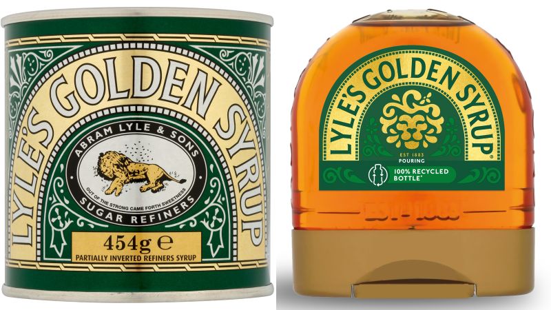
- fuckin ruined itmilfhunter
- i hope there sales go down hardmilfhunter
- Not familiar with the product, but that is just sad.monospaced
- the tins will keep the same logo and packagingkingsteven
- hydro740
- Love this logo. Any thoughts on how it was made? Glass Ripple?hydro74
- midjourney? (half joking half head in hands cus AI is taking over)GM278
- Signs you're getting old answer - photocopier or fax in good ol' Tomato or Carson style. I think they took it a bit far obliterating the N...MrT
- Otherwise, in Photoschlop, Filter > Displace using an external map file to mess shit up.MrT
- https://jmp.sh/Hz5GV…MrT
- makes sense. Thanks Thydro74
- PRO TIP: pull on the receipt at self checkoutAQUTE
- utopian0
Price List for Budget Logo Design in America (in USD):
DIY / Logo makers: $0 – $50
Logo template: $5 – $100
Logo Contests / Crowdsourcing: $299 – $1000Designing a Logo on a Mid-Range Budget in the USA (in USD):
Beginner Freelance designer: $50 – $100
Experienced Freelance designer: $500 – $5000
Renowned Freelance designer: $1000 – $10000+
Small Design Studio: $2000 – $10000
Mid-Sized Agency: $5000 – $1,4000+Logo Design at High-End Prices in the United States (in USD):
Big Branding Studios: $20,000 – $50,000
Top Branding Agency: $700,000 – $1,400,000+ (generally includes strategy & global brand identity)
Experienced Logo Designer: $2,800 – $11,200+- Mid range and upper don’t just design logos. At that tier it’s a whole system and implementation.monospaced
- milfhunter0
- *palimpsest busts a nutNairn
- I really don't get that random symbol. Also it gives me Asics vibes.milfhunter
- quoi!omer
- what is the icon supposed to be?dbloc
- cool clipart symbolutopian
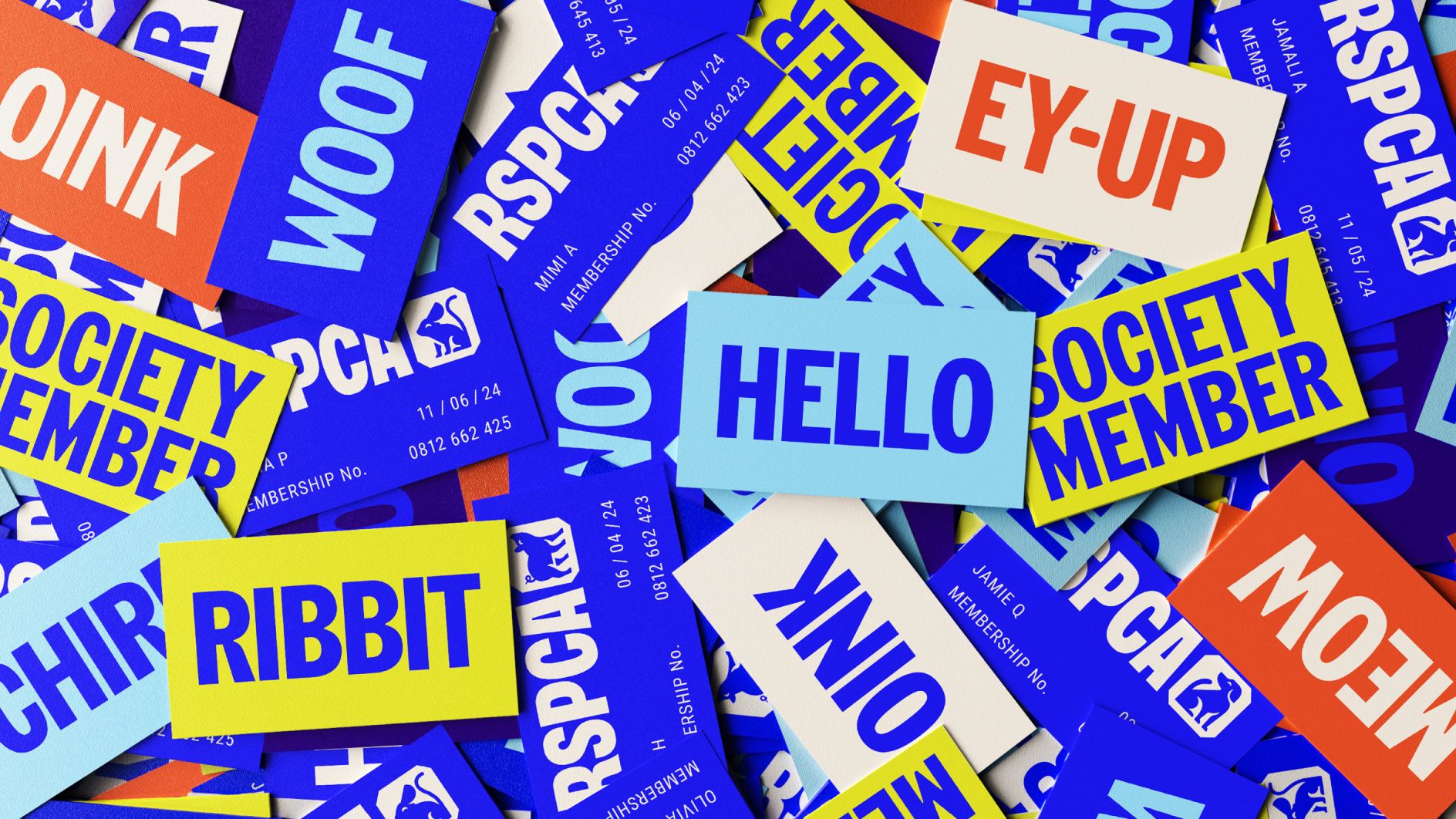
- https://wolffolins.c…dmay
- I'd love to know how much Wolff Olins charged for this.Continuity
- Also, that they managed to make that CA ... err ... ligature(?) look even worse than it did on the old logo is astonishing. That's talent I really don't have.Continuity
- the lettering is much better, the icon... well, it's usable and distinct enough to use across all the products they havedmay
- Logo of the Day shows it without context; meh.
Wolff Olins over contextualizes it, BUT man it looks good!ideaist - that will be 895,734.76$
Our team worked very hard in the last 6 months to bring your logo to the next level.HAL9001 - I think it's smart to have a "mark" that you can use without the type. Clip art or not, it works well on their clothing and on tiny applications.monospaced
- It evokes movement, it's like a D, it locks up nice. Don't need to read too much into it beyond that.monospaced
- Pecathalon.Nairn
- Weird forced ligature that looks like C4bulletfactory
- ^ For whatever reason, that CA ligature thingy reminds me of a dog lifting its leg up to piss on something.Continuity
- The icon is the P for decathlonimbecile
- The selected blue color is not working, previous was way more "positive" than the new. The new logo looks like the LADA of clothing...OBBTKN
- Taking into account the price increase that their products have experienced lately... This is not going to help them to sale moreOBBTKN
- The icon makes sense in that it is reminiscent of the CA ligature, although that could be pushed harder. Very useful to have something small for buttons and >>skinny_puppy
- >> other small touches. I liked the old font though has character, the new one is ... dull. They could just have tweaked the original lettering.skinny_puppy
- @cont Like a lone elephant washing itself with the self-knowledge that it is a dying species, because it fits in with nothing that surrounds it.garbage
- The new font is boring, generic. The icon looks like a random korean or chinese car company. The old color is also way better. Don't get it.sandpipe
- I do not approve.
I agree with sandpipe, the old color is the best thing they had.palimpsest - The tension between the top right of the C and the A makes me very uncomfortable.maquito
- We want it to have movement, so italicise the ligature.
More.
No like they did in the 90s.
PerfectionProjectile
- sted1
- The fuck is a ciejej?milfhunter
- bundes nachrichten dienstneverscared
- the wifi under the wings symbol is scary.
I like the punk one better
https://i.imgur.com/…uan - an improvementutopian
- Shouldn't it say BIRD not BND? ;)sab
- or BOND :)uan
- This kind of German crest imagery always has bad connotations for me personally.HAYZ1LLLA
- neverscared3
‘These people are ignorant’: the designer facing death threats for his Portugal government logo
Eduardo Aires’s innocuous-seeming branding has become a ‘projectile weapon’ for rightwing leaders – who have manufactured ‘patriotic’ outrage into real political power- wow so much woke...neverscared
- fuck that bauhaus shit...neverscared
- That new branding is great!sab


