Logo of the Day
- Started
- Last post
- 824 Responses
- ORAZAL1

I would make the gold color warmer and bring the circles together to symbolize unity.- mastercard?Bluejam
- What? It's the Tokyo Olympics logo inspired by darkslateblue.ORAZAL
- too gayset
- lolBluejam
- Master the moment!utopian
- lol @ setmonospaced
- Thank you for doing this. Saved me the trouble.iCanHazQBN
- LOLmoldero
- grafician5

- Always loved the logo and packaging/brandinggrafician
- This is a really good book: https://page-spread.…zardoz
- @zardoz Tnx, indeed!grafician
- grafician0

- Niiice, took me a second, haharobthelad
- Nice, well donejagara
- ahh no way_niko
- I don’t get itnb
- It looks like a tire. if you change the color of the t...sarahfailin
- i don't get otkingsteven
- Oh a tirenb
- Well I never. Nice.
They could have probably done similar with the ee too.Hayzilla
- detritus1
Just saw this in a photo and quite liked it..

- Terrible "logo".
Is that Australia?freedom - well, it worked that well at least.detritus
- Looks like an anus, is that why you like it?pinkfloyd
- I am disappointset
- Just in case it's not obvious what it's representing .. http://www.extremete…detritus
- Bad.bainbridge
- serious, dude? looks like my anus after eating spaghetti.iCanHazQBN
- No Tasmania? They'll be furious!emphor
- 'Bad' hahah.
Ok.detritus
- Terrible "logo".
- PhanLo2
Initial ASICS proposals by Herb Lubalin, 1977
-
round 2

- Round 1 first row #2 for me_niko
- although I also love something like row 2, #2 but not sure it would translate to shoes/athletic wear_niko
- they really went for the worst one twicekingsteven
- i like 3 / 3 " asks" and 4 / 3 is funAQUTE
- Just needs a 'b' at the front to make senseshapesalad
- A lot of 70s logos buck the trend of horrible excess in every other aspect of life at the time.CyBrainX
- nb0

Holyshit
- Medics for Ho's?oey_oey
- A little cream will sort out that chafingPhanLo
- Sup Home Dicdbloc
- Homie Don't Play Dics®utopian
- Ho medics come over and treat your ailmentsnb
- Just don't make the mistake of calling Home Dics like I didnb
- Ho Me DicsChimp
- Vertical scale amateurs. MrsT's got their heated back massager though and it's damn good.MrT
- shapesalad0
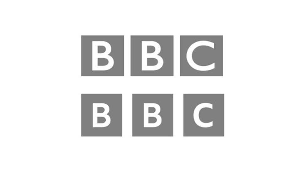
Micro changes. The theme for new logos of 2021.
- font changedbloc
- Geniusutopian
- With smaller letters, they needed to bring the rectangles closer, not even more far apart. Now it looks like 3 rectangles instead of one split in 3!grafician
- ^ I tend to agree...at least they should have kept the distance. but hey maybe it's actually worse than one thinks it would look likeoey_oey
- ^at small sizes the new one is unrecognisable while the old one is still somethinggrafician
- Apparently it already made a big "impact": https://www.creative…grafician
- Isn't bashing the beeb the thing to do now anyway? Rotten timing...MrT
- they fit better in the squares nowmonospaced
- Same same differentChimp
- oey_oey0

- not a great update.milfhunter
- Client: You got rid of the FC, now we have no Idea what they do!Hayzilla
- Horrible.Hayzilla
- The original light blue would have looked nicer. That blue is gross.Hayzilla
- IMOoey_oey
- Made by Mirko https://www.instagra…grafician
- what's OTIT?Krassy
- ^oey_oey!Nairn
- There’s a missed opportunity here to have parallel lines in the “m” to go with the “I” and make the letters blue on a black background to visually tie it in to_niko
- Their famous black and blue stripped kit._niko
- Their famous black and blue stripped kit._niko
- And this new thing of i m denoting both inter Milan and I’m as a rallying cry for a new generation of fans is sort of weak and doesn’t speak to Italians._niko
- Ramanisky20
Saw this one on Twitter ... well done

- nice! needs a crownbezoar
- if it only had a crown, yeah.ben_
- the K stands for "Know what's between the buns?"Krassy
- doesn't look like a burger at alloey_oey
- ^ that too ! lolKrassy
- Yeah was my favourite of the tear sheet of ideas too, some other decent options with crowns too but in the end the original retro logo was prob best_niko
- missing a few teethdbloc
- 3 burgers ... KKKmicrokorg
- 7point344

- LOLutopian2
- LOL It was a classic before you even closed the PSD.dog_opus
- LOLiCanHasQBN
- <3 her.ohhhhhsnap
- grafician3

- ooh.
.
oh! it animates too, haha.Nairn - Love thisdbloc
- "Practice safe design, use a con...cept"grafician
- That's quite nice.grotesk_neue
- ooh.
- Projectile0
I've posted this before but I love it

- Ned?dbloc
- :Edeldelesc
- http://www.toxel.com…utopian
- N = EDmonospaced
- N EDsem
- the sideways space invader action is distracting because it's a non shapecanoe
- total fail.fadein11
- are you guys pretenting to be stupid?Projectile
- grafician0

"Today, we have some very special news regarding the evolution of our company.
ZEIT is now Vercel. This new identity aligns with our new focus — to provide the ultimate workflow for developing, previewing, and shipping Jamstack sites.
Towards that goal, we are thrilled to also announce that we secured $21M in Series A funding. "https://vercel.com/blog/zeit-is-…
-
Behold!A startup with 20 mil in the bank can't pay a logo designer to make for them a proper logo, so they rebranded to a BLACK TRIANGLE that's not even own-able, not to mention can't be trademarked...
- Probably done by a developer, as obv they can't center shit...grafician
- https://www.fratelli…Nairn
- so basicdbloc
- The v is upside-downGnash
- "to provide the ultimate workflow for developing, previewing, and shipping Jamstack sites." LOGO IS PERFECT.nb
- https://i.imgur.com/…utopian
- Maybe overreacted, yeah...grafician
- ZEIT was great, Vercel is lameESKEMA
- i_monk0
- Needed bad tracking to make it work.Gnash
- ha - the connection's slow here so it paused whilst loading half way through, so I thought THAT was what I was looking for. But no, it's a png...Nairn
- good idea thoughnbq
- Tasteful.ideaist
- y - i
very cool!Krassy - That's a really wonderful wordmark, actually.Continuity
- Not Terrible.stoplying
- i_monk0

Elijah Wood's Woodshed film production company


