Company logos
Company logos
- Started
- Last post
- 52 Responses
- thelukeandrews0
- scotch is ok i guess... and maybe canon.. but the rest.. ewwthelukeandrews
- waterhouse0
not by most means a "huge" company, but:

- kalkal0
A lot of replies have noted how successfully recognisable logos posted have been but the original question was "What huge companies do you believe have horrible logos?"
You can't get a huge company that doesn't have a well recognised logo so we're purely looking at aesthetics here, right?
- Jaline0
more!
- TheBIueOne0
Always hated this:

- my teachers are always bragging about how great this is.bebelabree
- I think it was a good idea, but boringly executed, with some very strange negative space within itAmicus
- I don't mind this logo!phatlee
- bebelabree0

maybe the blockbuster one doesn't look so bad here, but I don't like it when it glows bright as I drive by. It's simple but I hate how trapped it is.- it does have a unique shape that is very easily recognisableAmicus
- armsbottomer0

- i'm ashamed that they're my service provider.armsbottomer
- oh yeah I hate em!bebelabree
- Horrible.Jaline
- kalkal0
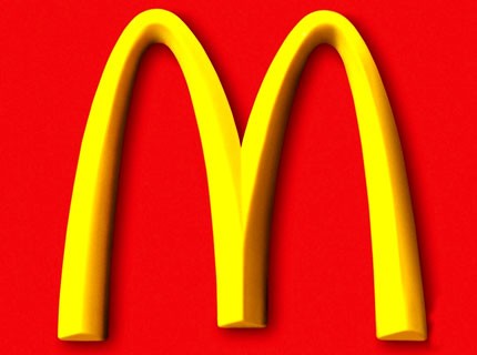
- Disagree. I hate McD's, but you couldn't ask for a better, simpler, more recognizable logo.joeth
- When a logo can mean the same thing w/o words, it's incredibly powerful. There aren't many. Nike and Apple are a couple others.joeth
- Yah, agreed. Hate McDevil's, but the french fry implication is low and high interpretation and is major win.dMullins
- I'd be surprised if McDevil's EVER rebranded, to be honest.dMullins
- No, this one won't change any time soon.Jaline
- the bottom of the right stem has something funky going on...Amicus
- Disagree - Golden Arches - a classic
AVAVA - Yes, this works. Splendid job.doctor
- kalkal0

OK, thats the last of the computer component makes I'm posting, they're way too easy
- GrandChamp0
Sports brands should not be held to lower standards than corps

- Jaline0
OK, I think I'm going to focus on the eBay logo and explain why it's bad. I'm not sure if one would keep the colour scheme in-tact while designing new concepts for it. Maybe you'd include various concepts within a mock-up file anyway.
- joeth0

- so squishyAntonelli
- i kind of liked this one.. especially the middle form.. reminds me of erosion/stone/nature...janne76
- This is the most terrible poo in the room.lifterBARON
- "zaney"showpony