6 Typefaces
- Started
- Last post
- 13 Responses
- Meeklo
In between all the penis and Spam, I thought it would be a good idea to start another design thread. Lets keep it clean, civilized, no insults, no nudes, no penis.
So here we go!
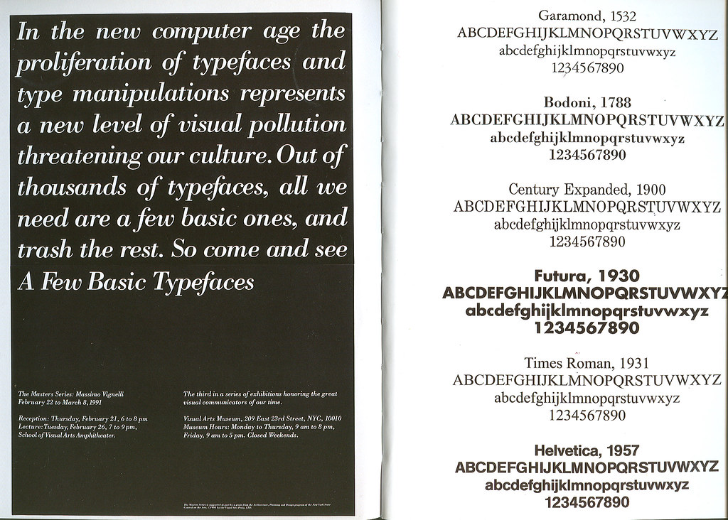
I 'm currently reading A to Z by Vignelli, very similar to what you'll find on the recently posted Vignelli Canon http://www.vignelli.com/canon.pd…
In both, he says:
What are your thoughts on having a small selection of typefaces for every project you work on?
- monospaced0

- oops, did I fuck up this thread?monospaced
- fucking retard.tank02
- onewhoslaps0
seems limiting, but would probably force better design.
- morilla0
I think it is a great idea. I usually do that until I burn them out, then I start looking for another set.
- monospaced0
In all honesty, keeping your type selections down to a minimum is a great practice for all designers. It gives them time to "master" how each is used, and then eventually they can move on to new typefaces.
- +1janne76
- have you been reading bringhurst, sir?tank02
- no, I haven'tmonospaced
- johndiggity0
it'd be pretty boring if we all used the same 6 typefaces.
- set0
I have basically adopted this practice and never really realised it. I use an odd font every once in a while but I certainly do have a basic set of fonts that I always use.
Monospace you waste of space retard, god damn.
- Although its a good few more than 6set
- oh, set, you cunt.
what would we do without you?monospaced
- al_la0
Garamont, Bodoni, Century Expanded, Times... woo hoo!
- Meeklo0
Initially I was going to say not only that I would get bored, but that it would be hard to incorporate them into different projects, Lets say a furniture catalog vs an ad for motocross company.
But I never considered on moving between sets. so put together sets of 4/6 faces and move on to the next when I get bored.
I actually (like the majority I would guess) have my favorites and use them differently on different projects, but I never though of making a rule about only using 6 or something like that.
- I think the rule is flexible, but good if you find yourself wasting time going through your type library.monospaced
- magnificent_ruin0
I agree in the sense that I think it's not the typeface so much as how you use it
- play0
Don't think that works so well with different types of packaging. wouldn't want to buy some bubble gum with a package set in futura, right?
- agreemagnificent_ruin
- if I saw bubble gum packaging set in Futura, I would buy it immediately!monospaced
- I would shoot it immediately!gramme
- gramme0
I agree 100% with Rand that good typography is all about how fonts are used.
That being said, I think a quiver of only six typefaces for most work is very limiting. I didn't see any script faces in his arsenal, nor do I see any humanist faces. I think 10–12 is more reasonable. I personally don't even like half of Vignelli's standards, but that's just me. I think I could do just about any project with the following faces, in no particular order:
Helvetica Neue
Gotham
Franklin Gothic
Minion
Garamond Premier Pro
Baskerville
Mercury
Bauer Bodoni
Serifa
Bickham Script- Add TheSans and TheAntiqua to that list for a humanists sans and a contemporary slab serif.gramme
- he is a bit on the conservative side though..Meeklo
- Oh and Avenir Next. So that makes it 13 staples for me.gramme
- well that's the thing Meeklo, his work is almost always very good, but his palette is a bit too narrow imho.gramme
- The same small set of fonts and colors does not work so well for every client or project.gramme
- I agree w youMeeklo
- gramme0
A better rule of thumb would be to pick at least one typeface in these major categories, and become fully proficient in working with them:
Classic Grotesque (Helvetica, Franklin or Gotham)
Contemporary Grotesque (Avenir Next)
Humanist Sans (TheSans)
Garalde (Garamond)
Venetian (Minion)
English or Scotch Transitional/Roman (Caslon, Baskerville, Miller)
Fleischman (Mercury, Farnham)
Bodoni (Bauer Bodoni, Didot)
Modern Slab Serif (Serifa)
Script (Bickham, Sloop, etc.)- *the fact that Avenir Next has small caps & OSF makes it contemporary in my mind.gramme
- I love type with OSFs and small caps.monospaced
- Pupsipu0
it would certainly help the mess of thousands of shitty typefaces in giant font folders that are impossible to browse through. I see it as a usability problem for the designer, he has no practical way of learning to use even thirty fonts properly.
- that about sums it upmonospaced
- I have probably 20 fonts that added 10 years ago, and I will never use again, ever..Meeklo