Pic of the day - DESIGN
Pic of the day - DESIGN
- Started 16 years ago
- Last post 13 days ago
- 1,467 Responses
- PhanLo3
- Dude nice!GuyFawkes
- Great link. Also lol:
https://64.media.tum…garbage - Love this site. Nice reminder it exists!uan
- Remember those days when doing something official and it "must be on letterhead paper" wow the security of that. many wows.shapesalad
- That just reminded me of The Daily Heller from Printmag.com He's always posting vintage letterheads.CyBrainX
- Wolfboy6
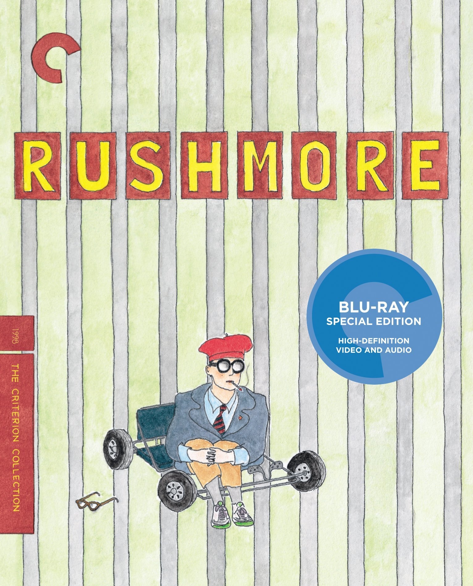
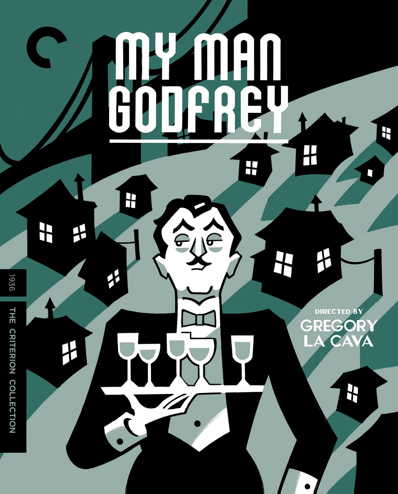
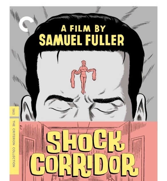
- “Let’s save money and ask the director’s brother if he can draw the covers?”********
- Jk about saving money. These are great. But it’s less “Design” and more Eric Anderson’s illustration as default.********
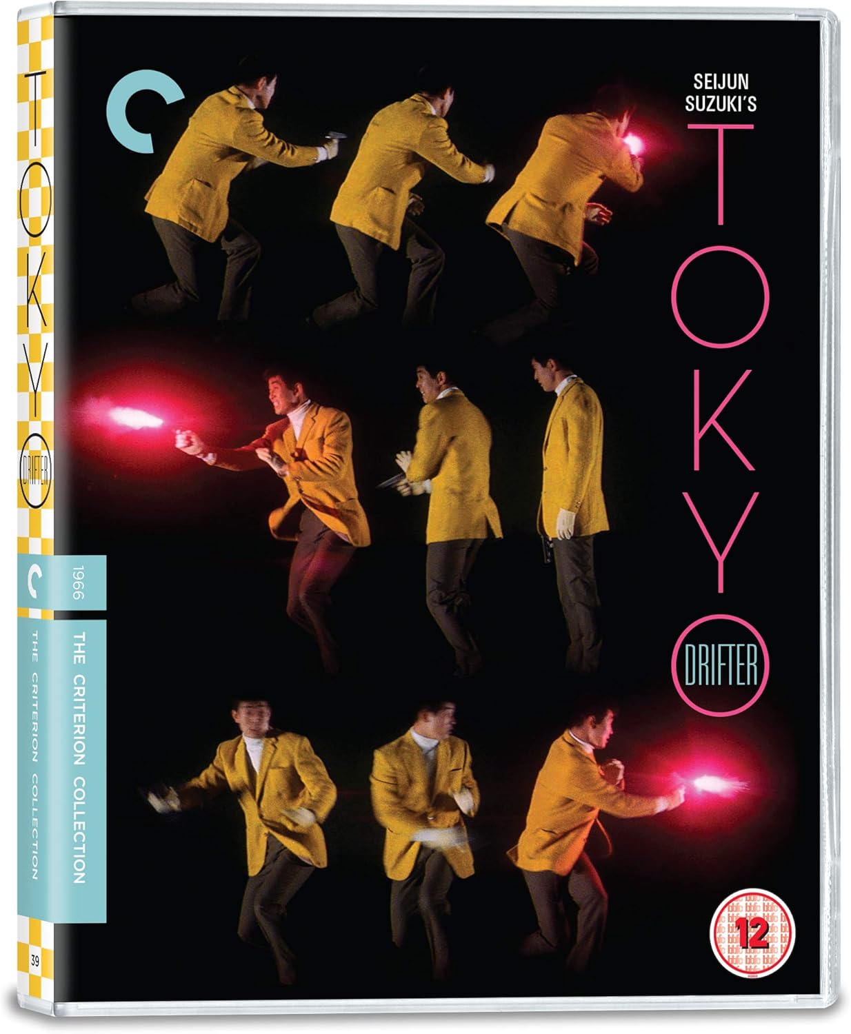
- Maybe it's not just 'Design' but it's definitely more than just the illustrations. It's 'Pic of the day - ART DIRECTION'. I should have started a new thread.Wolfboy
- This is fine.********
- Oh, I didn’t mean to suggest you shouldn’t have posted it! These are dope!********
- No, I didn’t think thats what you were saying. My point (and I didn’t say it very well) is that Criterion look at all aspects of their releases and someone...Wolfboy
- made a great decision on hiring him across the range. The booklets that come in the cases are really nice too.Wolfboy
- “Let’s save money and ask the director’s brother if he can draw the covers?”


