complimentary font?
- Started
- Last post
- 28 Responses
- Tali
What would be a good complimentary typeface to the typeface Elan?
- Antonelli0
depends, are you using this one for headlines or the body copy?
- Tali0
both! plus print and on-air design but mostly on-air
- Tali0
why rotis or futura? i suck at typefaces thats why i need your help but i imagine my boss would want to know why these fonts would work as a compliment. :-D
- typist0
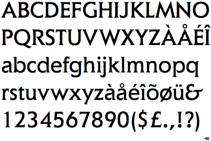
elan is a serif typeface, so i would choose a sans serif to pair up with it, the basic shapes are close of both, except the G and a, and futura has a huge family to cope with print and screen use
- Tali0
is that the secret to pairing fonts? they're suppose to have similar proportions?
- 7point340
yes and no.
it's not an exact science, though some would have you believe it to be. a lot of it comes from trial and error and seeing what looks appealing to you and the viewer. proportions are a good bit of design in general, aren't they?
- 7point340
proportions are a very general term anyway. you would probably look at x-height, stroke-width, ascender and descender length, maybe cap-height, stress, and what period/style it is from/modeled after.
and again, it would all come down to your eye and what you feel is the best fit.
- Tali0
yes, but sometimes conflicting or drastically different proportions are equally as pleasing. I have a hard time figuring out what looks good with typefaces. I tent to go for two that are very different than two that are similar. is that wrong?
- Tali0
what are some other fonts that would be a good compliment?
- Tali0
what are some other fonts that would be a good compliment?
- Tali0
what are some other fonts that would be a good compliment?
- Tali0
woops sorry- multiple posts
- ribit0
- fighting for literacy, one thread at a time...ribit
- well its a good thing i'm a designer and not a writer. you, however, may want to switch professions.Tali
- I'm stuck doing both already.ribit
- recently had someone try and correct this fubar about 4 times. I asked them to please check the dictionary. Why do illiterates try to proofread?Amicus
- Why do illiterates try and proofread?Amicus
- Mau0
I prefer two complete different faces... but as mentioned before the propositions are not unimportant... try and look...
btw: I don´t think that typefaces like Elan or Fritz Quadrata are good for any kind of body copy... too loud...
- Knuckleberry0
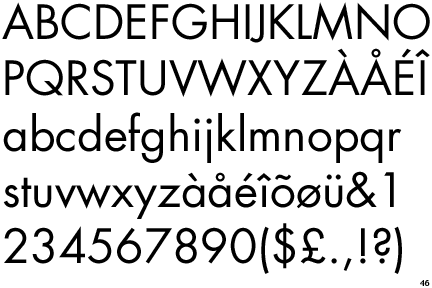
I was thinking avenir.
- forcetwelve0
as it's got a lot of character, you will need to compliment it subtly. i'd prob use Elan for your headers/titles, and then a more straight forward sans as body copy. Try something clean like Avenir as suggested above, helvetica, univers, or a grotesque.
- Benton SansMau
- +1forcetwelve
- or gotham / gotham condensed.forcetwelve
- Tali0
yeah, i didn't choose Elan. the logo was designed by someone else and i'm charged with the task of designing around it
- Mau0
could work