Guitar Hero Logo
- Started
- Last post
- 12 Responses
- fiesta0
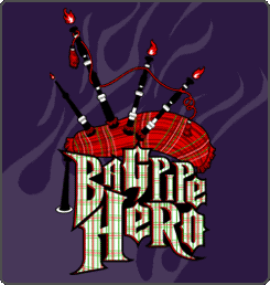
Font works fine for Guitar Hero seen as it looks like a metal band font, but DJ Hero?
Trying to tie things together that should have been left apart.
- Not_Just_Another0

^ Are they serious? all this needs now is a space wolf...
- jimbojones0
the left foot of the H is stupid, why is it flat
- Invalid0
The new set of logos are an improvement IMHO. However, the stylised visuals look like they've applied a bunch of photoshop filters. Revolting.
- jimbojones0
Can't say it's better now, it's more static, the old GH collision was somehow more... rocking. Cool thing with DIN, hate the G and Q though. And the fire visuals are fucking hideous
- utopian0
I wonder what it cost to develop/modify a typeface for the game?
- attach spikes to FF DIN A-Z: $50
delete other 3400 glyphs: $2000jimbojones
- attach spikes to FF DIN A-Z: $50
- Palindrome0
I have to say, this is not bad, although its a modified version of DIN:

- Andy_ssw0
Rock on i say.
- Point50
I bet someone was banging their head on a desk to figure out how to cradle that D into the the top of the O in that BAND HERO logo.

“After considering changes that ranged from imperceptible to unrecognizable, Pentagram redrew the original Guitar Hero logotype, adjusting some of its more aggressively odd features to enable accurate reproduction at a variety of scales and in media from digital animations to temporary (or permanent) tattoos. In addition, the new logotype serves as a basis of an extendable system, unifying the presentation of Guitar Hero, Band Hero, and DJ Hero in a consistent brand architecture.”
- Point50
new:

- so they nested the letters a bit tighter and more uniformly; kept a more consistent weight.Point5
- our mate Hubb7 did it:
http://www.hubb7desi…Shaney - is that a joke site? brilliant if it is. If not...ThePublics
- notShaney
- Point50
well, can't say it's really better, but it is changed

- Palindrome
How did Pentagram make the logo better?