design a typeface 2009
- Started
- Last post
- 629 Responses
- jimzy0
we're all very naughty...
- ItalianStallion0
Number 2 - Version 1A/B
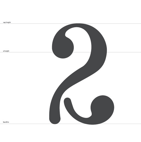
Just a concept, need some fix on line weight smoothness...
- looks good..neue75_bold
- pfowh thats niceRavdyk
- like this the best of all your submissionsneverblink
- typist0
missing glyphs update
B: doesnotexist
H: Horp
I: version3
K: lukus_W
M: skt
N: MrDinky
O: elpaso
V: utopian&: gramme
*: rayborn30003: neferiu
0: dyspl?: detritus
%: nerrdboy
@: OSFA
£: Autokern
#: MrT
¥: heathen
Å: NotByHand
- Sandman_19820
Quick draft based on my handwriting style. I'm not too keen on it to be honest so I might try another direction. Any thoughts whether I should try tweaking it or scrap it?

- looks bit like a £ symbolWeLoveNoise
- Couldn't tell what letter it was, so I had to go back to the list.juhls
- looks like a £ rather than a E to melukus_W
- < agreed. It'll look more like an E if you flip it upside downneverblink
- I definitely thought it was £dMullins
- to me it's looking like like ETomBac
- yeah im afraid it looks a lot like a £jimzyk
- hans_glib0
bump to remind the missing typographers...
- hansglib0
the original font can be found here:
- luckyorphan0
No numbers?
- digdre0
is this any better already ???

- it's the start of a nice 7..neue75_bold
- i don't think so ehdigdre
- this is a 7, you don't have a seven. jpseprieto has the seven, you have the T.jimbojones
- ITS A FUCKING Tdigdre
- IT4S NOT DONE YET :'(:'(:'(:'(digdre
- whythe fuck id i pick the T, it's the cuntiest char everdigdre
- lol @ the cuntiest character ever! poor old T...hans_glib
- http://upload.wikime…Mau
- I nominate this for "7"juhls
- lol @"this is a T"FallowDeer
- Nice 7.i_monk
- I thought I was doing 7joseprieto
- An interesting 7, it has character!ali
- neue75_bold0
.ai = sent

- freaky and brilliantkelpie
- on its own this kinda works although unoriginal, but as part of a typeface it fails miserably mate!set
- And your one of the good designers!set
- thanks for that...neue75_bold
- from my perspective any of the faces here that are 'proper' are by no means original... the ones that aren'tneue75_bold
- are just vain efforts to create something unique..neue75_bold
- further to that, this is not going to be an actual typeface, the letters will be featured in another way that I'mneue75_bold
- god... 'vain efforts to create something unique' - what a fucking bizarre view of graphic designset
- not sure jimbo has explained so I will not ruin the surprise..neue75_bold
- stop defending yourself. If I didn;t think you were one of the better designers I wouldnt be so harshset
- dude get over yourself.. I'm not sure you know what you speak of..neue75_bold
- shut your puss set, wtf are you on about you arrogant twat?kelpie
- if you come at my like that I'll defend myself since you seem to need clarificationneue75_bold
- bunch of pussies. An opinion is an opinion. What do I need to be informed about?set
- context, usage?neue75_bold
- excuse me for misinterpreting the word TYPEFACE!set
- lets be honest this is the most vain submission there is, as it only works on its own! Im just being a cunt now but reallyset
- ok..neue75_bold
- i mean really, you call everyones submission either unoriginal or a vain attempt at originality...set
- you then say that there is a different intention for these designs but only you know about itset
- keep going..neue75_bold
- none of the things work in conjunction with the others, that's the frickin pointkelpie
- and call me arrogant? haha. No worries dude I shall keep my honest opinions to myselfset
- hey kelpie fuck off son I'm talking to neue.set
- what a bunch of sensitive little dudes you are!set
- ok boss, you the mankelpie
- dude your grammar is terrible, you've never shown your work, your opinions are weak, why should we give you any credit?neue75_bold
- haha fuck my grammar mate this is a qbn note. Not asking for your credit just giving my opinion. I'll keep shtum from now onset
- the age old 'you havn't shown your work so your opinion is invalid' Grow up mate design is for people. ALL PEOPLE.set
- My opinion is valid whether I am wim crouwel or a bus driver.set
- I'm talking in general here, not this note.. you toss around the "nothing new nor original" comment all the time..neue75_bold
- those words in-itself have absolutely no meaning and show your ignorance..neue75_bold
- We can do this all day mate. My opinions are just that. If you want to tell yourself they are meaningless then fine.set
- yes, you are entitled and yes it is valid.. I'm done here.. again, thanks for your comments..neue75_bold
- http://www.qbn.com/t…jimbojones
- haha! get a room / thread chaps!
i joke, i joke.....
i like the C neue, and hadn't come across similar font before the guys pointed it outjimzyk - ....come across a similar font before the guys pointed it out eitherjimzyk
- 38!duckofrubber
- drgss0
I take the G
- jimzyk0
woah, so there was a riot over the weekend on the internets eh?
i was in the pub, damn, missed it all...
- jimbojones0
Sandman, my experience with such projects was that it got stuck forever at some point every single time.
When people shout give me the A* and never come back here, it's ok, because the others can move on. Not the case with a chain.
Don't get me wrong, sometimes the workload is just too much, or maybe the pressure to come up with something decent, or whatever. (I've called them lazy cunts and all, but I hope they know I was joking.)But by all means go for it!
*Doesn't relate to FallowDeer, he submitted his A on time ;)
- neverblink0
I'm sending the 'y' today..
- doesnotexist0
shoot I'll send one today
- airey0
i did a quick lowercae h to force amicus out of his hole.

- version30
"Maybe the follow up is to design a sample poster using all the glyphs... " - MrT
I'm sure once the face is distributed, more fun could be had, posters, etc... however unfortunate it will be incomplete
- gramme0
version3,
While I'm certain you could do a far better job of drawing an ampersand than me, I beg to differ with the "error in time management" bit. If it weren't for obligations that cropped up to clients who pay me for my time, then I would've gotten it done. That's not an error in time management, unless you call being a responsible owner of a growing studio an error. Call me crazy, but I'm not going to turn down real work in favor of drawing a letter for a font with my QBN pals.
Needy? That's not needy, that's simply me not liking to waste time. The guy gave me the distinct impression that I'd still make the cut, and then only after I submit, he tells me it's too late. I wasn't aware the font had already been finished, since reading every post in a 23-page thread is only just below the top of my must-read list. I was under the impression that it was still in the works and I was merely being "disciplined" as an example or something. If it's already been finished, then the hell with it, let's forget about the ampersand.
- jimbojones0
A: FallowDeer
B: doesnotexist
C: neue75bold
D: liveforever
E: Sandman_1982
F: jimzyk
G: Jimbojones
H: Horp
I: version3
J: juhls
K: lukus_W
L: grafician
M: skt
N: MrDinky
O: elpaso
P: visual_infection
Q: neverblink
R: ESKEMA
S: hans_glib
T: digdre
U: 7point34
V: utopian
W. DesignedbyDave
X: Greedo
Y: Knuckleberry
Z: johndiggity&: gramme
*: rayborn3000
Mau & typist, I'm waiting for your calls- hey, jimbo did you get my submission?7point34
- yes, thanksjimbojones
- see few posts below, i will take the period. no character set without a period. period. full stop.janne76
- typist0
O U T S T A N D I N G
b: mau [x] [ ] no ai file
c: camer [ ] [ ]
f: jimzy [ ] [ ]
h: Amicus [ ] [ ]
k: ltalianStallion [x] [ ] no ai file
l: airey [ ] [ ]
m: identity [ ] [ ]
p: non [ ] [ ]
r: doesnotexist [ ] [ ]
t: MrT [ ] [ ]
z: sandman_1982 [ ] [ ]lowercase v up for grab
