Dinner and a DJ
- Started
- Last post
- 43 Responses
- inkpink0
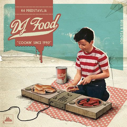
is this a logo? needs some type.
- inkpink0
if it is a logo dj food hit the knife and fork thing pretty heavy thru the 90s. not saying thats bad, just be prepared for comparison.
- ninjasavant0

- Candy raver???? If so needs more candy.discoduro
- yeah, it was the best image i could come up with quickly that was work safe :Dninjasavant
- show me the nsfw onesscarabin
- hehediscoduro
- imnotadesigner0
what do you guys think? The first or second one?


- Google "Blue Note Covers" for some inspiration of typography. You are ALMOST there23kon
- ninjasavant0
I like the second one but not the title font.
- any other font suggestions then?
I was kinda going for that artsy retro lookimnotadesigner
- any other font suggestions then?
- Shaney0
first
- ukit0
1
- inkpink0
#1 but with Title Case... to create more contrast between "a dj"... and maybe no ampersand.
Dinner and a DJ
Dinner + a DJ
?
- inkpink0
actually withdraw that i like #2 better...
but with just a clean didot or bodoni, no rough edges.
restaurant chic.
- imnotadesigner0
thanks Ill try those suggestions, Im off for the night but'll check back in in the morning
- version30
I searched through 20 pages of this
http://images.google.com/images?…
and didn't see anything like his proposed work, mine was merely a remix of his.
does anyone have a link or album name to search for?
- imnotadesigner0
I revisited some of the typography from the first draft. Now Im confused... as to which I like more


- Curious...what style of music, feels like downtempo or deep house?discoduro
- I was told it was chill... for the afterwork crowd and artsy locals in the area.imnotadesigner
- Artsy locals on Wellington? Mostly Ad Agency D-bags when I've walked bye. Including myself. ;-) #2 FTW!Andrew_D
- I like number 1 then 3.KevinTx
- If it's chill I like the first 2.discoduro
- #1turnerworks
- 2 (without the numeral), 6scarabin
- Andrew_D0
I think you've got too much of the same going on there. Personally, I think #2 is the strongest of the bunch. The concept of Dinner and a DJ get's lost when you bleed the fork, record and knife off the page.
Is that place any good? I live pretty close.
- Ive been once last year, but cant really say how good it was because it was for a private party. The space is nice thoughimnotadesigner
- imnotadesigner0
bump
- inkpink0
imo, some of these use too many fonts for one poster.
- i'd do #4 with a bigger/heavier bodoni-ish font.
- but "Dinner and a DJ"
- or use an oversize "&" in the background as v3 suggested way back
- select an ampersand to accent the swash M in logo
- "Thursdays at..." go all uppercase in the cond. sans used below.and its thursday already, just get it done before some kid steals your gig.
use the cropped plates styles for a repeat poster sometime down the road, when people are already familiar with graphic.
- wise wordsimnotadesigner
- I like what you're saying about the cropped graphic later on down the roadimnotadesigner