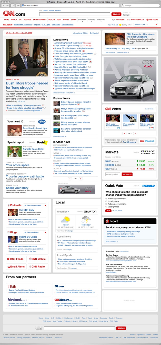
CNN Redesign
- Started
- Last post
- 49 Responses
- discoduro
Not sure if this has been posted yet, sorry if so.
- elahon0

(on the site, not the post)
- Etype0
what did the old one look like?
- dbloc0
pulse is cool
- mg330
I can get used to it, but the red banner is not good. Red was previously used for their alert banners, so what are they going to use now?
- Etype0
ya this was better...
- AngryMob0
Aren't they supposed to be a news agency?
- identity0
I think this is an improvement... just my 2cents...
- EightyDeuce0
Just seems like the content areas and other sections were more clearly defined in the old design. Not too sure how granny friendly this new design is.
- angrybot550
I believe they used different colors for different types of breaking news. I forget the categories but they were different. On the new site - I am not really into it. It puts too much emphasis on the videos rather than the news items...
- EightyDeuce0
Just seems like the content areas and other sections were more clearly defined in the old design. Not too sure how granny friendly this new design is.
- Etype0
http://www.cnn.com/interactive/r…
it looks a lot nicer in this video
- angrybot550
^ exactly why I like the older site
- epic_rim0
I get all my news from Southpark.
- mattiaBK0
It's shit!
- tasty0
After watching that video, the homepage design may be unnecessary to achieve what they are going for, but this is what I walked away with.
Seems they are moving the way of "social news"...customizing the information you are taking in - by making an account, following stories, comment tracking, and "ireports". Giving people more say in what they want to learn ore even say about the news.
- graphiknature0
Why you going to steal my thunder? LOL j/k http://www.qbn.com/topics/607474…
Where is the merge button?