Album design critique
- Started
- Last post
- 9 Responses
- mynameisdave
Unfortunately I can't post any of the music at this point in time, but it's an instrumental combination of classical and modern composition and is at some points very ambient and some points very aggressive and primitive in nature.
The artist's commercial work is mostly for Christian TV network. He also composes music for networks such as The History Channel, Lifetime, and a few other high-profile networks and produces work for motion pictures and video games. This is for the launch of his personal work however which is very different from his commercial work but still carries certain undertones of Christianity and what I would consider an examination of the social construct. It's very touching stuff, Christian or not.
Here are the drafts for the cover design and initial branding for his personal project I want to tweek before I present them;


First, let me know which one is the strongest piece or if they're both bollucks at this point. I have one more draft I'm working on and have a bit of fine-tuning to do with these two, but feedback would be very valuable at this time. Also, critique the kerning and whatever else you want to throw my way.
Thanks in advance.
- utopian0
i like the type treatment, i am not crazy about the imagery.
- mynameisdave0
The first example plays off of the Christian aspects of the artist. The second piece plays more off of the idea of the album being an examination of the social construct and roots more into the primordial feel of the music.
After I get a little more feedback, I'll know where to go with the direction of the third concept. I appreciate the quick feedback utopian. I am pretty happy with the initial text treatment but may play with it a bit more if necessary. I would love to hear some more opinions.
- mynameisdave0
ismith, great feedback. I was curious if the first example would strike some as too cliche. I want it to really touch on the ideas I have laid out, but still be broad. I think I'm going to play with an idea based on the universe. Like I said, It's a bit of a challenge to brand music without lyrics. Rock and Indie albums are easy.
- Play off the title... there could be some great imagery from itfresnobob
- fresnobob0
As the song goes: "This world is not my home..." If it is a Christianity thing, I get the first one with the angel wings and the earth off in the distance, but then the 2nd one with the earth over some native americans doesn't make any sense to me. Whats the connection?
I think the first one fits better thematically, but the wings combined with the dot (moon?) totally looks like an "A" to me.
You also have your type placed at the exact same size in the exact same place on both covers, but its in a completely different context. You need to make the type harmonize with the image, not just place it on top. Personally, its way too big to me, especially on the first one. The type is also very thin and light. I'd consider trying some really wide letterspacing to push this feel more. The ruins are falling and your just floating away on a cloud or some shit like that.
- mynameisdave0
"but then the 2nd one with the earth over some native americans doesn't make any sense to me. Whats the connection?"
It deals with the primordial/raw side of the music. Good points. Like I said, I was pretty happy with my initial type treatment so I used it on both of the drafts. Perhaps I should play with the type treatment a bit more. It worked with both, but I like your idea on wide letterspacing, ect. I may do something in Universe bold or DIN 1451 (which is typical in my 'more creative work' but it's worth playing with I guess.)
I really want to develop the idea of "the ruins fall" but I have to stay away from modern ideas such as of the desaturation of America, 911, political imagery, ect. I want to develop an idea to combine classical with modern. I'm thinking about playing with the fibonacci sequence in another draft or combine imagery of ancient ruins with modern architecture. Both seem to enter into the realm of "cliche" however so I'm trying to come up with a concept to find a happy medium, but still have religious and spiritual undertones.
Keep the ideas coming. You guys are great.
- mynameisdave0
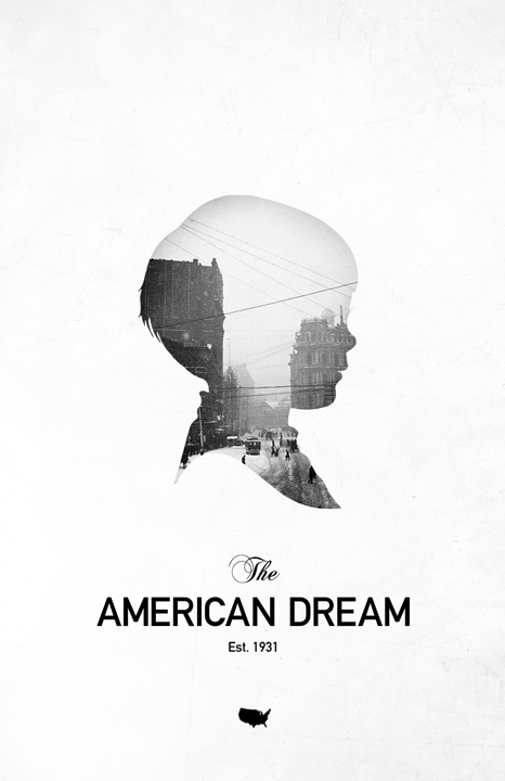
This may help as well. The client really likes this piece of mine:
So I need to produce something in a similar style. I'll shut up now and let you guys do the talking. Thanks in advance.
- skt0
if he likes that you should probably just forward him mark weavers details.
and you really need to stop using that image of the earth in everything daven.
- skt, I was wondering when you would come along to troll. :)mynameisdave
- skt0

- omg we both used a boy's profile in a design piece in a totally different style with a totally different message.mynameisdave
- You look like a silly ass. Congrats.mynameisdave
- you used it immediately after him, in the same thread, on the same forum. coincidence entirely.skt
- You are less than amusing.mynameisdave
- Thanks for chiming in with your usual trolling though. I'd rather focus on productive comments though.mynameisdave
- You have proven time and time again you have nothing positive to contribute.mynameisdave
- d_rek0
I like the imagery and type on both of them.
However I feel that compositionally the first one is stronger (heirarchy and relationship of illustration and type works better). It also seems more uplifting - if that's the intention. As far as kerning i think you're good until you ge to the last pair of letters: the a-n. The space there feels like it needs to be tightened a bit.
The second cover invokes associations with that whole electronic/techno/massive-attack style cover imagery. Also, there seems to be more focus on the 'kauf' than any other part of the typography because of the way the gradient is applied.
After further examining the type I think you have something really nice going on with the artist's name. I think the subtext falls a little short as it feels rather frail and unimportant. This could just be the compression of the image tho.