Logo help
- Started
- Last post
- 29 Responses
- d_rek0
Going to pour out some honesty:
That bird-shape is incredibly unattractive and feels amatuerish in execution. It just doesn't feel elegant and/or refined. Not something I would be proud of or wanting to represent my organization visually. I'm not sure how you arrived at that shape but I feel as if it could use more exploration and certainly refinement.Typographically you're safe. If i had to make a judgement call I would axe the bird thing and just leave it a straight-type identity.
- johndiggity0
do you have parkinsons?
- kiusa0


Sorry guys i forgot to post i yesterday (went to have a drink :) ... changed it a little bit...thanks for the font site link (however it was strange with this font)
here how it goes any suggestions are welcome as usual :)
10x
- ckentish0
give the man a break
- How can I critique if all I see are 404 errors?monospaced
- critique the 404 errors?flashbender
- monospaced0
Not a single link you posted works!
- kiusa0
will post the final one soon
- lukus_W0
I don't understand - what was the point in posting your design when you carry on regardless?
- jay_jay0
I really don't like it, sorry.
- kiusa0
thanks alot
- kiusa0
now i have to face the challenge to do it in only black version like for a stamp and such :)
- kiusa0
*3d road i mean
- kiusa0
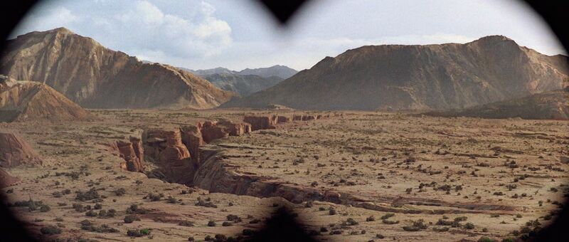
the idea with the canyon is vastely used (the 3 road) as on Eco Petroleum...was nice the it can look as like a bird when you tweak it...
it's a 2hours logo..after all nothing special
- typist0
indiana jones
- Ruffian0
Oh my...
- kiusa0
oh thanks guys... my other option is helvetica ... let me upload it