Identity Design
Identity Design
- Started
- Last post
- 109 Responses
- Amicus0
Brilliant concept and execution. Yeah, it's probably been on every blog on the planet, but I managed to miss it until today.
1 : 1 Arkitekter by Scandinavian DesignLab – http://www.scandinaviandesignlab…
- non0
- What's the ID for? A bit of context would be good. That said, I like the treatment on the QContinuity
- Well, it was a pitch for a web design studio. The word in superscript changed depending on the message.non
- Everything was set in an angle.non
- Fax_Benson0
- Looking good! Nice Fonthektor911
- Love that font, WTF!********
- akrok0
- source: http://www.iscreativ…akrok
- Not a fan, too 'mill' like.Hombre_Lobo
- Love the florescent pink edging though.Hombre_Lobo
- pressplay0
Mike Meiré about Brand Coding
http://www.meireundmeire.com/pro…
- mydo0
- mydo0
- ********0
- it kind of annoys me. idk whyCygnusZero4
- Because you're a wretched cunt, obviously...********
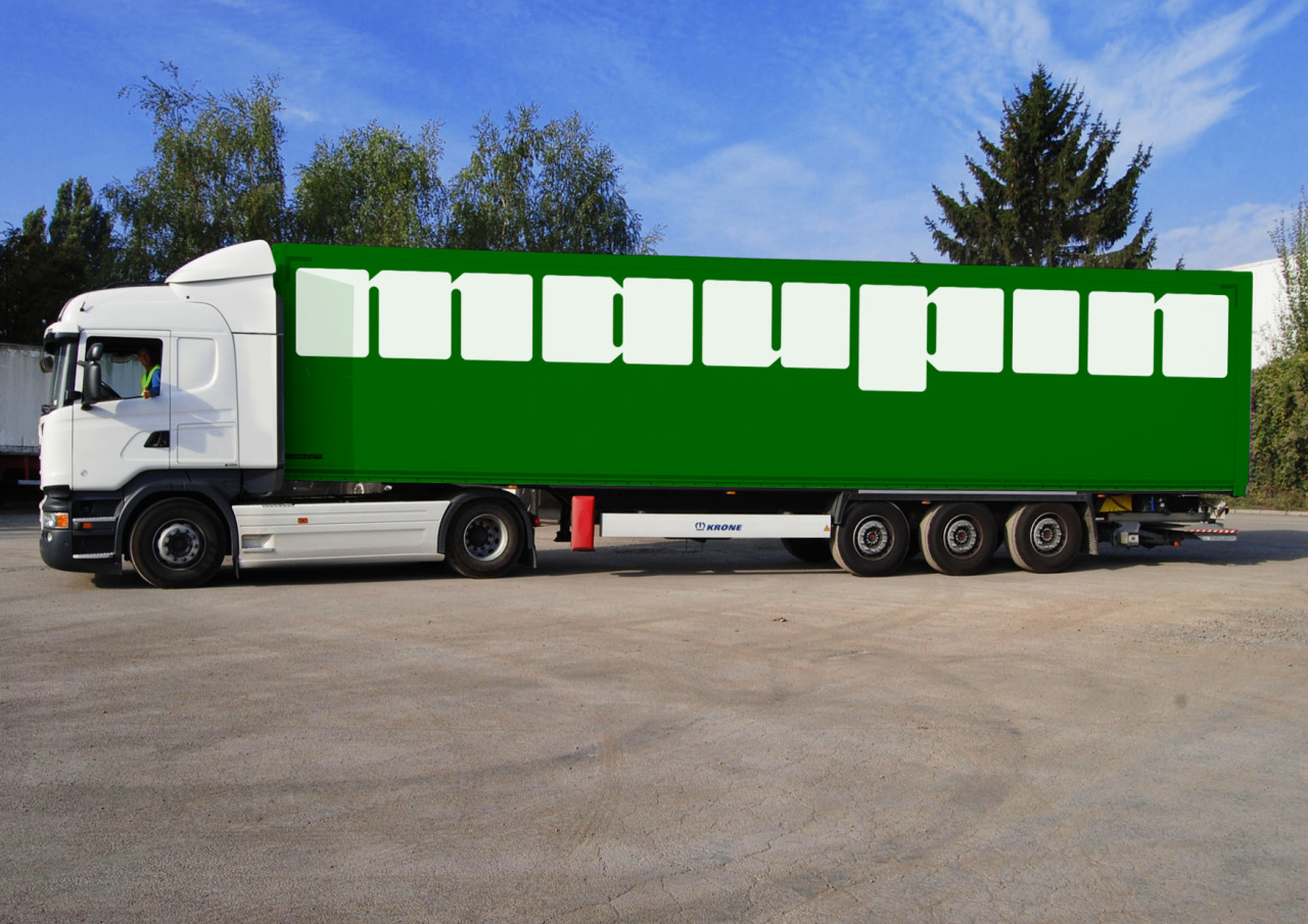
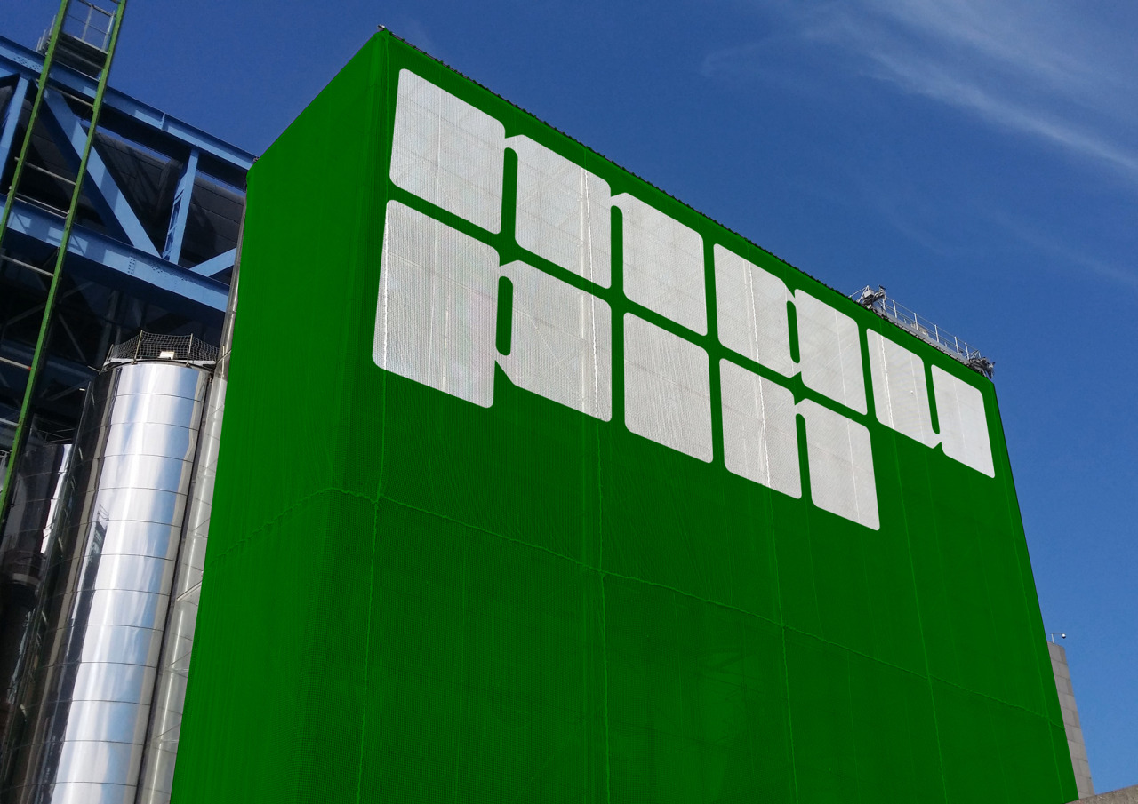
- I know what you mean to be fair. It looks odd until you see it on the lorry and the building and then all of a sudden it looks utterly brilliant********
- I thought for moments that set was backoey_oey
- mort_5
- nice colors, pops!renderedred
- so much plastic though!!
Genuinely wouldn't buy thisProjectile - Doesn't make me wanna buy. 0 pesticides but the branding screams "chemicals". And too much plastic/ packaging.NBQ00
- When you go to a studio that only has one house style...grafician
- I don't hate the approach personally. All packaging is trying to punch off the shelves these days (hence the colours) but without a lot of money investedben_
- in solid spot colours these will be pretty muddy in real life packaging. And yeah, who buys packaged greens?ben_
- It's really hard to get away from this approach to colour right now. All the grocery and food clients want the "Impossible" look. Soon to be interchangeable.ben_
- When you follow the current trend and not what’s right for the brief.Chimp
- Can smell a new thread being started "&Walsh Sucks"NBQ00
- Made a coluorful salad brand a few years back; really sticks out in the "salad" area of a grocery store. Clean and tasteful BUT yeah plastic, blah, blah...ideaist
- zero pesticides, but plenty of plastic particles.shapesalad
- Plastic packaging is really tiring. What's wrong with aluminium base, with a waxed paper top. Is that worse when you factor in co2 used in manufacturing?shapesalad
- @Chimp, the issue is more client related than studio related right now. They are driving all of their packaging this way. Blame the me-too marketing teams.ben_
- I can only speak for what I've noticed but our company works for three of the largest food producers in North America, and this is where they all want to go.ben_
- Waxed paper = non recyclable. Aluminium = huge energy wastage for containing a product that has fuck-all energy value in and of itself.Nairn
- The best thing we have with current tech is a thin plastic bag. What happens to that after use is the problem. Ideally, it'd be burned for clean energy.Nairn
- As a fellow N.LDNer, you should know that most of your non-recycled household waste is burned for energy. Thin plastic is a great energy as it burns q. cleanNairn
- nngh.
*a great source of energy as it burns quite cleanlyNairn - Or you can just buy produce non-bagged that's set out on a produce stand? Does that not exist in Britain anymore?ben_
- There are bio plastics that work okay, but they are also quite pricey.ben_
- [Useless but tasty] Salad leaves all come in bags here in Britain, afaik. Otherwise, yes - shops tend to have unpacketed vegetables otherwise.Nairn
- There's a drive in most supermarkets to reduce plastic consumption. My local one encourages the purchase of re-usable plastic nets for vegetables.Nairn
- <This sort of shit is interesting as it could be from inner-city indoor growrooms. Presents an engaging 'problem' for dispersal locally.Nairn
- Bio-plastic includes cellophane, which for some reason is reviled. I don't know why. Just as long as it's recycled/re-used, it's a great material in this domainNairn
- I really don't like thispedromendez
- I really like the strong graphic presentation in the first image. Text is great. Otherwise, it's entirely despicable as an over-made bullshit product. Sadly.Nairn
- One thing I'm always curious about - how is the ink that is used to print on 'bio' plastics or paper accounted for? Is it Bio-Dye/etc?
I need to research this.Nairn - Most paint is inherently micro-particulate plastic. The very thing most of us rely upon daily for our profession, is one of the worst bullshit things. I think..Nairn
- @nairn, wow that's so much different than here. There's a ton of this packaged branded shit, but also loose versions.ben_
- And yeah much of the ink is veg ink. it's not 100% clean but about as close as it's getting for now. That said, 1% of the market or less uses it.ben_
- nice typeface...but the fake plastic colorsutopian
- agree, it's actually pretty hard to hate on their type work.ben_
- @ben yeah I can sympathise with the designers being pushed around.Chimp
- There should be a better solution than this plastic package. We can’t carry on producing crap like this.Chimp
- It’s not just designers getting pushed around, haha let me tell you. Yeah the plastic boxes are tired. No one has the guts to change.ben_
- But it's vegetables. If everyone ate this the world would be saved!MrT
- %100 plasticmilfhunter
