WWDC 2013
- Started
- Last post
- 220 Responses
- monospaced0
You can do it!

- wagshaft0

- interesting. i like this chart.capn_ron
- an intern designed it.wagshaft
- You like the chart because it shows Apple tanking?monospaced
- mg330
Did you see this?
Jony Ive Put Apple's Marketing Team in Charge of iOS 7 Icon Design
http://www.macrumors.com/2013/06…Likely to see major revisions before release (I think we all expected that)
http://appleinsider.com/articles…- "mid-stride"ok_not_ok
- they hate it, what do we do? change it.albums
- backpedalling much?monospaced
- it's a blatant back pedal but it would of course be unwise not to revise it even slightly before launchset
- Threw the marketing guys under the bus :(ok_not_ok
- ok_not_ok0
- They need to create a perfect black & white base and than release it into the wild; curating public theme submissions...ideaist
- haha, I would totally sport thismonospaced
- I for one welcome this Palm Pilot inspired version.ETM
- utopian0
Apple’s Flat Design Falls Flat on Wall Street
http://www.wired.com/business/20…- Funnily, it didn't. It went down on the same central bank info as the rest of the market. It's back up, 1 day later.monospaced
- They wrote: "That’s nothing dramatic (and in line with historic share price moves around WWDC)."monospaced
- a whopping -0.1% downmonospaced
- set0
scary thought
- GRADIENT ALL THE THINGSGeorgesIV
- oh lordinv
- i love that the dock isn't centredset
- LOL set thats the best part!Hombre_Lobo
- looks like it's for childrentymeframe
- sighmonospaced
- Oh Shit X MavericksIrafis
- animatedgif0
Re: OS9-OS X
The evolution of OS X is actually really interesting
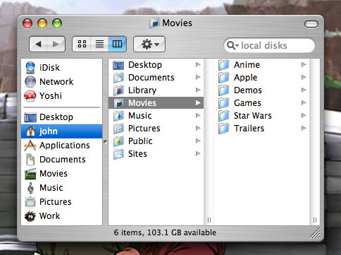
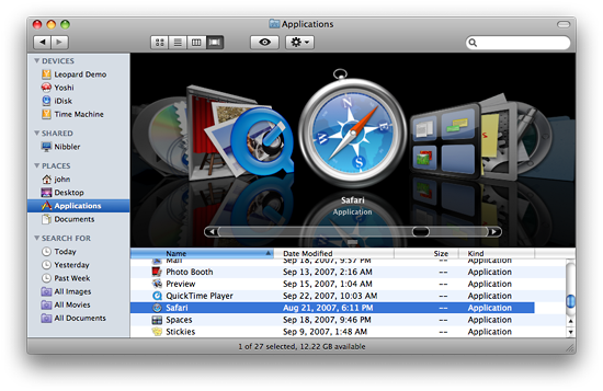
Intense pinstripes/gloss/shadows > Less Intense pinstripes/gloss > Intense Brushed Metal > Smooth grey gradients that look more like a modern OS9 "Platinum" than the original OS X
iOS 9 is gonna look awesome
- Those shots are Puma > Jaguar > Panther > Leopard BTWanimatedgif
- inv0
- inv0
pschiller tweets: This is what matters. http://t.co/f81ccshIZi
Well done video, but I still call bullshit on this focus they are talking about...
- Pupsipu0

The old one doesn't look dated. I haven't looked at it much, so may be more objective.
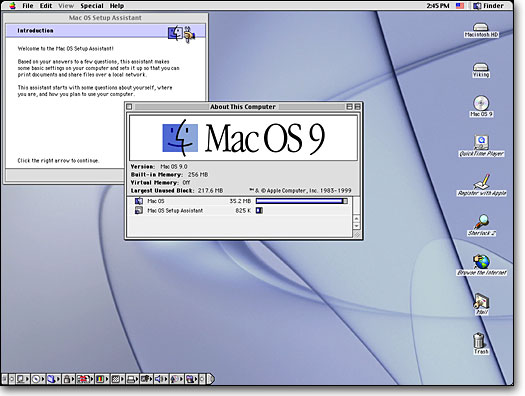
Unfortunately I'm old enough to remember the switch from Mac OS 9 to OSX. OSX looked great in screenshots, promised the moon, etc. But in practice the UI was worse, the Aqua look wasn't better and eventually OSX went back to platinum/patina simple shapes and got rid of the Aqua overload.

It's probably some art director switch or designers got bored of the old look. Or they're trying to advertise iOS7 as something new. They won't let it stand for long, they have to look at the thing all day and will notice it's not all that.
- GeorgesIV0
is this even steve jobs?

- that's a plastic model of himmonospaced
- Nice nod to jobbs thoughset
- or john lennonGeorgesIV
- or gandhiteh
- Miguex0
Windows phone UI is 1000s time better, the 'swiss inspired' design is really nice, and the animations are cool.

Yes, Apple is not what it used to be, but what are you going to do? go back to windows?
they know this, you complain now but will stand in line when the release day comes...
They got you by the Nesmins
- Hardly. The switch to android is easy.set
- if I switch to Android, I lose all the Apps I bought, and what happens to all my iTunes music?monospaced
- Nothing. They are DRM free, remember.ETM
- Android launches like a flash drive. Just drag your iTunes library in.set
- I only had a few paid appsset
- ETM0
If only Dieter Rams had designed icons... to inspire the Apple crew. :)
- cannonball19780
Black stands out way too much in the new color scheme.
- raf0
So you've slept on it and the process is already taking place in your head.
You look at the comparison imagery. As with any previous new Apple product, the old design suddenly looks dated.
The new design, as much as you thought yesterday it was bad, begins to make sense today and will look like the most obvious choice tomorrow.
The irritating colour scheme actually looks refreshing today, like a whiff of the future.
"How did we cope with that gloss and the stupid reflective shelf in the bottom?" you ask.
You are readying your credit card.
- I don't think anyone is arguing against the direction, just the lack of attention to obvious detailset
- gradient and depth inconsistencies, circles almost touching the edges, bad icons...set
- it's beta. people are such haters.rosem
- beta or not, they revealed itmonospaced
- They're the kind of mistakes no designer worth his salt would allow to be released as betaset
- beta change it.
amirite!!ian - Lol Ian! Hahaha
But ultimately releasing a completely inconsistent ui even in beta, is bad.Hombre_Lobo - suddenly looks dated? *cough. If by sudden you mean last 3 years, ok.monkeyshine


