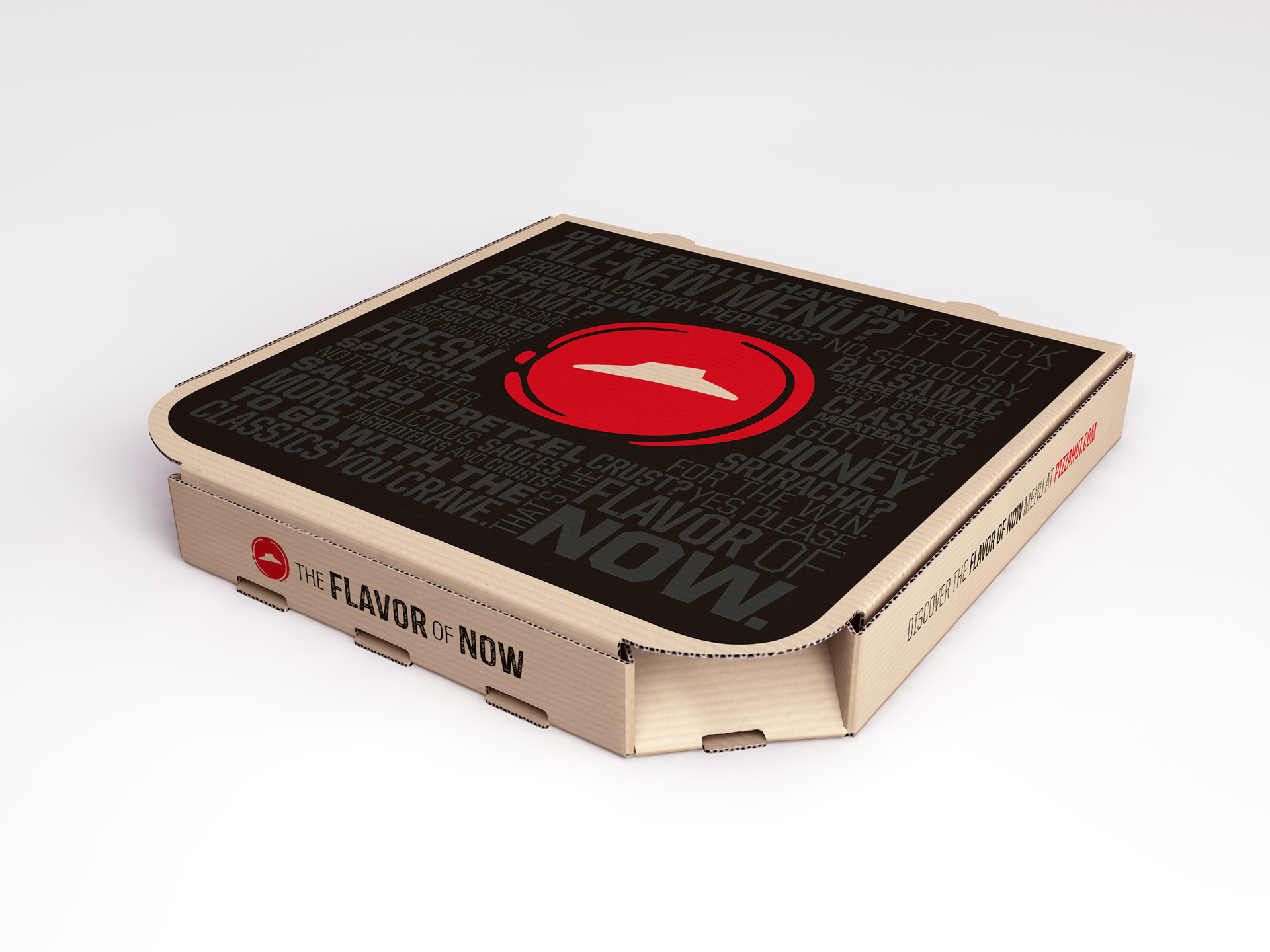
New Pizza Hut Logo
- Started
- Last post
- 38 Responses
- kingkong0
I love their PR copy.
"Pizza Hut has been defining what's possible with pizza since 1958 and our newest changes are the most significant we've made in our history as we once again look to take the entire category to another level," said David Gibbs, chief executive at Pizza Hut.
"We are radically reinventing the pizza category with a menu transformation that more than doubles our amount of ingredients and flavours, a world-class digital ordering experience and an entirely new look and feel to our brand, all the way down to our uniforms.
"We couldn't feel better about the direction we're going and the long-term impact these changes will have on our business."
- still disgusting pizzageorgesIII
- "we couldn't feel better" Sounds awfully defensive doesn't it?ukit2
- fadein110
Looks like a doodle then trace vector in AI.
- MrAbominable0
who did it? or was it in-house?
- CygnusZero40
Lmao the guy that owns the company that did this redesign is named Donny Douche.
- it's donny deutschdoesnotexist
- ummm... Cygnus, not sure if you don't know who Donny Deutsch is, or if you don't know what the world Deutsch is.monospaced
- either way it's weird unless you're trollingmonospaced
- No, its Donny Douche.CygnusZero4
- irrelevant0
I personally like it. I think it is much better than their previous logo and enjoy its simplicity. It's not easy to rebrand a company that has strong brand recognition, and with that said I think he nailed it.
- desmo0
Missing helvetica
- vaxorcist0

- for a fatter tomorrowset
- someone from qbn designed...bklyndroobeki
- monNom0
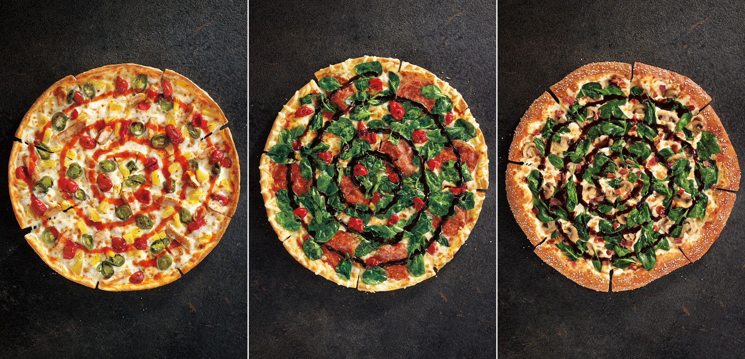
The logo is fine. The new pizzas sound revolting. The names are probably the least appetizing aspect of it all. "Cock-a-Doodle Bacon".
- What, you dont like 400 calorie PER SLICE pizza? Pizza Hut is fucking nasty.CygnusZero4
- Not to mention the fact that the slices are tiny. How do you even get 400 cal into something so small?CygnusZero4
- They must have actively searched for ways to make the most greasy pizza doughCygnusZero4
- calm downmonospaced
- vaxorcist0
Well... we are probably not the target market....
Whenever I am revolted or confused by marketing, I breathe deep and remember I am probably not the target market for that ad....
and/or the client side of that agency relationship had "lots of powerful ideas" that the agency's account staff said "yes to everything" and the rest was... uh...
- DRIFTMONKEY0
I had Pizza Hut once.

Once.
- instrmntl0
It's not terrible. It look s like a wine stain, letter seal, or pizza sauce. It makes the brand look a bit younger and not so dated. Sure it could be better, but it's audience (18-30) doesn't like sophisticated brands and branding.
- i_monk0
Changing the logo won't save this brand.