Nice initial logos
Nice initial logos
- Started
- Last post
- 13 Responses
- CygnusZero4
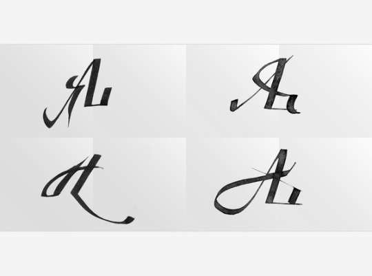
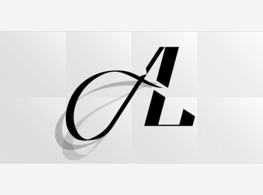
Anyone have any examples handy where 2 letters are very cleverly connected? Ive seen some in that past that were great and wish I would have saved them.
Not really talking about basic stuff like the Chanel logo or almost every sports team lol, but examples of very clever ways to connect/combine letters.
- CygnusZero40
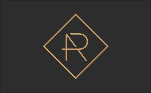
Decent example of what im looking for. Someone with the initials AR.
- That's nice.mg33
- squarespace one is decent tooCygnusZero4
- The A looks thicker? Letters off center?freedom
- Amateur.freedom
- I said DECENT. jesus lolCygnusZero4
- timeless-1
http://designspiration.net/searc…
scroll scroll scroll scroll
- set0
- CygnusZero40
Cool, thanks peeps. Still bothered by the notes at the right not having an outline :(
- --------------------...
| Huh? |
| |
--------------------...set - --------------------
|Cock...
--------------------set - --------------------
| Thanks set
| you fixed it!
--------------------ORAZAL - --------------------
| pretty cool!
| thanks set
--------------------uan - much better :)CygnusZero4
- --------------------...
- letterhead-1

- PU? RI? TRJ?sarahfailin
- TeJfreedom
- RUletterhead
- Bad.freedom
- That gap in the top of the R is way too big. That leg of the R doesn't translate.freedom
- ¯\_(ツ)_/¯letterhead
- Nice first try.freedom
- Hidbloc
- lol someone downvotedCygnusZero4
- JOSF0


- JOSF0