Hillary 2016 Logo
- Started
- Last post
- 96 Responses
- OSFA
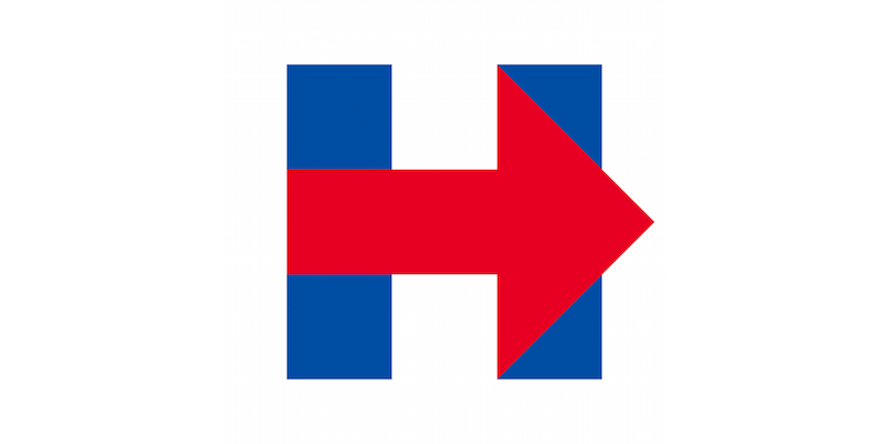
Always hard top top Obama's O but here's Hillary's logo for her 2016 run. Done by Michael Bierut / Pentagram. Thoughts?
- feel2
<!--
HHHHHH →→HHHH
HHHHHH →→→→HH
HHHHHH →→→→→→→
→→→→→→→→→→→→→→→→→→→→→→
→→→→→→→→→→→→→→→→→→→→→→→→
→→→→→→→→→→→→→→→→→→→→→→
HHHHHH →→→→→→→
HHHHHH →→→→HH
HHHHHH →→HHHH
-->lol
- feel1
- yuekit0
So Pentagram did that? I guess it's OK but I think it lacks the originality of the Obama logo. It could almost be the brand for a construction company or something.
- Pentagram did this? Someone should be fired!utopian
- ^ Yeah you should go over there and tell them that. Explain why this logo is so bad and they'll thank you and offer you a job. Probably make you a partner.nb
- ^ I would have no problem telling the clip art master to his/her face how bad their logo sucks! Stop riding their Pentagram's cock, the logo blows monkey balls!utopian
- hahahahaha!!!! @nbzenmasterfoo
- jtb262
It's simple. It gets the job done. If the website were designed better I think it would really sing.
Often it's the design around a logo that makes it work. The mark itself isn't bad. Despite the story that's being written on tech blogs.
- _niko1
I think she wins based on the possibility of having him as the first lady:

- hahamoldero
- what would be be called? first gentleman?CygnusZero4
- first gentleman?sarahfailin
- Bill in a dress. I'm sure that's already happened.zenmasterfoo
- probably the first Man.bklyndroobeki
- wonder if her salary will be market rate for prezbklyndroobeki
- He'll likely be referred to as Former Presidentjtb26
- or "The Man"CyBrainX
- BLUNTMAN!!!e-pill
- yurimon0

go now if you think of voting for her. means you need some serious help...
- Jeb Bush might be running. What then?CyBrainX
- we are not free, we are doomed if this keeps up. hillary or jeb we are fuckdyurimon
- samebklyndroobeki
- same: meaning good HOSPITAL referencebklyndroobeki
- yurimon. Why are you regurgitating shit from what's clearly a google image search for Hillary Logo. Have an opinion of your own for once in your fucking life.kona
- what you talking about? i saw the logo and looked up "hospital sign" as a reference.yurimon
- haha lol, yea she is kinda the devil incarnate isn't shegilgamush
- hans_glib0
didn't someone somewhere once say something about how using an arrow in a logo displayed a total lack of ideas and imagination?
or maybe not. I don't remember
anyway the repeated use of the arrow on the website seems ok, its a bit clunky in the logo tho.
- nb1
I think it's fine. It meets the requirements (standard colours, etc) for a campaign logo and does a few other things.
Using just the H helps shift people to talking about "Hilary" instead of "Hilary Clinton". She wants us to think of her as a regular American, on a first-name basis. She also wants to stand on her own, not be seen as Billy's wife. I don't think many people talk about her that way, but America is a big country and a lot of people might see these simple things when they look.
The arrow represents moving forward (reading left to right) and also moving the party to the right, or rather towards the centre. That's a good place to be for a democratic candidate. The republican party has lost a lot of it's moderate members over the past years by promoting the Tea Party and other nut jobs. Moving to the centre might mean getting a few more votes.
Keep in mind that the Democrats are probably going to win the presidency again unless the Republicans have a massive change in their message or there is another major terrorist attack. So, this democratic primary is very likely going to decide the presidency. Of course, none of the candidates will admit to that, which makes this "moving the democrats to the centre" campaign a good strategy for Hillary.
I think the two vertical beams (of the H) also symbolize a separated country. The arrow implies that she's bringing the polarized country back together, as one strong pillar.
The arrow sticking out just past the H implies that her campaign is about more than her and more than right now. It's about the issues, the future of the country, etc.
I'm interested to see if anyone at Pentagram releases a statement about it, they usually do, right?
- The Hillary logo is horrible on so many conceivable levels, I don't even know where to begin.utopian
- I agree with utopian. It's horrible. A good campaign logo is inspiring on some basic level. This is just a typical, minimal effort from Pentagram that probablymg33
- took 10,000 hours to conceive.mg33
- 10,000 hours to conceive?
Are you kidding us?utopian - Thank goodness nobody gives a fuck about the campaign logo though.monospaced
- utopian I said "probably took 10,000 to conceive.mg33
- sarcasm, monospaced?bklyndroobeki
- Just don't talk about Apple here okay!utopian
- 10000 hours is about 420 days lol. Most of us here could have done something more inspiring in 420 secondsset
- is it 4:20 already?Gnash
- ^Well, let's see 'em?!sarahfailin
- Feel free to pay meset
- How much is 420 seconds of your time worth, set?nb
- nb can i have you on my selling team?bklyndroobeki
- Ten fifty moniesset
- i'll put my neck out there and say I like it strong, timeless, simple and unexpected. Also - its engaging: we're all talking about it.timeless
- So let's all design really bad stuff so that people will talk about how bad it is. What a great direction design is heading in. /Sarcasm.iCanHazQBN
- Not sarcastic. I do believe people make decisions politically based on politics and really pay little attention to the logo. It's hillary. Her brand is theremonospaced
- Not sarcastic. I do believe people make decisions politically based on politics and really pay little attention to the logo. It's hillary. Her brand is theremonospaced
- And this logo doesn't change it. I truly believe in this case (presidential candidates) that logos don't matter to the voters.monospaced
- by saying the logo identity does not matter, why have one? For hundreds of thousands of people the logo will be the first touching point for Hillary.utopian
- And if her logo sucks, which it does. As well as lack of personality, humanity, and or strength, she will be perceived that way.utopian
- Fair enough.monospaced
- after that shepard fairey nonsense it's become pretty clear that the iconography indeed matters, at least to the young voting basegilgamush
- nb0
- yuekit0
Agreed nb, but I don't think she would want to express "moving to the right." I think it just represents forward or progressivism.
She is basically running as a third term of Obama, which is probably the best you can hope for in American politics right now.
Right now her candidacy seems to lack a certain inspiration or central idea, but she's still going to be the favorite based on the Clinton name and chance to elect the first woman. Just ask yourself if there is any way Republicans can hope to win male voters by a larger margin than Hillary wins women.
- At least the logo could have been somewhat aspirational. The mark is so safe, that it lacks any personality or genuine qualities.utopian
- utopian5
www.horriblelogos.com would of created a: stronger, expressive, cohesive, well thought, original and definitive logo for only $5 bucks.
- _niko0
as far as voters go:
Men love women (but not necessarily women in power)
men like men
women love men
women hate women= man wins vote.
- dbloc0
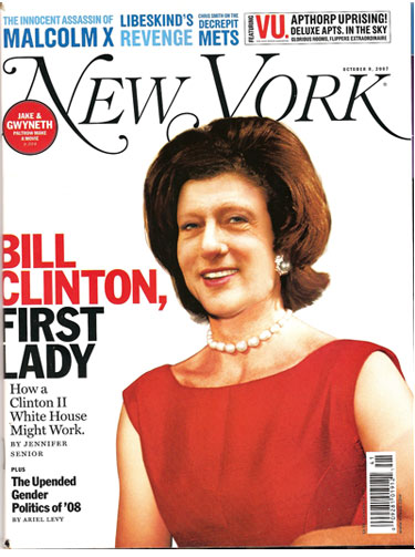
fake smile

- forceddbloc
- Yes you can tell by the lines under the eyes and way the upper lip tucks in and is not widely expressive. I watch a doc on Discovery over the weekend on fake...utopian
- not a good photo. not even looking into the camera.bklyndroobeki
- we r fuckd x ∞yurimon
- Are you surprised? Every single public figure has a fake smile. You need it when photos are snapping. Nothing wrong with it.iCanHazQBN
- They just want to be perceived as happy friendly people even though at that very moment there might be nothing specific that's making them smile.iCanHazQBN
- Tell us moreset
- utopian, link to docubklyndroobeki
- https://www.youtube.…utopian
- https://www.youtube.…utopian
- https://www.youtube.…utopian
- http://photographyco…utopian
- https://www.youtube.…utopian
- tx!bklyndroobeki
- mg330
Nobody has even posted the whole thing:

The "r" in "for" to the left of the triangular point, and the "A" in America are atrocious. Just absolutely atrocious.
- For some reason the logo is remindful of KMart or Walmart for some reason?utopian
- K e r ni n gutopian
- It feel like bad corporate identity, Pentagram should just of used a swoosh.utopian
- Just so my day isn't ruined, are you guys down voting the logo or down voting my comments about it? Thanks.mg33
- This isn't on her site that I could see.nb
- colin_s0
terrible
- dbloc-2

- too soon?utopian
- Nah.utopian
- hahahasarahfailin
- oh shit. haha!zenmasterfoo
- Saw that tooset
- fucking idiots on this siteCygnusZero4
- lol. I didn't make this.dbloc
- America Fuck Yeah! CZ4...oey
- lolzrenderedred
- Oh manfooler
- HAHAHAHAHAHAA OMG SO FUNNY
fuckin moronsgilgamush

