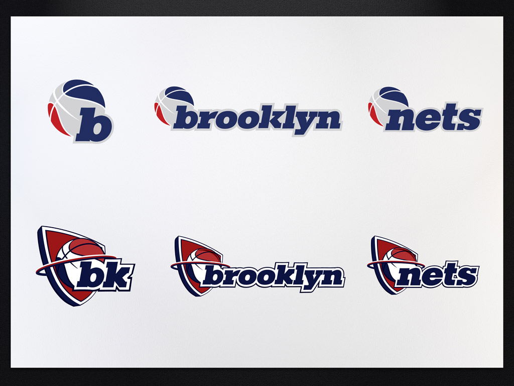
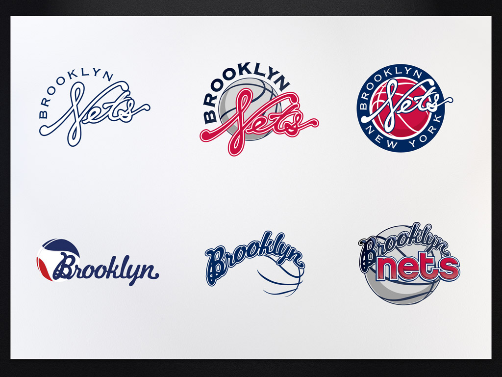
Brooklyn Nets Logo
- Started
- Last post
- 68 Responses
- utopian0
OSFA21
- futuremongolian0
The real problem with this is that it does look like it could be a parody. The Helvetica tweet campaign, even more so.
- ohhhhhsnap0
ya'll should see the stadium. it's just as ugly.
- identity0
The guy can rap. Why would branding or architecture be any harder?
- desmo0
The Nets logo seems like its still in the BW concept stage. Where are 29 other options?
- letterhead0
Is it an optical thing or is that "B" not centered correctly? Center that fucking B!!!
- i think it's an illusion because the lines in the bball are heavier on the rightjayliquori
- gramme0
The main reason I think it's bad is that the concept lacks originality and creativity. It's a basketball. For a basketball team.
- albums0
if the Timothy Morris ones are the rejects, why does it look like the same ball?
- bottom right two from second image abovealbums
- because its a basketball?ian
- it looks to be the same ball precisely like they took his ball from a comp or his or bought his ball?albums
- Yeah they might be the same ball, but these logos are different from the final logo. Not sure I understand your point.CanHasQBN
- I'm just wondering if Jay-Z did actually make this from the designers assets based on his wife's suggestion is all. ;)albums
- Oh. I think he's the one who actually executed the final logo. So he just used the same ball.CanHasQBN
- I dunno. I'm confused.CanHasQBN
- if you were paid to make unused comps how would you feel if they made something else from them?albums
- If I was paid? No, I would not have a problem with it if they ended up using some elements in the final.CanHasQBN
- I think that end up happening a lot in design. As long as you're paid for your work by the client, what does it matter?CanHasQBN
- it always stings a bit, i guess you can be optimistic they used something but i never enjoy the client revampalbums
- i think his stringy nets type is very nice as well.albums
- this just wreaks of the House of Deréion.
identity
- TheAnthonyWallace0
i think it will be very successful as a brand. design is not 100%, but i think it works, and will be well received by non-designers.
- k_temp0
Is the idea to go retro on the design?
I kinda like the current logo.
- akrok0
so tim made it but jay-z took the credits?
- C'mon son. You know how the game goesGlitterati_Duane
- hah. game set.akrok
- detritus0
I'm curious to see the original version - searches on google are swamped by the new versions.
- detritus0
Given the general state of sport insignia branding and the backdrop of his investment and the marketing thing, I'd say 'he' got it pretty bang on.
As much as I loathe the guy and what he represents, he's done as good a job as anyone of you pansy-ass fluffers would likely have, regardless of how clinically you choose to pick apart his efforts.
Good on him for proving to the world that any fool with a copy of Photoshop can actually claim to be a designer.
We exist in an awkwardly kindergarten industry, cosseted by the delusion that pompoous verbosity and pseudo-intellectual dissection makes it any more the grown up.
Our grandparents died in wars, people - pull your head out of your asses.
- Amicus0
The NETS font looked familiar so I stuffed around with it.
Turns out it is a totally futzed up Geogrotesque. The horizontals are the Regular weight and the verticals are the Medium weight. The diagonals on the N and S have been accentuated a little. Looks like two of the round corners on the S have also been lost in the futzing.
- Berthold Akzidenz Grotesk Condensed
http://www.qbn.com/t…albums
- Berthold Akzidenz Grotesk Condensed
- qTime0
Needs to pop more
- cbass990
On Tim's website, it says - Designed Official Brooklyn Nets Logo (to be announced this month)
Why does Jay-Z get all of the credit?


