Surfrider digs a rail
Surfrider digs a rail
Out of context: Reply #2
- Started
- Last post
- 32 Responses
- gramme0
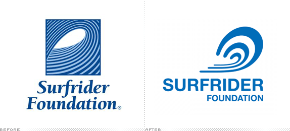
The old symbol didn't reproduce well @ small sizes, and the logotype was nasty. But if they had simplified/refined the old wave and dressed up the type, that would've been a far better solution.
I'm half tempted to play around with refining the old logo and just sending it to the CEO for the heck of it.